

Ask around and the same names come up, but most lists stop at the name and the birth year, which doesn't help much when you've got a brief open. We've profiled 40 designers, named the work that made each one famous, and pulled out what our own creatives still borrow from them.
Ask ten designers to name the most famous graphic designer and you'll get defensible answers. Paul Rand comes up almost every time, because most of us grew up looking at his IBM logo. So do Saul Bass, Milton Glaser, Massimo Vignelli, Paula Scher, Susan Kare, David Carson and Stefan Sagmeister.
Between them, they drew the mark on the side of every UPS truck, the title sequence for Psycho, I ♥ NY, the New York subway map, the Public Theater's posters, the original Macintosh icons, the pages of RayGun and album art for Lou Reed and Jay-Z.
Which points to something a bit strange about fame in this field. You've seen all of that work, probably hundreds of times. Until a minute ago, you might not have been able to name a single person who made it.
That gap between the work and the name is really what a list like this is about. We've gathered 40 designers here: the 20 who shaped the field, 15 doing the most interesting work right now and five our own creatives keep coming back to.
Every entry leads with the work rather than the résumé, and where there's a studio site, an archive or a museum record worth your time, we've linked it so you can go deeper than a paragraph allows.
What actually makes a graphic designer famous
“Fame” works differently here than it does in other visual arts. Hardly anyone can tell you who drew the FedEx logo, and yet almost everyone has noticed the arrow. The work goes out into the world and becomes public property while the person who made it stays backstage, which means reputations in graphic design get built on a narrower set of things than you might expect.
Looking across the 40 designers below, four patterns keep showing up. They're worth naming before the profiles start, partly because they explain the selection and partly because three of the four are things a modern brand team can deliberately engineer.
One piece of work that outlives the brief
Rand's IBM logotype was a corporate identity job with a deadline and an invoice. Glaser's I ♥ NY was a tourism campaign that nobody expected to survive.
Max Miedinger was designing a typeface to compete with Akzidenz-Grotesk and ended up with Helvetica, which became one of the most widely used typefaces in the world. In each case, the work turned out to be so well fitted to the problem that replacing it would have cost more than keeping it, and that's usually where lasting fame starts.


Our roundup of 30 famous logo designs digs into why certain marks refuse to age, and our piece on iconic logos and brand redesign covers what happens when a company tries to replace one.
A visual language nobody else has
You can spot a Sagmeister, a Carson or a Myerscough across a room. That isn't a style applied on top of the work, it's the residue of the same decisions about typographic design, color and structure being made over and over until they harden into a signature.
Aaron Douglas did it in the 1930s by pulling Art Deco geometry together with Egyptian silhouettes and the visual language of the Harlem Renaissance.
Morag Myerscough's studio is recognizable through its use of color, space and a distinctly experiential approach, which is a fair description of what a visual language actually is once you strip the mystique off it.


Aaron Douglas and Morag Mysercough, respectively.
A discipline they redefined rather than joined
Alvin Lustig decided a book cover could be an abstract translation of the text instead of an illustration of its plot, and every literary paperback since has lived downstream of that decision.
Susan Kare did the same thing for the interface and Cipe Pineles did it for the magazine.


It's the rarest route onto a list like this one and by far the most durable.
Visibility, then and now
The historical names got known through professional bodies, awards and the trade press, and the AIGA Medal, running since 1920, is still the closest thing the field has to a canon.
Contemporary names got known through Instagram, Behance, Pinterest and self-initiated work at least as much as through clients, which is why social media platforms now sit alongside the portfolio as career infrastructure. Both routes are real, and neither one substitutes for the work.
Famous graphic designers at a glance
If you're scanning for a specific reference rather than reading straight through, this table covers the historical figures who come up most often in briefs. Signature work means the piece most people would recognize on sight. The last column is the part worth borrowing, and it's the reason each of these names is still useful rather than merely well known.
| Designer | Active era | Signature work | What it changed |
|---|---|---|---|
| Cipe Pineles | 1930s to 1970s | Seventeen and Charm art direction | Brought fine artists onto commercial magazine pages |
| Charles Dawson | 1920s to 1940s | ABCs of Great Negroes | Self-publishing as a route around exclusion |
| Lester Beall | 1930s to 1960s | Rural Electrification Administration posters | Made the image carry the message, not the copy |
| Paul Rand | 1940s to 1990s | IBM logotype | Corporate identity as a designed system |
| Abram Games | 1940s to 1990s | Second World War information posters | Maximum meaning, minimum means |
| Alvin Lustig | 1940s to 1955 | New Directions book jackets | Book covers as abstract translation |
| Saul Bass | 1950s to 1990s | Psycho title sequence | Film titles became part of the film |
| Jacqueline Casey | 1955 to 1989 | MIT poster program | Swiss rigor with a sense of humor |
| Ikko Tanaka | 1950s to 2002 | Nihon Buyo poster | Japanese form inside a modernist grid |
| Milton Glaser | 1950s to 2020 | I ♥ NY | Showed a civic mark could carry real feeling |
| Alan Fletcher | 1960s to 2006 | Penguin and V&A identities | Founded the studio that became Pentagram |
| Massimo Vignelli | 1960s to 2014 | 1972 NYC subway map | Diagram beats geography for navigation |
| Sheila Levrant de Bretteville | 1970s to present | Woman's Building, CalArts program | Built institutions, not just artifacts |
| Archie Boston | 1960s to present | Boston & Boston self-promotion | Confronted racism in advertising's own language |
| Paula Scher | 1970s to present | Public Theater identity | Typography as the entire image |
| Sylvia Harris | 1980s to 2011 | US Census 2000 communications | Design as public infrastructure |
| Susan Kare | 1982 to present | Original Macintosh icons | Made computers feel approachable |
| David Carson | 1980s to present | RayGun art direction | Legibility and communication aren't the same thing |
| Peter Saville | 1978 to present | Unknown Pleasures sleeve | Album art as pure signal, no band, no title |
| Gail Anderson | 1980s to present | Rolling Stone and SpotCo work | Expressive type inside editorial discipline |
The 20 most influential graphic designers of all time
The phrase “graphic design” only came into common use around the 1950s. Before that the people doing this work were called commercial artists, and the working assumption was that words carried the message while pictures decorated it. The designers in this group are the ones who dismantled that assumption, mostly one discipline at a time and usually without much fanfare while they were doing it.
They're ordered roughly by birth year rather than by rank, since ranking Saul Bass against Susan Kare isn't an argument anyone wins. What connects them is that the field looked measurably different after each of them than it did before.
1. Charles Dawson (1889 to 1981)

Dawson was one of very few Black professional designers working in early twentieth century America, and he spent much of his career being denied credit for work he'd done. He was the only Black artist represented at Chicago's Century of Progress Fair in 1933 and 1934. When publishers wouldn't take on his book celebrating Black and African leaders, he published ABCs of Great Negroes himself, and the linocut portraits in it are still striking. Princeton's Graphic Arts Collection holds a good account of his career if you want the fuller picture.
2. Cipe Pineles (1908 to 1991)

(Source: Eye Magazine)
Pineles became the first woman admitted to the New York Art Directors' Club in 1943 and later the first woman inducted into its Hall of Fame. She art directed Glamour from 1937, then moved through Seventeen, Charm and Mademoiselle. Her real innovation was commissioning fine artists, including Ben Shahn, Lucille Corcos and a young Andy Warhol, to illustrate commercial magazine pages at a time when those two worlds barely acknowledged each other. Eye Magazine's profile makes the case for her better than most.
3. Lester Beall (1903 to 1969)

(Source: Communication Arts)
Beall's posters for the Rural Electrification Administration in the late 1930s had a genuinely hard job to do: explain electrification to rural Americans, many of whom had limited literacy. His answer was to let the image do the work, with flat color, blunt iconography and text cut back to a handful of words. That inversion is so standard now that it takes some effort to see how radical it was, and Communication Arts has the full history.
4. Paul Rand (1914 to 1996)

(Source: PaulRand.Design)
Rand gave American business its visual grammar. IBM, UPS, Westinghouse and ABC all still carry marks he drew or that descend directly from his work, and the archive maintained in his name is worth an afternoon. He was an early champion of the International Typographic Style in the United States, and he argued throughout his career that a corporate logo exists to be recognized rather than to describe anything. His striped IBM logotype from 1972 demonstrates the point neatly, since it says nothing whatsoever about computing and yet nobody mistakes it for anything else.
5. Abram Games (1914 to 1996)

(Source: AbramGames.com)
As the British Army's official war artist, Games produced more than 100 official posters under a three-word discipline he set for himself: maximum meaning, minimum means. Gradients, flat planes and geometry did the arguing, and the compression is why they still read from across a room. His estate's archive covers the later commercial and television work too, which kept the same economy. Anyone who has ever cut a layout back until only the idea survives has used his method.
6. Alvin Lustig (1915 to 1955)

(Source: Communication Arts)
Lustig read the books he designed jackets for, then translated their atmosphere into abstract marks rather than illustrating their plots. His New Directions covers from the 1940s could plausibly have been printed last year. He died at 40, which makes the scale of his influence on literary publishing faintly absurd, and Bauhaus and Modernist thinking reached American bookshelves largely through him. Communication Arts has a good retrospective.
7. Jacqueline Casey (1927 to 1992)

(Source: Rochester Institute of Technology, Cary Graphic Arts Collection)
Casey ran design at MIT from 1955 to 1989 and turned a technical institution's noticeboards into a coherent visual identity. She worked in the Swiss idiom, with tight grids and precise execution, but she loved puns and visual jokes and let them into the work, which is a harder balance than it sounds. RIT's Cary Graphic Arts Collection holds 99 of her posters and they repay browsing.
8. Ikko Tanaka (1930 to 2002)

(Source: Design is History)
Tanaka is usually called the father of Japanese graphic design. He set Japanese calligraphic and theatrical traditions inside Western geometric structure and bright modernist color, most famously in his Nihon Buyo dance posters. He worked with Issey Miyake, Kenzo and Hanae Mori, and his art direction shaped Muji's entire visual restraint. Cross-cultural design usually flattens both cultures involved, and his work managed to do the opposite.
9. Massimo Vignelli (1931 to 2014)

(Source: New York Transit Museum)
Trained as an architect, Vignelli produced the 1972 New York City subway map, which threw out geographic accuracy in favor of a clean diagram of connections. Riders complained; the map was eventually replaced, and it now sits in MoMA's collection as the ancestor of nearly every transit diagram since. The New York Transit Museum's digital exhibit tells the whole story. His argument was that good design starts from what people are trying to do rather than from what happens to be literally true.
10. Milton Glaser (1929 to 2020)

(Source: MiltonGlaser.com)
Glaser co-founded Push Pin Studios in 1954 and made more than 400 posters over his career, and he's still best known for something he scribbled in the back of a taxi. The I ♥ NY concept sketch from 1976 is in MoMA's collection, ink and tape on a paper envelope, made for a tourism campaign during the city's fiscal crisis. Fifty years later it's on merchandise in every borough, and his studio site is still up.
11. Alan Fletcher (1931 to 2006)

(Source: Domus)
Fletcher founded Fletcher/Forbes/Gill in 1962, which grew into Pentagram. He shaped Penguin Books, Pirelli, Reuters and the Victoria and Albert Museum, whose ampersand-based mark remains one of the most elegant identity solutions British design has produced. His Penguin work in the 1960s built the consistency that still makes those spines recognizable from across a room, and Domus has a thorough biography.
12. Sheila Levrant de Bretteville (born 1940)

(Source: Yale University Art Gallery)
De Bretteville founded the first design program for women at CalArts in 1971 and co-founded the Woman's Building in Los Angeles. She became the first woman to receive tenure at the Yale School of Art and has directed its graduate graphic design program since 1990. Her own work includes public pieces embedded into pavements and buildings, collected on her studio site, though her larger contribution was structural. Yale's exhibition framed it well: she built the places where other people could do the work.
13. Archie Boston (born 1943)

(Source: Duke University Libraries)
Boston was the first Black designer elected president of the Los Angeles Art Directors' Club and became an AIGA Medalist in 2021. His self-promotional work for Boston & Boston turned the visual language of racist advertising back on itself, with dry humor and no comfort offered to the viewer. It's confrontational work made inside a commercial discipline that generally rewards the opposite, and Duke's exhibit has the images.
14. Paula Scher (born 1948)

(Source: Pentagram)
Scher joined Pentagram in 1991 as its first female principal, and the firm still describes her as a master conjurer of the instantly familiar. Her Public Theater identity, built from compressed wood type filling every available inch, changed what an arts identity could look like and has been imitated for thirty years. She's worked with Bloomberg, Microsoft, MoMA, the Met Opera and the New York City Ballet, and she designed for Hillary Clinton's 2016 campaign. Art Directors Club Hall of Fame in 1998, AIGA Medal in 2001.
15. Sylvia Harris (1953 to 2011)

(Source: AIGA)
Harris called what she did public information design. She founded her studio in 1994, later renaming it Citizen Research and Design, and worked on the systems ordinary people have no choice but to navigate, including the US Census. Her position was that a confusing form isn't a design inconvenience so much as a civic failure. She received the AIGA Medal in 2014, posthumously.
16. Susan Kare (born 1954)

(Source: Susan Kare)
Kare designed the icons, typefaces and screen graphics for the original Macintosh between 1982 and 1986, working on graph paper because no tool existed for the job yet. Her Apple Macintosh OS icon sketchbook is in MoMA's collection, and she still sells signed prints of the icons. The trash can, the pointing hand and the smiling computer set the grammar of interface design for the next forty years, and more than that, they made a machine feel like something you could reach out and touch.
17. David Carson (born 1955)

(Source: Design is History)
Carson art directed RayGun through the 1990s and once set an entire interview in Zapf Dingbats because he found the interview boring. Depending on your temperament that's either vandalism or the most honest editorial decision of the decade. His argument was that legibility and communication are not the same thing, and a generation of designers took it seriously enough to reshape the look of the era. The RayGun archive shows the range. He won the AIGA Gold Medal in 2014.
18. Peter Saville (born 1955)

(Source: Typeroom)
Saville's sleeve for Joy Division's Unknown Pleasures in 1979 carried no band name, no album title and no picture of anyone, just a plot of radio emissions from pulsar CP 1919 lifted out of an astronomy reference book. It's now a tattoo, a t-shirt and a meme, and Saville has talked at length about how little he expected that. His Factory Records work established that a label could hold a visual position as strong as its roster.
19. Gail Anderson (born 1962)

(Source: Gail Anderson)
Anderson spent years at Rolling Stone before running creative at SpotCo from 2002 to 2010, producing Broadway posters that had to work at billboard scale and thumbnail size simultaneously. She designed the 150th anniversary Emancipation Proclamation stamp in 2013. Her work treats type as material to be cut, layered and distressed, always in service of a specific emotional register, and her portfolio is worth the visit.
20. Saul Bass (1919 to 1996)

(Source: San Francisco Museum of Modern Art)
Bass decided a film's title sequence could be part of the film rather than an obligation to get through before it. The Man with the Golden Arm, Psycho, Vertigo and North by Northwest all open with sequences that set the psychological terms for everything that follows, and SFMOMA holds the 1955 Golden Arm poster in its collection. He also drew marks for AT&T, Kleenex and United Airlines that lasted decades. Moving away from the star portrait toward abstracted, organic form was his single biggest structural contribution.
15 famous graphic designers working today
The group above became famous by inventing categories. This group became famous inside a far more crowded field, where the barrier to being seen has never been lower and the barrier to being remembered has never been higher.
What connects them is specificity. Each one has a problem they've decided belongs to them, whether that's food packaging typography, public installation, African visual iconography or the book jacket. Generalists don't tend to make lists like this. If you're building a reference library for briefs, this is where the current work lives, and our roundup of leaders in graphic design covers the studios around them.
21. Louise Fili (born 1951)

(Source: Louise Fili)
Fili art directed Pantheon Books from 1978 to 1989 and designed close to 2,000 jackets there. She then moved into brand identity, logos and packaging design, mostly for food and beverage, where her blend of historical European lettering with modern color has become a recognizable category of its own. If a restaurant identity looks hand-lettered and faintly Italian, there's a decent chance it descends from her studio.
22. Michael Bierut (born 1957)

(Source: Order Design)
Bierut has been a Pentagram partner since 1990 and works across identity, editorial and environmental design for the New York Times, the Brooklyn Academy of Music, MIT Media Lab and the New York Jets. He designed the Hillary Clinton 2016 campaign identity, whose arrow-through-H was polarizing on day one and legible from a moving car, which was rather the point. His stated aim is accessibility: work a viewer absorbs without having to think about it.
23. Stefan Sagmeister (born 1962)

(Source: Stefan Sagmeister)
Sagmeister founded Sagmeister Inc. in New York in 1993 and built his reputation on music packaging for Lou Reed, Talking Heads, the Rolling Stones, OK Go and Jay-Z. His work is deliberately uncomfortable, sometimes literally, and it's usually trying to make an idea physical rather than illustrate it. Now Is Better, published by Phaidon in 2023, turns long-run historical data into ornamental prints, which tells you most of what you need to know about how he approaches a subject.
24. Morag Myerscough (born 1963)

(Source: Morag Myerscough)
Myerscough works at architectural scale in saturated color, building installations like the Temple of Love on London's Southbank, a giant camera obscura in Mexico City and a traveling bandstand. Her projects are made to be occupied rather than looked at, and they're usually built with the communities who'll use them. Color at that intensity is a risk most designers quietly avoid, and her portfolio shows what happens when someone stops avoiding it.
25. Chip Kidd (born 1964)

(Source: Chip Kidd)
Kidd put a T. rex skeleton on Michael Crichton's Jurassic Park in 1990 and the film adopted the mark wholesale three years later, which almost never happens. He's designed hundreds of jackets for Knopf and did more than anyone to make the book cover a place where contemporary graphic design actually happens. His method, judging by the body of work, is finding the one image that feels both wrong and inevitable.
26. Eddie Opara (born 1972)

(Source: PrintMag)
Opara has been a Pentagram principal in New York since 2010, working across identity, digital products and environmental graphics, with awards from the Art Directors Club, D&AD, the Type Directors Club, AIGA and Communication Arts. His branding for Ben's Best Blnz, a cannabis company tied to criminal justice reform advocacy, shows how he treats a commercial identity and a political position as the same piece of work.
27. Lauren Hom

(Source: Lauren Hom)
Hom built her audience through self-initiated projects, starting with Daily Dishonesty, a lettering series of small lies she told herself that became a book in 2014. That led to work for Target, Google, Prudential and Samuel Adams. She now runs courses and publishes free resources for other designers, which has arguably made her as influential as an educator as she is as a practitioner. The useful lesson in her career is that the personal project is the portfolio.
28. Leta Sobierajski

(Source: Leta Sobierajski)
Sobierajski works with Wade Jeffree as Wade and Leta, combining graphic design with photography, sculpture, styling and, frequently, their own bodies. The results are surreal, geometric and slightly unsettling in a way that reads instantly as theirs, and they've worked with Adobe, Google and Bloomberg. Her solo work is a good argument for treating illustration and photography as one continuous material rather than two separate briefs.
29. Lindon Leader

(Source: Leader Creative)
Leader trained under Saul Bass and went on to design the FedEx logo, hiding an arrow in the negative space between the E and the x. Most people have looked at it thousands of times without seeing it, and once they do they can't stop. He runs Leader Creative in Utah, working in corporate identity and design systems, and his whole practice runs on simplicity and clarity. The arrow is the proof of concept.
30. Aries Moross (born 1986)

(Source: Aries Moross)
Moross started out making hand-drawn flyers for London's music scene in 2007 and turned that into a lettering and typography practice with clients including Kylie Minogue, Disclosure, the Spice Girls, H.E.R. and London Grammar. The work is loud, hand-made and unmistakably British. It's also a case study in building a career outward from a subculture rather than downward from an agency.
31. Verònica Fuerte

(Source: Hey Studio)
Fuerte founded Hey Studio in Barcelona after seven years in the industry, and built a practice on geometric shapes, bold color and a warmth that stops it feeling clinical. The studio works with global corporations and neighborhood businesses on much the same terms. Fuerte is also deliberate about the studio as a community space, and that shows up on the page more than you'd expect.
32. Osmond Tshuma

(Source: Mam’gobozi Design)
Tshuma is a Zimbabwean designer, artist and curator who co-founded Mam'gobozi Design Factory in Johannesburg. His work draws directly on African aesthetics and iconography for clients including BMW, McDonald's, the South African Broadcasting Corporation, the Africa Centre in London and the Apartheid Museum. He's a curator as well as a practitioner, which means he's actively building the context his own work sits inside.
33. Tea Uglow

(Source: Editions at Play)
Uglow founded Google Creative Lab in London in 2007 and in Sydney in 2012, running collaborations between technologists and cultural organizations on projects that turned books, theater and archives into digital experiences. She left Google in 2023 and co-founded the Dark Swan Institute. She's a writer and an outspoken LGBTQIA+ advocate, and her contribution to design has less to do with artifacts than with proving a technology company could genuinely fund and support artists' work.
34. Lotta Nieminen

(Source: Lotta Nieminen)
Nieminen is a Finnish designer and illustrator whose commercial work sits alongside a serious children's book practice. She's designed for Facebook, Google, the New York Times, Bulgari and Volkswagen, including background artwork for Google Calendar. Her portfolio has the flat, confident color of mid-century children's publishing applied to modern digital surfaces, and that combination is why she gets imitated so constantly.
35. Sindiso Nyoni (R!OT)

(Source: Studio Riot)
Nyoni is a Zimbabwean designer, illustrator and self-taught street artist based in Johannesburg, working in mixed media with a hard-edged protest poster aesthetic. He's won Cannes Lions and Clio awards and worked with Hennessy, Netflix, Apple Music, Converse and the NBA. What makes his studio unusual is that the political weight survives the move into commercial contexts instead of getting sanded off on the way in.
5 designers our creatives keep coming back to
Our creatives work across brand, performance and motion for hundreds of companies, which means they spend a lot of time hunting for references that solve a specific problem rather than references that simply look good. These five come up in internal conversations more than anyone else, and you can meet the wider team on our creative talent page.
They're here because their work is unusually useful as a reference. Each one solves a problem in-house teams run into constantly: how to be bold without becoming incoherent, how to make handmade work reproducible, how to give type a voice that survives a resize.
36. Jessica Walsh

(Source: &Walsh)
Walsh spent seven years as Sagmeister's partner before founding &Walsh in New York in 2019, one of very few agencies in this field founded and led by a woman. Her work uses color with no apparent fear and carries a surrealist streak that could easily tip into chaos and somehow doesn't. What makes it a genuinely useful reference is the discipline underneath, because the wildness is always structured.
Jessica produces incredible work and never compromises on quality. It’s impressive to witness people successfully selling highly creative and out-of-the-box work to ‘corporate’ customers, which isn’t something we see every day. When she assumed leadership at Sagmeister & Walsh, she stood out as one of the very few female agency heads/founders, which is truly inspirational and impactful.

37. Jon Contino

(Source: Contino)
Contino builds a New York vocabulary out of vintage signage, tattoo flash, street art and hand lettering, then makes it hold up at commercial scale. Keeping the hand-drawn quality alive through digital reproduction is the difficult part, and his studio has been solving it for years. Any team trying to give a brand a handmade feel without losing consistency across formats should study how he keeps the roughness under control.
I believe that Jon is one of a kind, adding so much personality to the brand in general, whether discussing branding or delving deeper into logo or identity creation for a brand. I especially love the way he mixes hand-drawn elements with digital ones; I think that makes him unique and inspires me to leave my personal mark on projects, whether digitally or in print.

38. Timothy Goodman

(Source: Timothy Goodman)
Goodman combines typography and illustration in a loose, high-energy line that carries clear echoes of Keith Haring. His 40 Days of Dating project with Jessica Walsh went properly viral in 2013, and he had his first solo gallery show at the Richard Taittinger Gallery in 2021. His work is a reference for anyone trying to make personal, hand-drawn output read as a brand asset rather than a doodle.
Goodman inspired me earlier in my career, especially when I was delving more into lettering. He shared perspectives as a freelance designer primarily focusing on lettering, which was a path I also wanted to pursue. I was drawn to follow his practices because of his rawness, not only in his work but also as a professional.

39. Camille Anne Ferreol

(Source: Camille Anne Ferreol)
Ferreol is a designer and creative strategist working across marketing, branding and book design, most recently as an Associate Creative Director at Right Left Agency in Boston. Her identities manage to be warm and accessible without sliding into generic, which is a much harder brief than it sounds. She's here as the working designer on this list, doing the day-to-day identity work that most of this industry actually consists of.
40. Mike Perry

(Source: Mike Perry)
Perry has run his Brooklyn studio since 2006 and won an Emmy for the title sequence on Broad City. He moves between design, illustration, animation and large-scale public installation, with more than 40 group and solo exhibitions behind him. His pattern and color work is a standing argument that playfulness and craft aren't in tension with each other.
Iconic graphic design examples by category
Designer profiles are useful for understanding a practice. They're rather less useful when you've got a brief open and twenty minutes to find a reference. This section reorganizes the same body of work by the kind of problem it solves.
Each category names the examples that solved the problem most completely, along with the principle underneath. If you're briefing a designer or assembling a mood board, these are the reference points that survive scrutiny in a review, and our graphic design tips cover how to brief against them.
Logos and identity
Rand's IBM, Leader's FedEx, Fletcher's V&A and Bass's AT&T bell are the four that come up most. None of them describes the business. The IBM stripes say nothing about computing, and the FedEx arrow doesn't say delivery so much as imply forward motion in the gap between two letters. Recognition beats description almost every time, which is also why the strongest marks tend to survive twenty years of brand refreshes. Our guide to creating a visual identity covers how these decisions get made in practice, and digital-first branding looks at who's doing it well now.
Posters and public information
Beall's Rural Electrification series, Games's wartime posters and Casey's MIT program form the canonical set. All three worked under real constraints: limited literacy, wartime paper rationing, a campus noticeboard competing for attention. Constraint is the shared ingredient. Games reduced to a single geometric idea because he had no other option, and that compression is exactly why the posters still work.
Film titles and motion
Bass is effectively the whole category. The Man with the Golden Arm in 1955 established that a title sequence could set tone, and Psycho in 1960 proved it could set dread. The principle carries straight into brand motion work, where the first three seconds establish the terms for everything after and are usually wasted on a logo animation instead.
Album covers
Saville's Unknown Pleasures and Sagmeister's music packaging bracket the range nicely. Saville removed everything, including the band's name, and trusted the image to carry it. Sagmeister added physical intervention, cutting and layering and building. Both are answers to the same question, which is how to make an object somebody wants to own. Album art is the closest historical parallel to what social graphics have to do now: work as a thumbnail, reward a closer look.
Book covers
Lustig's New Directions jackets and Kidd's Knopf covers sit fifty years apart and use the same method. Read the thing, find the one image that captures its atmosphere without illustrating its plot, execute it cleanly. Kidd's Jurassic Park skeleton is the most famous case of a cover image so right that the film simply took it.
Wayfinding and information design
Vignelli's subway map and Harris's census work anchor this one. Vignelli traded geographic truth for navigational clarity, got criticized for it at the time, then got vindicated by every transit system that copied him. Harris treated a government form as a piece of public infrastructure. In both cases the user's task set the design rather than the underlying data.
Interface and icons
Kare's Macintosh set is still the reference forty years on. Drawn on graph paper at tiny pixel dimensions, the icons had to be legible, memorable and warm all at once. The trash can and the pointing hand became universal because they borrowed from the physical world without being literal about it, and every icon system since has been in conversation with them.
Editorial and typography
Scher's Public Theater identity, Carson's RayGun spreads and Anderson's Rolling Stone pages show the full range of what type can do on its own. Scher fills the frame edge to edge, Carson breaks the grid until reading becomes an act of will, and Anderson cuts and layers for emotional effect. If your brief has typography carrying the message, start with those three. Our design glossary is handy if the grid terminology is unfamiliar.
What these designers teach in-house creative teams now
Studying famous designers can turn into a very pleasant way of avoiding work. The useful version of the exercise is narrower: what did these people do structurally, and which parts of it survive when the work has to happen forty times a month instead of once?
Three things carry over, and none of them has anything to do with style.
Constraint beats decoration
Games had rationed paper. Kare had a 32 by 32 pixel grid. Beall had an audience who might not read. Almost every piece of work in this article that still functions was made under a limit that forced the designer to cut until only the idea survived. Modern teams have the opposite problem, which is infinite format options and nothing forcing a decision, so the discipline has to be imposed deliberately now. Usually that happens at the brief, which is why good creative strategists earn their keep.
A system outlives a campaign
Rand didn't hand IBM a logo. He handed them rules for using it, which is why the identity held for decades across thousands of applications and hundreds of people who never met him. Fletcher did the same thing at Penguin. The instinct to build a system rather than an artifact is the single most transferable idea on this list, and it's almost always the first thing in-house teams drop when a deadline tightens. Our work on design systems exists largely because of how often that happens.
Consistency is a memory problem
Vignelli could hold an entire identity in his head because one person drew it. A brand team of forty people, three external partners and a rolling campaign calendar can't, and no amount of talent fixes that, because it isn't a talent problem. It's a memory problem.
Brand Brain is built to close exactly that gap, holding a brand's voice, visual rules, specs, past assets and the feedback given on them as connected knowledge rather than a folder of files, so a decision confirmed in March still gets applied to the ad somebody briefs in November. Consistency stops depending on who happens to be in the room.
That matters more as volume climbs. The same Breakpoint research, which surveyed more than 300 creative and marketing leaders at enterprise companies in Q1 2026, found 78% saying creative demand now exceeds their capacity to deliver.
At that point, brand drift usually isn't a sign that anyone's doing bad work. It's a sign that the context isn't reaching them.
How Superside builds creative teams that work this way
Superside is the world's leading AI-first creative partner, and the shorthand we use for what that means in practice is that we're your creative team's creative team. You keep the strategy, the relationships and the final call. We bring the bench, the systems and the capacity underneath it.
That bench is 500+ creatives across 67 countries, more than 90% of them certified in AI tools, with over 200,000 projects delivered since 2015. Brands including Intuit, DoorDash, Figma and Reddit work with us on design excellence, performance creative, video and advertising design, and we hold a 4.5 out of 5 rating across 115 reviews on G2. You can meet the people behind that if you'd like to see who'd actually be doing the work.
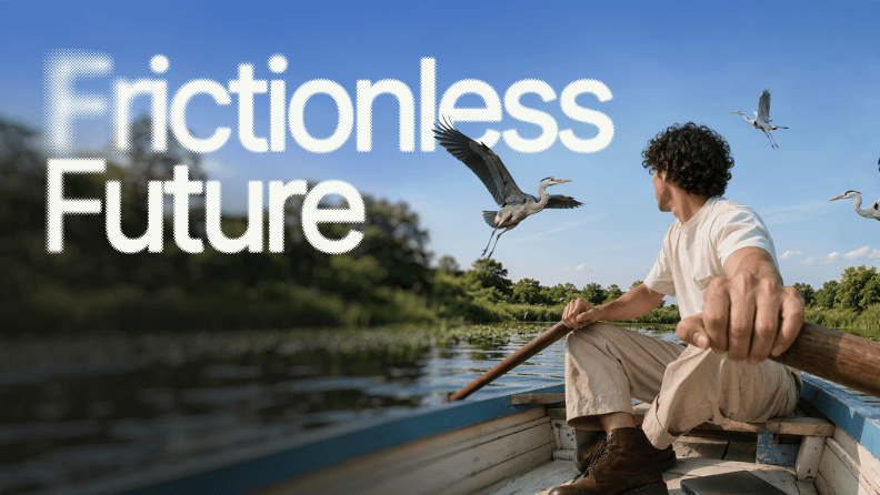
The reason the model holds up is the combination rather than either half on its own. Our Frictionless Future trend report found 97% of creatives saying it's extremely or very important that creative output stays distinctly human, and that's the position we design around. AI-powered workflows take care of resizing, versioning, variant generation and the parts of production that shouldn't be eating a senior designer's afternoon. People make the decisions that end up visible in the work.
Being AI-first means AI isn't just powering individual tools. It's embedded across the entire creative model, from how teams are trained to how brand knowledge compounds over time.


In practice that looks like a team that stops having to re-explain itself. Boomi tripled its creative output and hit a 24% LinkedIn engagement rate. OPA! ran a full brand refresh in a month.
On the financial side, ROI came in at 94% over three years with payback inside six months, as reported in the Forrester Total Economic Impact™ study, commissioned by Superside (April 2025). That study measures the partnership on cost and efficiency terms rather than AI ones.
If you want the fuller picture, the human-led, AI-powered model page walks through how it runs, and pricing and plans covers what an engagement looks like.
The names change, the discipline doesn't
Every designer in this article solved a specific problem for a specific client under real constraints, and the famous ones are simply those whose solutions turned out to be more durable than the problems that produced them.
The route to work that lasts hasn't changed much since 1938. Take the actual brief seriously, understand who has to receive it, then cut until only the idea is left. What has changed is how much of it a single team is now expected to produce, and that's where having the right partner stops being a luxury and starts being the thing that keeps the work good.
If your team is producing more than it can hold together, take a look at what we can do and what a dedicated creative team could take off your plate.
Frequently asked questions

See 10 AI Design Examples
These 10 AI design examples show how AI
is a force multiplier, letting you build on-brand
image libraries and push creative boundaries.

Join 70K+ creatives and marketers
Subscribe to The Creative Brief for the latest events,
articles and insights sparking industry-wide interest.


How 400+ brands get more work done, without doing more
They Superside it. Fast, high-quality creative from the
AI-powered creative service that handles it all.


Top design capabilities
Explore Superside's full range of design capabilities
with creative examples of our work for clients,
like Amazon, Notion and Reddit.