
You know those brands where, despite their best intentions, something about their visual identity feels a little... off? Maybe their social media images don’t match their tone, or they’re constantly using different fonts or logo colors. When it happens, it’s hard buy from or trust these brands because it seems like they don’t know who they are.
On the flip side, brands with cohesive brand and visual identity appear to be much more confident and trustworthy. When everything from their graphics to their imagery feels in sync and aligned with the nature of the brand and the products or services they offer, choosing to work with them (or at least learn more about them) feels like a no-brainer.
Where does your company fit in?
If you feel like your company falls more into column A than column B, it’s not the end of the world. In this article, we’ll go over what is a visual identity, why you need one and offer 5 tips on what makes for a good visual identity with examples for crafting a knockout visual identity.
What is a visual identity?
Visual identity is all of the imagery and graphical information that visually communicates what a brand is and what makes it unique. A brand's visual identity is a visual representation of everything that a user or customer would physically see either in-person or online, from a logo to social media assets to product packaging.
A visual identity comprises of the visual elements (e.g. fonts, colors, imagery) that define your brand. It evokes emotion from your customers, builds trust among them, and helps you stand apart from competitors. It personifies your brand across all consumer touchpoints from your offline billboards to your online landing pages.
A brand style guide is important to develop, and while the specific brand identity elements may differ depending on the nature of your business, most visual identities and style guides consist of:
- Logo design
- Brand colors and color schemes
- Typography
- Icons
- Imagery (i.e., photography and video content)
Your brand’s visual identity may evolve, but ultimately it needs to have a consistent look and feel for all visual elements and evoke emotions. As the design team at Slack explained, “whenever people see you in the wild, they should recognize that it’s you.”
A good visual identity can even become identifiable without the logo later on. Take Apple, for instance. When you look at one of their ads or posts, you don’t need to see the logo to know that it’s an Apple ad.
Take a look at this ad from London-based agency, Leo Burnett. They did away with any images of food and the brand name itself, but you inherently know, you can feel what it’s selling.

Image Source: Dezeen
What is the difference between visual identity and branding?
Branding is the foundational and emotional elements from which customers derive meaning from your company and its product or service. A visual identity is the visual perception of your brand created by graphic designers through typography, color psychology, and imagery. Your visual identity is an expression of your brand’s spirit.
What makes a good visual identity?
A good visual identity is distinguishable from other brands and thus makes a strong impression on your target audience. It’s future-proof and can scale with product expansion or more service offerings. It’s easy for designers to apply it across any medium and cohesive enough that any visual fits seamlessly together.
Whether you’re creating a brand identity from scratch or refreshing an existing one, it's challenging to know where to start or what to consider. So, we’re sharing our top five tips and give you a few visual identity examples for inspiration.
5 steps to creating a powerful visual identity
- Consistent visual identity
- Don't stray far from what works
- Avoid popular trends
- Align brand with vision and mission
- Design for scalability
1. Be consistent with your visual identity
A strong visual identity must be consistent. Presenting a consistent image across all of your visual marketing channels can help you build trust with your customers. It also helps boost brand visibility with your audience. A visual identity makes your brand recognizable.
Now, this isn’t as simple as putting your logo on everything and calling it a day. Brand consistency means using the same brand assets everywhere your brand lives.
Brand Assets:
- Colors
- Typography
- Imagery
- Illustrations
- Graphics
- Patterns
- UI
- Photographic treatments
- Icons
Where The Live:
- Website
- Social media accounts
- Print Ads
- Print materials
- Internal documentation
- Billboards
- Packaging
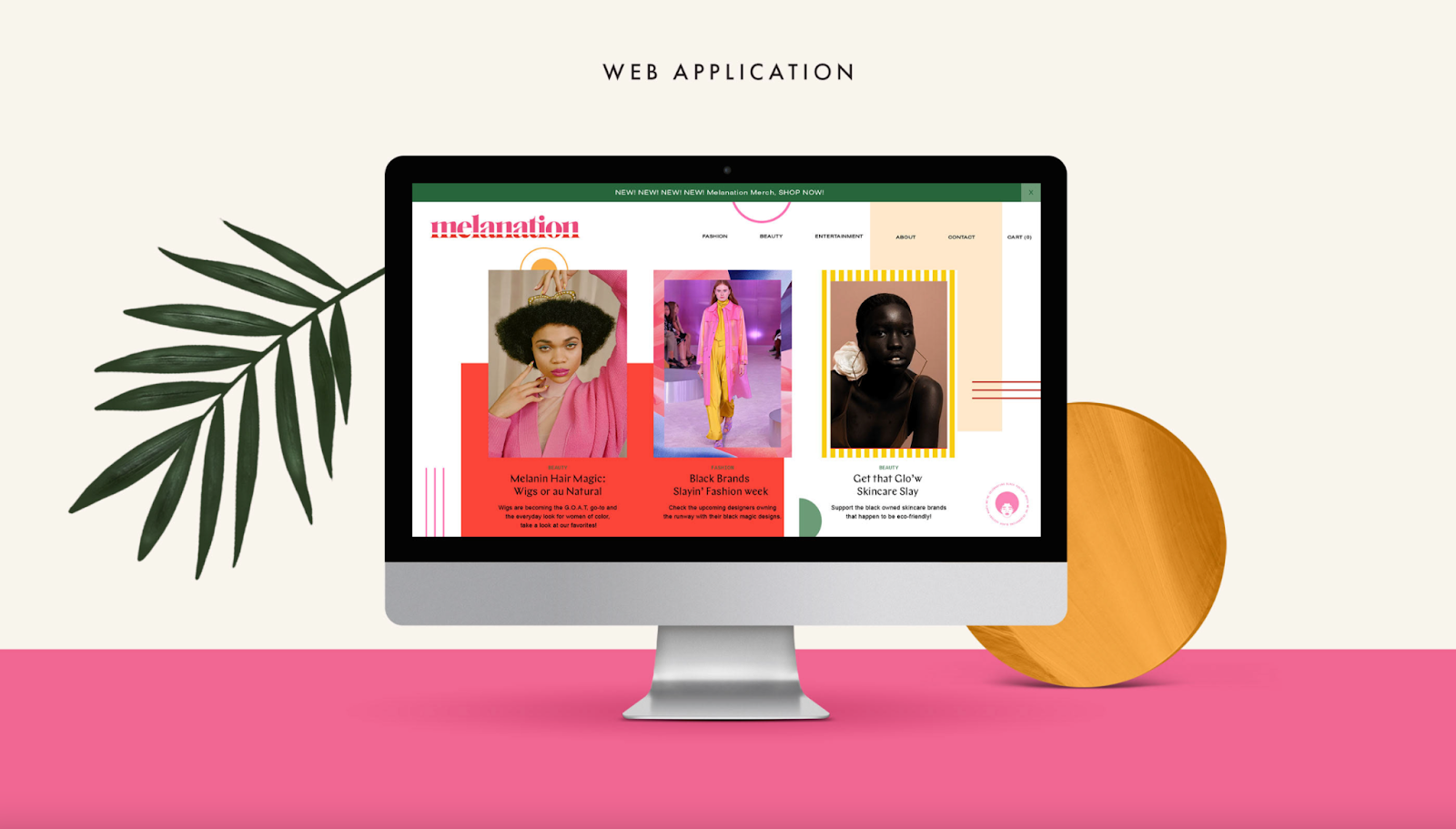
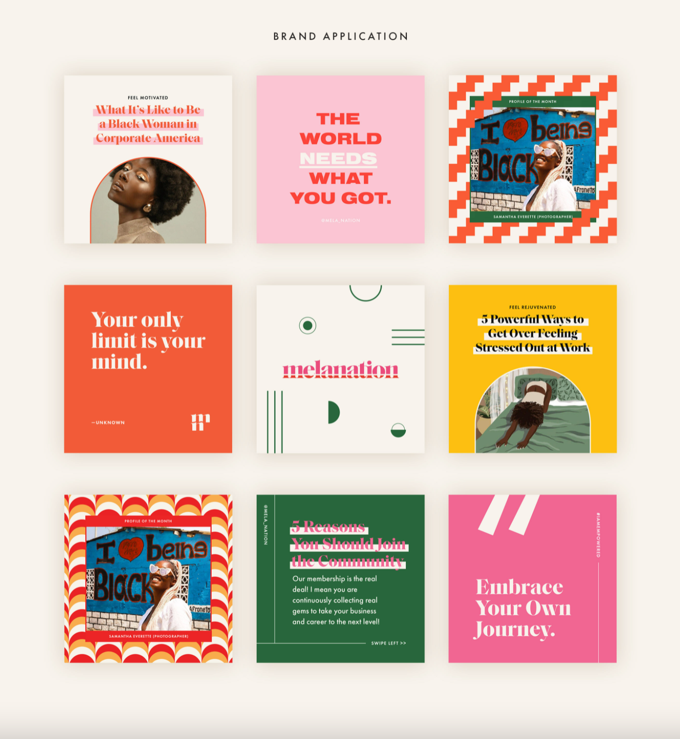

Take this brand identity for digital media company, Melanation, for instance. The brand fosters a cohesive visual identity by using the same bold color palette and font throughout their website and on their social channels while also using consistent image tonality (diverse, fashion-forward photography and illustrations), so everything looks and feels on-brand. It’s also the smaller details too, like retouching photography to have the same colour palette accents in clothing, scenery and other aspects.
2. Don’t stray too far from what works
Remember Gap’s now-infamous 2010 logo redesign? That’s a pretty good example of what not to do if you’re looking to revamp your brand’s visual identity. Familiarity breeds customer loyalty.
If you already have an established and recognizable brand, straying too far from your current look could alienate and confuse your audience. So instead, make sure to approach a redesign project with your company’s core image and values top-of-mind.
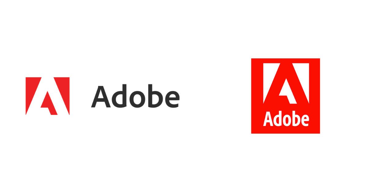
Image source: Looka
For example, Adobe recently refreshed their logo and brand identity with a focus on accessibility and functionality. The new single color, all-red logo ensures the mark is functional in all sizes and across all surfaces. It also reads as one component, compared to the old icon-and-text style logo. They are also updating the colors of their product logos to make it easier for their customers to find the products they need.
3. Avoid popular trends
Drawing inspiration from the latest branding and design trends can keep your visual identity fresh and modern. But, there's a reason people show up fashionably late. Going too trendy means you could end up looking like everybody else (or creating a visual identity that will look dated in about a year or so). Use design trends to help spark fresh ideas (just don’t build your foundation on them).
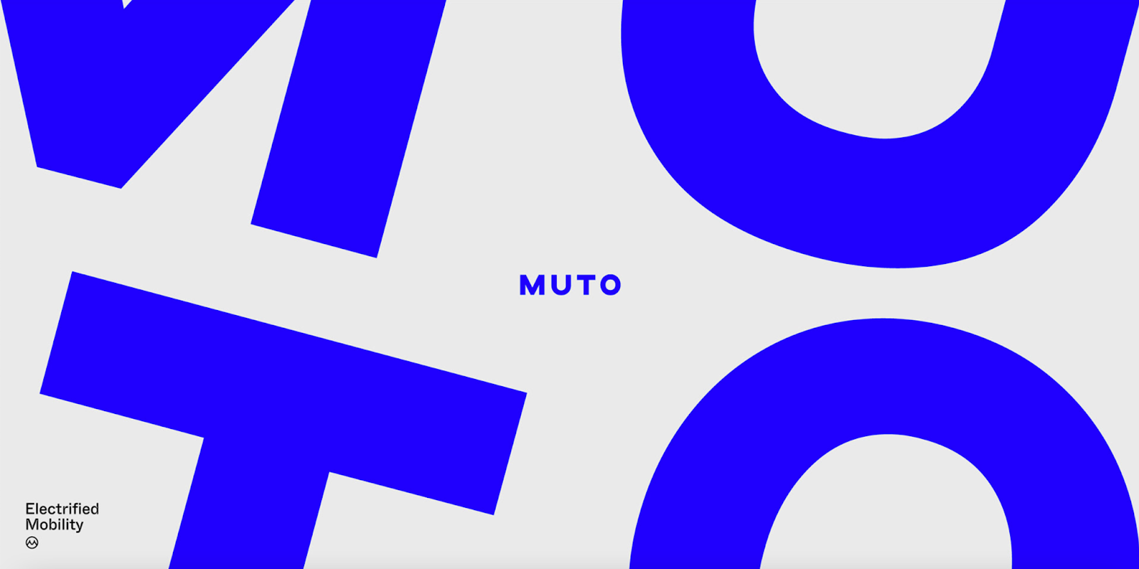
For example, this minimalist visual identity for e-bike company Muto feels modern thanks to its use of animation and striking ‘electric blue’ signature color. Still, it avoids feeling cliche by drawing design inspiration from the bike itself.
4. Align your brand with your mission and values
A consistent brand story is essential. While companies pivot all the time, and your product or service may evolve, your mission and values should stay the same (for the most part). It's why you should craft a visual identity around these brand pillars rather than a specific offering.
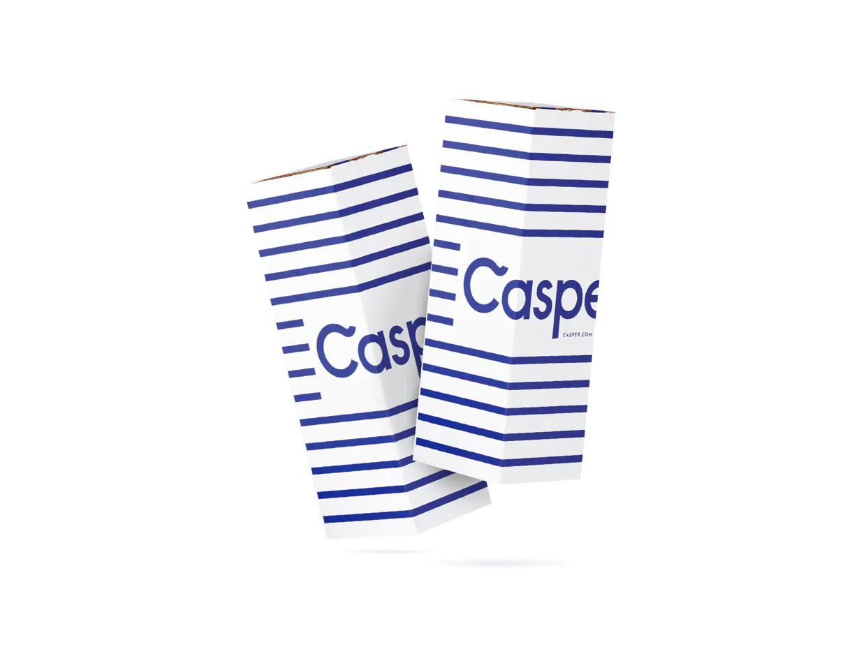
Image source: Redantler
Let’s look at DTC sleep product company Casper. When they first came on the market, they only sold mattresses. Now, the company sells pillows, bed frames, bedding – you name it. If Casper modelled their logo and visual identity around the mattress, product expansion through visual identity would have likely required a rebrand.
In comparison, the company’s iconic blue and white color palette and logo can apply to many different products. The light and airy color pairing also align well with the company’s mission to “awaken the potential of a well-rested world.”
5. Design for scalability
Your visual identity should grow with you and have as much room for scale as possible, which is why simplicity is key. Slack’s recent redesign is a great example of this. Their old logo was fun and playful, but because it had 11 different colors, it was lost on dark or colored backgrounds. Their overall visual identity also lacked cohesion, making it harder for their audience to understand who they are and what the brand stands for.
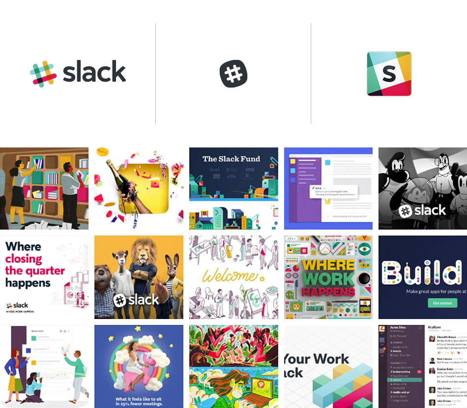
Image source: Slack
Their new logo is much simpler, and in turn, much more scalable - applying its use in a much wider variety of contexts, from laptop stickers to billboards. Their new imagery style is also a lot simpler, trading in the busy, juvenile graphics for bold illustrations and photography that feel much more sophisticated, yet still eye-catching.

Image source: Slack
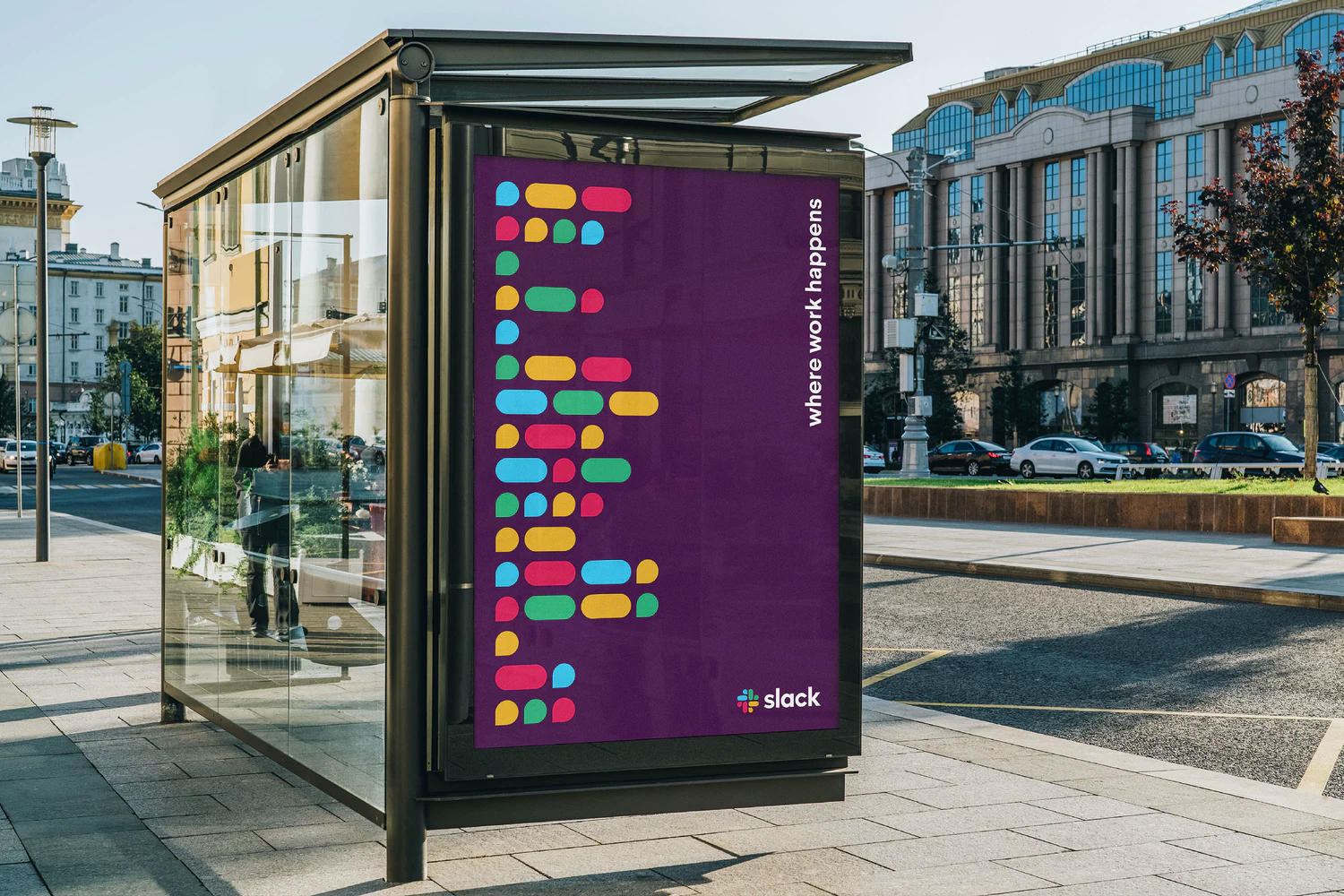
Image source: Pentagram
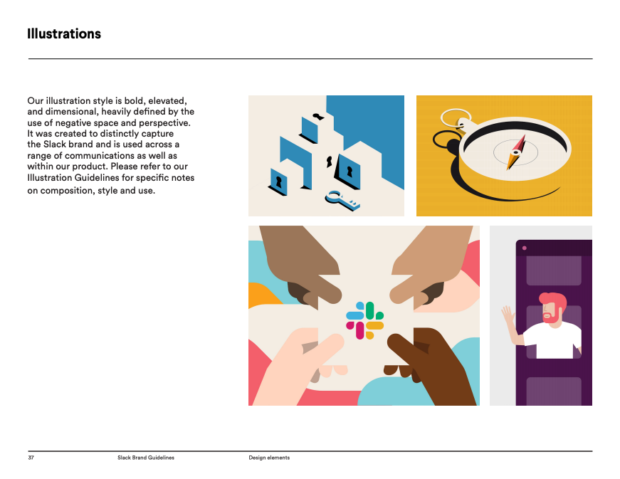
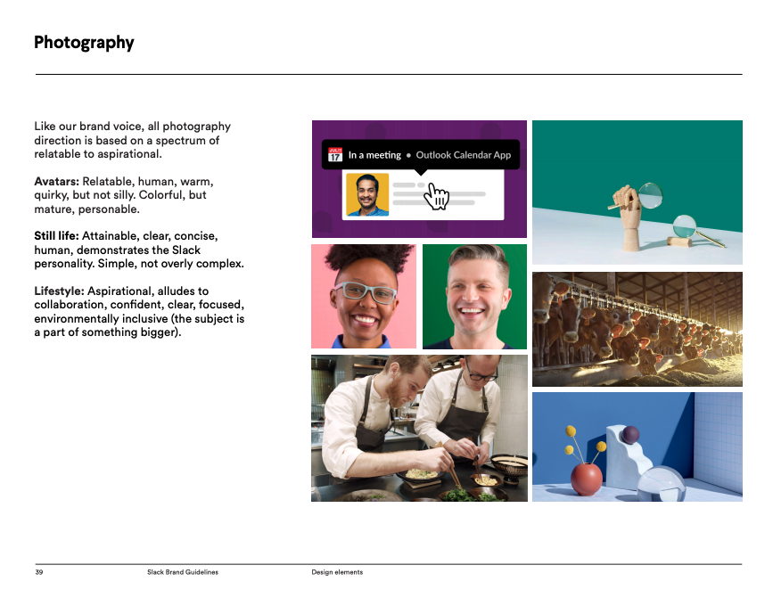
Image source: Slack Brand Guidelines
Visualizing your final identity
Trust us: visual identity design is not an easy assignment. It requires thoughtful consideration of your brand’s mission, values, goals, offerings and ultimately your brand strategy.
You must think carefully about how you plan to communicate these facets to the world. For example, do you want to be bold and irreverent? Or softer and more empathetic? There’s no right or wrong answer, but you should have a strong understanding of your brand’s ethos before you dive into visual branding.
However, you don’t have to go at it alone. We’ve helped countless brands update their logos, visual identities, style guides and templates based on their marketing strategy, customer feedback, competitive intelligence and more. So if you’re looking for a design partner to help you level up your brand identity design, Superside has your back.


