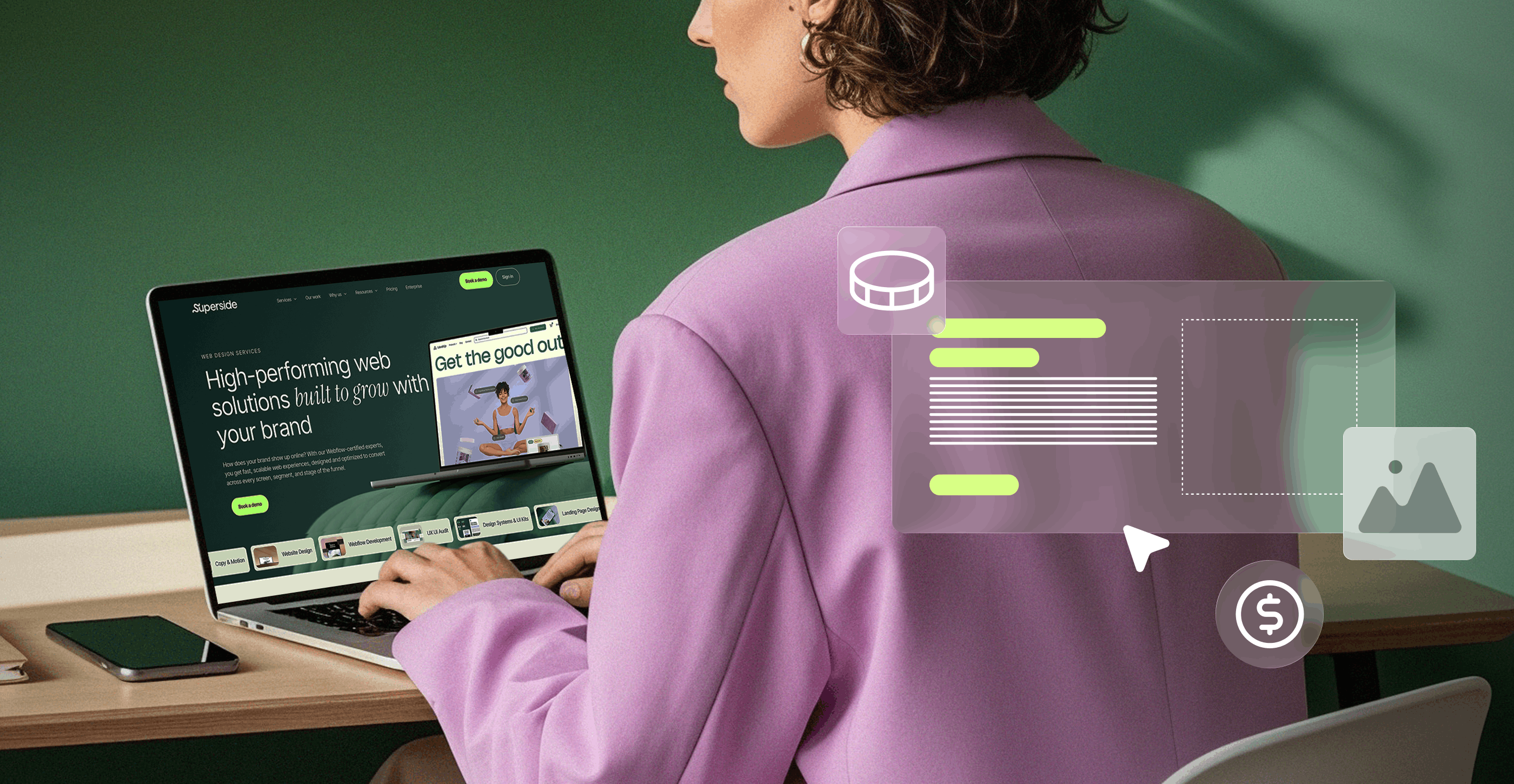
Today’s top SaaS companies know excellent graphic design drives trust, conversions and long-term loyalty. See how standout brands use cohesive visuals, review today’s top graphic design for SaaS examples, and discover how Superside’s AI-powered model helps tech companies like yours build memorable, high‑impact brands.
Five hundredths of a second. That’s how long it takes potential customers to form an opinion about your website and decide whether they’ll stick around or bounce off to a competitor’s page.
The impression they make in that split-second determines whether prospects find their brand trustworthy and whether they’re likely to convert.
Unfortunately, however, many SaaS companies still miss the mark. They treat design as interface work only, and overlook the equally critical brand identity and marketing elements that shape user perception.
That’s why top SaaS companies pay close attention to the design of their entire customer journey and integrate everything from web design to video production under a single, unified brand identity.
It’s a tall order, which is why many partner with AI-powered SaaS design partners like Superside. The right partners combine various creative design services across product, brand, marketing and visual design under one roof to ensure every design output matches the last.
This article highlights several superb graphic design examples from top SaaS companies and breaks down the essential elements that make their SaaS UI / branding design truly exceptional.
6 key components and attributes of graphic design for SaaS
In the SaaS world, graphic design involves a user-centric, strategic approach that creates a clear, intuitive visual experience to drive business growth and customer retention. It’s a blend of UI/UX design, branding and marketing that helps digital products stand out in a competitive market.
The reality is that great SaaS graphic design functions as a cohesive visual ecosystem. The logo in a social post acts as a visual signature that helps your target audience associate your brand with specific values. The illustration style on your website makes complex concepts easier to grasp. The iconography in your app supports intuitive navigation.
Superb digital product design is also essential, of course. In fact, companies like Figma and Slack use design systems to keep every asset across multiple channels consistent and cohesive. But it can’t stand alone.
Unlike traditional graphic design, SaaS design must function across several contexts at once: The product interface users rely on every day, the marketing materials that drive conversions and the brand touchpoints that create recognition and trust.
A comprehensive SaaS design service should, therefore, offer:
- UI/UX and product screen design
- Landing pages and web pages
- Marketing and sales creative
- Iconography, illustration and brand assets
- Design systems and component libraries
- Motion and animation for SaaS storytelling
- Flexible subscriptions, retainer models or unlimited creative models
When you evaluate a SaaS design partner, make sure their portfolio showcases strength across these six core components:
1. Visual identity and branding
Your SaaS brand’s visual identity is what sets you apart from other platforms and products. It includes everything from your logo and color palette to typography and iconography. The key is to keep elements consistent across platforms and touchpoints to make your product instantly recognizable.
For example, when you see a Slack ad on social media, you immediately recognize its colorful logo and signature aubergine-colored backdrop. You know precisely what you’re looking at before you even read the text. That’s the power of a strong, consistent visual identity.
To create that kind of impact, your SaaS design partner should have tech branding experience, along with expertise in other key areas, such as:
- Color palette strategy: Colors aren’t arbitrary. They evoke specific emotional responses and can communicate a brand’s personality. Your graphic design partner should understand that and help you refine a palette that reflects your company’s values and identity. For example, a fintech SaaS company might lean into blues and grays to convey trust and stability. But for a creative collaboration tool, pink, lilac and/or bright yellow could be precisely the right fit.
- Typography systems: Legible, web-friendly fonts are non-negotiable in SaaS design. Many successful SaaS brands use large, bold header fonts to grab attention quickly, paired with clean, readable body fonts optimized for screens. Importantly, your creative partner should help you choose fonts that work perfectly across all your touchpoints, from product interfaces and merch to blogs and brochures.
- Logo and iconography: Your logo should be scalable and straightforward, and designed to look good whether it’s displayed on the bottom of a webpage or across a conference banner. Meanwhile, your icon style needs to be both recognizable and consistent wherever it appears, as this will build brand recognition.
- Illustrations and animations: Custom illustrations can humanize your brand and simplify complex concepts. This is particularly useful if you need to explain abstract software features in relatable terms.
Subtle micro-interactions and animations are also a key part of UI/UX: They can guide users through the interface and help make the experience feel alive and responsive rather than static and mechanical.
In short, visual identity is about creating a cohesive, impactful look that reinforces the values and ideas that make your company unique. That matters even more in SaaS, where users need to trust you with their business data and daily workflows.
2. UX and UI design
The user’s in-product experience is one of the most crucial parts of SaaS graphic design. If your interface is clunky, chances are your product won’t get enough traction.
Good UX/UI design simplifies complex software and lowers customer churn. It can also directly improve conversion rates and boost your business’s bottom line. In fact, Forrester research shows every dollar you spend on great UX can return $100 (a ROI of 9,900%).
To reap these benefits, make sure your creative partner has mastered the key principles of effective SaaS UX/UI design:
- Simplicity and clarity: The best SaaS interfaces embrace minimalism, with clean design and ample white space. This lets users focus on their tasks without visual overwhelm. Check out Monday.com’s landing page. Its straightforward layout and uncluttered visuals make it easy to understand what the product does and how to get started.
- Intuitive navigation: Users shouldn’t need a manual to find your platform’s core features. A clear, logical navigation structure is a must. The faster users can navigate your product, the more value they can extract, and the more likely they are to stick around.
For more complex SaaS products, a prominently placed search bar is also essential, as it helps users jump straight to what they need.
- Effective dashboards: Your main dashboard is typically the first screen users see after they log in, so make it count. It should be easy to navigate and be designed to reduce visual clutter. The same goes for the rest of your dashboards. They should display critical information visually, and should allow users to filter and customize their view to easily find the data points or tools that matter to them.
- User-friendly onboarding: This is make-or-break for SaaS. A seamless, interactive onboarding process helps new users quickly understand how to use your product or platform. That, in turn, lets them know the value it offers. Use quality-of-life (QoL) features, such as contextual tooltips and short tutorial videos, to make the learning curve even smoother. The goal is to get users to “proficiency” as fast as possible, because that increases the likelihood of long-term retention.
- Data visualization: Many SaaS products handle complex data. The good ones present that data in well-designed charts and graphs to make it easier for users to understand. Infographics can also be a big help. The idea is to make it as easy as possible for users to find insights and take action.
- Accessibility: Design for all users and include features such as keyboard navigation and screen reader support. High-contrast themes and WCAG compliance are equally important, as good accessibility can expand your market.
In short, your design partner should prove that they know how to create UX/UI that makes users feel competent rather than confused and frustrated.
3. Marketing assets
Exceptional graphic design for software companies shouldn’t stop at the product interface. It should extend to every touchpoint, as part of the same design system philosophy and brand experience.
In addition to UX/UI expertise, your chosen partner should have the creative chops to design your:
- Website: Your website isn’t just a marketing asset. It’s a core part of the product experience. Prospects evaluate your credibility and technical maturity within seconds, so your site needs to communicate your value proposition instantly and without friction. Beyond fast load times and responsiveness on mobile screens, strong SaaS websites prioritize information architecture, narrative flow and conversion-focused UX.A skilled SaaS web design team will help you strike the right balance between brand expression, clarity of message and the performance required to support a high-intent buyer journey.
- Landing pages: These pages are critical and should, therefore, include a tightly structured narrative, frictionless interaction patterns and strong messages to guide visitors to specific actions.
- Marketing collateral: This includes everything from your social media videos and posts to email campaigns and illustrations placed in blog articles. Consistency will reinforce your brand identity and help build trust. The big mistake many SaaS companies make is to outsource product design to one team and marketing design to another. This siloed approach can lead to a visual disconnect that leaves customers confused.
The best brands maintain consistency across the customer journey with the help of design partners that cover all their creative needs.
4. Scalable visual systems
SaaS products are dynamic, with new features and modules added regularly. If you design every new screen or marketing asset from scratch, inconsistencies will creep in.
The key is to build a design system with assets that share a visual language, clearly documented color palettes, set typography, spacing standards, component libraries, iconography sets and more. From this foundation, you can easily scale design output and maintain consistency.
Your design system should also include:
- Dynamic components: Reusable UI elements like buttons and form fields that update automatically from your component library.
- Pattern libraries: Blueprints for how to solve user interface problems in visually consistent ways.
- Icon sets: Visually related icons and icon styles that are stored in a component library for easy deployment.
These comprehensive visual design systems are what make companies like Shopify, Atlassian and Airbnb so recognizable. They also ensure that as these companies expand into global markets, their brands remain consistent and unified.
A good design partner should understand what makes effective visual design systems work and be able to build one for your brand.
5. Brand cohesion across product and marketing
Do a test. Pull up your SaaS product’s dashboard in one browser tab. Now pull up your latest marketing collateral in another window and compare notes.
Is there a cohesion gap? Then it’s time to address it.
- Why this matters: When prospects move from your marketing collateral into your product trial, visual continuity builds trust and reduces friction. It also signifies attention to detail, which gives them confidence that your product can do what it says.
- How to achieve it: A cohesive design means all graphics are deeply anchored in your brand identity. The brand experience should resonate with the viewer, whether they view a product screen or a display banner. Be sure to match your visual language across user interface elements (from illustrations to motion style), so every asset feels like it’s part of the same brand.
Top SaaS brands like Stripe, Figma and Linear all use rigorous brand standards to build successful, recognizable brands. A strong design partner will be able to help you create the same kind of resonance, but again, it’s essential to have the same partner working on all your touchpoints. Outsource tasks to different companies, and you could end up with assets that simply don’t match up.
6. Localization readiness
If all goes well, customers will access your software from dozens of countries, in multiple languages, across countless devices and screen sizes. That means your graphic assets need to adapt beautifully at every breakpoint and in every context.
Your design partner should be able to accommodate:
- Multilingual typography and extensible layouts: Page layouts can change dramatically across languages, with some requiring more horizontal space. Similarly, your brand identity still needs to shine through as you change typography to accommodate language differences. Smart SaaS design uses flexible, responsive layouts that gracefully accommodate text expansion and contraction.
- Scalable vector assets: Your illustrations, icons and logos need to look the same at all sizes and screen resolutions. Choose a partner with a proven track record of working across devices.
- Adjustable icon systems: Some icons carry different cultural meanings in various regions. A localization-ready design system accounts for these nuances and provides alternatives if needed.
The nutshell: Choose a partner that knows how to build localization-readiness into your design system from day one, as this will save you significant time and costs as you scale.
And if you’re ready to create a fully-realized design system that scales with your SaaS product, Superside is the answer. Our design system services will help you build a strong visual foundation to ensure brand integrity across all customer touchpoints.
8 examples of effective SaaS graphic design
Ready to see what great SaaS graphic design looks like in action? These eight companies showcase the best of the best in SaaS design.
1. Endor Labs


As a top leader in the AI app cybersecurity industry, Endor Labs engaged Superside, a subscription-based creative service, to build its brand from the ground up.
Because Endor Labs operates in a highly technical and often "sterile" cybersecurity market, they partnered with Superside to create a visual language that was both professional and distinctively "geeky" to resonate with their core audience of developers.
When they approached Superside to enhance this brand identity, they wanted to continue injecting creativity into their narratives but needed to scale fast. Traditional agencies just didn’t give them the agility they sought.
Superside acted as an extension of Endor Labs' in-house team to deliver:
- Bold visual language for web, print and more that disrupted B2B cybersecurity stereotypes yet stayed 100% professional.
- Clever use of graphic and motion design simplified complex technical concepts, which drove better results for the brand.
Best example for:
- B2B SaaS companies that seek creativity and innovation even though they operate in complex, regulated industries (e.g., fintech, healthcare, enterprise software).
What to emulate:
- Think out of the box and don’t default to dull just because you’re in the B2B space.
- Build a design system flexible enough to work across product marketing, corporate communications and social content.
- Partner with a scalable creative team that can match the pace of your launches. Traditional agencies couldn’t deliver the speed Endor Labs needed, but Superside’s creative services model could.
2. Intuit Mailchimp
Email rarely tops the list of “inspiring” B2B marketing channels, but Mailchimp has spent years proving it can. Their secret? A distinctive visual identity built on whimsical illustrations and playful animation, as well as a beloved mascot (Freddie, the chimp).
Mailchimp’s design system is a masterclass in how to really own your brand’s visual identity. The brand’s well-placed, quirky illustrations contrast perfectly with its minimalist user experience design, brightened by splashes of their signature yellow.
The cohesion between product and marketing collateral makes their creative approach extra powerful. The same illustration style that appears in their dashboards and tutorials also shows up in their social ads and billboard placements.
The result is a cohesive style that feels warm and accessible.
What we like:
- Fearless commitment to personality and whimsical style.
- The strategic use of color (Cavendish Yellow, described as “sunshine” and “optimism”) makes the brand instantly recognizable across channels.
Best example for:
- Brands in crowded, look-alike markets that need a bold, ownable visual identity to break through.
What to emulate:
- Create consistent structural elements (logo, color, typography) that instantly evoke your brand.
- Don’t be afraid to be the colorful brand in a sea of minimalist competitors. Mailchimp stands out precisely because it zigged when others zagged.
Channels:
- Mailchimp uses everything from billboards to social media campaigns and Google ads to get its brand message across.
3. Slack
Slack’s design system strikes a balance between a distinctive brand personality and clean, highly usable interfaces. Its tools and visual assets are instantly recognizable, which reflects years of refinement and simplification. A good example is the octothorpe logo: Once a full hashtag, it’s since been streamlined into the simple, modern mark used today.
Every other element in Slack’s visual ecosystem is designed with the same core idea. Slack’s static illustrations are vibrant and colorful, yet maintain crisp lines and clearly defined edges. The brand’s color palette and contrasts prioritize legibility yet still deliver warmth. All elements are playful and approachable, yet professional.
The result is a SaaS brand that feels recognizable and distinctly human (almost like an old friend). That’s a rare achievement, and a decisive advantage for a product built to encourage connection and collaboration.
What we like:
- Purposeful use of animation and illustration in a way that both adds warmth and enhances usability.
- Complete visual cohesion across assets and touchpoints. Everything from emojis to message fonts and illustrations is unmistakably “Slack.”
Best example for:
- B2B brands that want to differentiate themselves through a well-crafted, cohesive personality that feels genuinely human and approachable.
What to emulate:
- Create clear brand guidelines that ensure every new entry into your visual ecosystem matches your predefined style and aesthetic.
- Draw inspiration from outside of your industry. Slack partnered with an illustrator skilled at children’s animation to create its distinctive illustration style.
Channels:
- Slack’s typical ad channels include digital marketing, social media, blogs, guides, tutorials and even word of mouth and referrals (which naturally grow when the brand is instantly recognizable).
4. Canva
Canva’s mission is to democratize design, and its brand identity embodies this philosophy at every level. From the moment you land on the brand’s website or open the app, everything about Canva’s design prioritizes accessibility and ease of use.
The brand’s design success also lies in how seamlessly the product experience aligns with its marketing assets. The user interface is built on drag-and-drop simplicity, clear typography and happy, bright colors, and those same principles carry through to every piece of marketing content.
Whether you use the platform or see an ad, the visual language is consistent, friendly and unmistakable. In each instance, the message is clear: Using Canva is easy and straightforward.
What we like:
- Product UI/UX that brings the brand’s core message to life. Every element communicates interactivity, accessibility and effortless ease of use.
- A strong alignment between the product experience and the way it’s marketed.
Best example for:
- Self-service SaaS products that rely on built-in user education within the interface. Canva’s tools teach users how to create better designs (and therefore reinforce the platform’s value).
What to emulate:
- Mirror your product’s UI/UX in your marketing. For example, if your tool uses drag-and-drop, your marketing layouts should reflect that intuitive flow.
- If design is central to your SaaS brand, don’t shy away from bold, vibrant colors in your interface or marketing. Create a product that feels lively, modern and enjoyable to use.
Channels:
- As a self-service platform, Canva offers extensive educational content. The brand also uses social media campaigns, influencer partnerships, digital ads, and UGC to capture the target audience’s attention.
5. Notion
In a world where every productivity tool fights for attention with over-the-top colors and aggressive CTAs, Notion took the opposite approach: Radical minimalism.
Its black-and-white aesthetic and simple, hand-drawn illustrations keep things calm and focused. Along with clean, uncluttered typography, this creates an impression of Zen efficiency, exactly what users want from a productivity platform.
That said, Notion’s design system incorporates small pops of primary red, yellow or blue. These accents maintain the brand’s minimalist roots while adding a touch of brand personality.
The result is a flexible, fully realized design system that seamlessly adapts across different contexts. The in-app experience remains minimalist and distraction-free because that’s what supports focused work. But the marketing adds just enough color and visual energy to stand out while still being on-brand.
The smooth jazz that accompanies their explainers is another effective touch, and a great example of how sound design can be worked into design systems.
What we like:
- Context-appropriate design. Notion uses minimalist graphics in-product for focus and bolder designs in marketing to grab attention.
- Consistent use of typeface and aesthetic across all materials, so that even within flexible design, all elements are still connected and instantly recognizable.
Best example for:
- SaaS products aimed at knowledge workers, creatives or anyone who needs a distraction-free interface.
What to emulate:
- Embrace minimalism as a deliberate design choice that enhances focus and usability.
- Adapt your brand identity for different contexts. Notion stays minimal in-app but uses color in its marketing materials to get its target audience’s attention.
- Build metaphors into your visual language that reinforce functionality and UX. Notion’s “building blocks” concept is a good example. Each design element (text, images, databases, toggles) is treated like a modular block that users can stack, rearrange or combine. This metaphor isn’t just visual; it mirrors how the product actually works
Channels:
- Digital ads, social media, billboards and pop-ups. Notion has also fostered a devoted user community that creates templates and tutorials to maximize the tool’s efficiency.
6. Airtable
Like many SaaS brands, Airtable faced a familiar challenge: How to convince new users that its product can make something inherently complex feel effortless (in this case, building apps to manage intricate workflows).
The Airtable team turned to design to help them clarify what their product does. The brand’s tidy layouts and refined color scheme create a sense of clarity and reassure users that workflow management isn’t nearly as tough as it looks.
Layered on top of this are marketing materials packed with interactive demos and real-world use cases. Their marketing and product interfaces are so tightly aligned that the transition between them is almost indistinguishable, which reinforces clarity and trust.
Rather than just lists of features, their site gives visual examples and tutorials. Each example uses actual Airtable interfaces that let prospects mentally insert themselves into the process.
All of this is supported by smooth typography and friendly icons that reinforce the core message: Managing your workflows in Airtable? Easy.
What we like:
- A demo-first approach that lets prospects experience the product through visual examples and tutorials before they have to sign up.
- Real-world use cases that speak to specific job functions and industries.
- Clean, uncluttered layouts that clearly showcase smooth functionality.
Best example for:
- How to use a “show, don’t tell” approach to convert prospects and reach business objectives.
What to emulate:
- Design your demos and marketing UI to mirror real product use. When you fuse interface and marketing designs, you make the transition from “see” to “do” much easier.
- Airtable’s demos are all highly targeted, for example, at product engineers or marketing teams. This marketing choice, supported by role-specific design, makes it easier for prospects to understand how the product solves their problem or fixes their workflow.
Channels: Social media, integrations and partnerships, digital ads and thought leadership pieces. Airtable also uses email marketing.
7. Duolingo
Duolingo is one of the most recognizable SaaS brands in the world. People know it for language learning and for its cheeky mascot, Duo. But the company’s design mastery extends far deeper than the owl’s character.
The Duolingo design system blends signature brand elements (characters, colors, expressive design) with a strong personality that’s seen across all assets.
On the website, playful lowercase CTAs sit front and center, surrounded by vibrant characters. That same energy carries through to the app and the YouTube channel, which is filled with brightly colored shorts and tutorials. It’s tongue-in-cheek and often wonderfully weird. And because the designs are unwaveringly consistent across every touchpoint, brand recall is achieved.
Duolingo also isn’t afraid to take risks and break out of its signature style. In fact, the dynamic brand has even experimented with animated plushies and Japanese-style anime.
Yet, the same brand personality is used across all touchpoints. The characters are playful, there’s a specific sense of humor, and the signature Feather Green color is ever-present.
What we like:
- Consistency comes from one key element: Duolingo’s signature green.
- Conversion-oriented design that balances playfulness with clear CTAs.
Best example for:
- SaaS brands that want to use personality, emotional connection and habitual engagement to retain users.
What to emulate:
- Use a bold character to turn everyday interactions into moments of delight.
- Use a signature brand element (mascot, color, pattern) consistently in your graphic designs to reinforce brand recognition.
- Let your mascot or key brand element grow beyond static imagery. For example, Duo appears in different contexts and situations across customer touchpoints.
Channels: Duolingo’s strongest marketing channel is the product itself. Its gamified experience makes achievements easy to share, fun to talk about and naturally encourages users to bring others in. Social media, video content, thought leadership pieces, influencer partnerships and paid ads round out the brand’s marketing toolkit.
8. Atlassian
Atlassian doesn’t design for a single tool. It has to deliver a cohesive experience that spans its entire product suite, from Jira and Confluence to Trello.
Part of the challenge is to unify elements such as button styles and UI interactions across these apps so that users can move seamlessly between tools. That’s no small task, especially since many of Atlassian’s digital products grew independently before they incorporated them under a shared design philosophy.
To simplify its SaaS design processes, Atlassian developed a comprehensive design system. Its graphic designers used modular building blocks to define colors, typography, spacing and animation across brands. The system also comes with crystal-clear, highly detailed UX/UI guidelines.
Here are some of the other features that make this a standout SaaS design example:
- Dedicated sections for brand, foundations, content, components, patterns and resources.
- Comprehensive component libraries with practical do/don’t examples for graphic designers.
- Tools to reinforce accessibility, voice guidelines and other often-neglected design elements to ensure everything looks and sounds like it comes from the Atlassian stable.
All of this results in a sleek, recognizable design language that connects everything, from the Jira and Confluence logos to the experience of clicking a button, across apps.
What we like:
- Atlassian has a comprehensive “design system resources” section that provides everything teams need to build and design on-brand assets.
- A strong emphasis on accessibility and content guidelines that are built into every component.
Best example for:
- Enterprise SaaS companies that need to manage multiple product lines or a suite of related tools.
What to emulate:
- Build your design system as a product, not a side project. Atlassian treats its design system like a standalone output.
- Make your design system user-friendly and accessible to third-party creatives and developers. This is especially important if a significant part of your platform encourages users to build on it.
Channels: Content and SEO, community and events, digital ads, social media. Atlassian also forges extensive partnerships throughout its SaaS ecosystem and cross-promotes products with free trials and partner programs.
How Superside delivers best‑in‑class graphic design for SaaS
Great SaaS product design and marketing? That’s the easy part. Executing it quickly and at scale? That’s where it gets tough.
In-house teams are overextended, agencies are slow and pricey, and freelancers can unintentionally turn your brand into a consistency nightmare. You might end up with a mountain of creative, but no unified system that ties it together. And without cohesion, even the best SaaS products land with a thud.
There is a better way: A single creative partner that can handle all your creative needs.
At Superside, we cover everything from product design and ad creative to marketing strategy and copywriting. We plug directly into your existing workflows to become your creative team’s creative team. Alternatively, you can outsource all your design to us.
Here’s what allows Superside to deliver more effectively than others:
Integrated product and marketing design capabilities
Most design partners specialize in one area, like product design or marketing creative. That means you need to contract multiple partners, which usually comes at the cost of design consistency.
Superside doesn’t silo your design needs. We build complete visual brand ecosystems for SaaS companies, so you can easily switch from creating dashboard interfaces and custom illustrations to motion graphics, SaaS web design and video at scale.
That means no more mismatches between “the team that does UI” and “the team that does marketing.” You benefit from one cohesive visual system that works across every touchpoint.
AI-enhanced workflows and design assist tools
Speed matters. At Superside, we use a full suite of AI-powered workflows to accelerate everything from ideation to iteration. At the same time, we keep superb human creatives in the loop.
This combination multiplies our creative firepower. The result? You get assets that meet the highest standards of quality and creative excellence at record speed.
Our AI capabilities include:
- Prompt assistants and style suggestion systems that generate multiple design directions quickly, letting you explore more options faster.
- Custom GPTs and fine-tuned models built specifically for your brand or creative team. These include layout tools and style consistency checkers that ensure every asset aligns with your guidelines.
- Internal pipelines for versioning, batch generation and variant creation. This means you can quickly request new visual assets that align with brand standards. Need the same ad in 15 sizes across six platforms? We’ll get it done in hours, not days.
Superside can also help you deploy the perfect AI marketing strategy and advise on the responsible use of AI tools.
Here’s how Superside helped Forter:
When the fraud-prevention platform wanted to bring its signature aesthetic of moving particles to life across all brand touchpoints, from social content to conference-venue collateral, they were stuck. The highly motion-centric style was incredibly time-consuming to produce.
Superside’s graphic designers helped them meet the challenge. We created reusable motion templates for quick-turn social content and used AI-powered animation tools to deliver immersive experiences fast.
Superside is my creative team’s creative team—and one of the best creative teams I’ve ever worked with.

For Forter’s internal sales kickoff, we produced sci-fi-themed animations that “literally looked like a sci-fi movie.” Think astronauts, planets and planetarium-like immersion.
We also helped Forter transform a boring conference venue into a stylized New York City, complete with murals, cutouts and illustrations in just three weeks. Oh, and we did it all within tight budget and timeline constraints.
Design system mastery for SaaS growth
We support our SaaS customers’ growth with fully realized design systems built to handle iteration and scale. Our SaaS design system services include creating bespoke component libraries and updating governance guidelines and documentation.
What this means for your creative:
- New features slot seamlessly into your existing visual fabric, so there’s no need to recreate designs from scratch. This means, for example, that your dashboard’s new module will feel “native” from the start because it’s built with the same component library used for other features. The same goes for your marketing assets.
- Legacy UI refactoring. If you’ve outgrown your old UI, we can help you migrate to a new design system and support your global rollout. You’ll achieve consistency, even during transition periods.
- Faster handoffs between design and development. With a robust design system in place, all graphic designers and developers draw from the same playbook. This significantly reduces review cycles.
QA, brand governance and consistency
Superside builds QA and brand governance into every stage of our process. This includes:
- Visual reviews to check adherence to brand guidelines before assets reach you.
- Consistency audits across all outputs (e.g., marketing campaigns, UI and content) to prevent brand drift over time.
- Cross-platform testing to ensure designs perform well across multiple devices and browsers.
- Built-in accessibility compliance (think compliance with WCAG standards, contrast ratios and screen reader compatibility).
For enterprise SaaS companies managing global brands, this governance layer is critical. It ensures assets stay consistent, at scale and at speed.
Need proof? Here’s how Superside helped Boomi:


Cloud integration leader Boomi came to Superside for a complete digital ad overhaul. The brand needed a partner who could revitalize its lead-gen ads while staying true to its new brand guidelines. Boomi also wanted to keep costs down, without compromising on ad quality.
Superside rose to the challenge, combining Adobe Firefly, Midjourney and Photoshop AI to create dynamic 3D visuals that balanced realism with creativity. The result was ads that looked professional and expensive but stayed 100% within budget.
What’s more, the ads boosted Boomi’s LinkedIn engagement rate to 24% (compared to an average brand engagement rate of 1-3.5%). Superside also delivered 3x as many creative options as a traditional design team would have done, generating 75 unique, on-brand images for Boomi’s asset library.
Scalable subscription model for SaaS rhythm
To be successful, software brands must roll out new modules and features regularly and quickly. Success means constant design work without the downtime associated with in-house team recruitment or traditional agency procurement.
It’s a challenge, but an easy one to solve with the right partner. Superside’s flexible subscription model aligns with how SaaS companies actually work.
This means:
- Predictable monthly pricing that scales with your needs.
- Flexible capacity that ramps up for product launches or seasonal campaigns.
- Always-on availability so you’re not waiting for contracts to get signed before work starts.
- Fast iterations that match SaaS sprint cycles, releases and A/B testing needs.
Proven results with enterprise SaaS companies
If you decide to work with us, you certainly won’t be the first SaaS company to achieve graphic design success using Superside.
With our help, Forter:
- Transformed a 30,000 sq ft blank conference venue into an immersive NYC-themed brand experience in under three weeks.
- Produced scaled motion graphics to match its moving-particle brand identity without adding headcount.
- Tapped into AI-powered creative experimentation to support an internal kickoff with slick sci-fi animations, without overshooting the budget.
With our help, Boomi:
- Received 3x more creative options compared to a traditional design agency.
- Added 75 unique brand images to their custom library.
- Improved their LinkedIn engagement rate to 24% (vs. the 1-3.5% industry average).
By partnering with Superside, each of these SaaS brands achieved tangible business outcomes: Faster time-to-market, higher target audience engagement, lower cost-per-asset and brand consistency, all without having to scale up their creative teams or manage the work of multiple vendors.
How to choose a graphic design partner for SaaS
You now know what a great SaaS design partner brings to the table. You also understand that a partner who can help you set up a robust design system is worth its weight in gold.
Here’s what else to look for in the perfect design partner:
1. Deep product design and SaaS experience
Look for a partner that understands the full SaaS lifecycle, from onboarding to user engagement and contract renewal. Experience with recurring-revenue products means they know how design drives acquisition, conversion and retention.
2. A product-and-marketing hybrid approach
Make sure your prospective creative partner can explain how their approach will deliver cohesive design across all your touchpoints, from product design to marketing.
Don’t take their word for it either. Their portfolio should prove they can build a unified visual language from the product dashboard to your homepage and more.
3. Ability to scale with you (think volume and speed)
SaaS moves fast. Choose a team that can match your release cadence with on-demand creative. Their process should be built for continuous iteration, and they should have the capacity to scale up or down as needed.
4. Support for design systems and future evolution
Many creative on-demand teams can roll out assets quickly. Very few can do so consistently across all formats and touchpoints. A good partner will understand that your brand needs a design system, not just design.
Pick someone who can explain exactly how they’ll help you build that system and how you can use it to future-proof your brand as new features and products roll out.
5. Process transparency, communication and feedback loops
Smooth collaboration is non-negotiable. Your partner should offer clear timelines and dedicated points of contact. They should also be very comfortable with structured feedback cycles, as this keeps work moving along smoothly and without surprises.
An intuitive creative management platform (like Superside’s Superspace) will make collaboration a breeze.
6. AI, automation and versioning capabilities
The world’s top SaaS teams use AI to scale their creative. If you haven’t figured out how to use the tech to move fast and efficiently, you risk falling behind.
Look for a creative partner that knows how to use AI tools for creative iteration, asset versioning, testing and comparison. Done right, AI can drastically reduce turnarounds and help you maintain quality and brand consistency.
Ready to transform your SaaS design? Choose Superside
SaaS brands that dominate understand the importance of consistent, on-brand creative and marketing materials that perfectly echo product design. They treat design as a strategic growth function and typically partner with specialized creative services to keep pace with a dynamic market.
If you’re serious about reaching your business goals this year, you need a partner who understands how to create a strong, consistent creative ecosystem.
With Superside, this is part of the package. Our creative talent and AI-powered processes put the full spectrum of enterprise SaaS creative services within easy reach.
We’ve helped enterprise SaaS companies like Endor Labs, Forter and Boomi break through creative bottlenecks and stand out in crowded markets. There’s no reason why we can’t do the same for you.
Need a design partner who understands SaaS deeply and can scale your visuals across product, web and marketing? Then, it’s time to Superside it.
FAQs

How 500+ brands get more work done, without doing more
They Superside it. Fast, high-quality creative from the
AI-powered creative service that handles it all.
Websites built to scale
Meet the Superside Web Services Team.
Strategy, design and Webflow development
working as one.
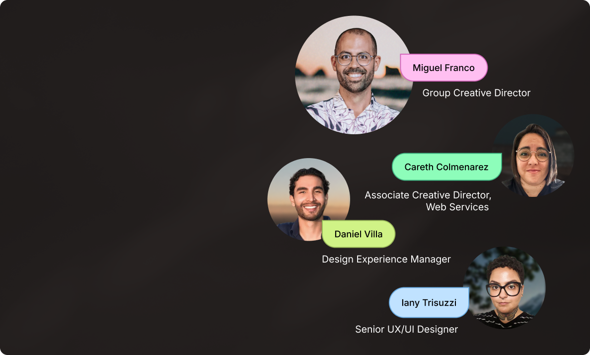
“One great page doesn’t scale
a business. A connected digital
ecosystem does.” - Miguel Franco.
Build once. Scale everywhere.
Launch faster, cut rework and double
design-to-dev alignment with
smart systems built for scale.


Go global without headaches
Streamline the way you localize content and creative.
Partner with Superside to amp up your processes,
production and creative performance.
How 500+ brands get more work done, without doing more
They Superside it. Fast, high-quality creative from the
AI-powered creative service that handles it all.


Craft unique brand experiences
Superside can support all your brand visions.
Check our creative services and plan your next
branding move in the blink of an eye.