Forgettable presentations cost you opportunities. Visually engaging slides, on the other hand, grab attention, clarify complex ideas and help close contracts. Let these creative presentation design ideas inspire you to take your next slide deck from another corporate deck to the next great thing for each occasion!
Good presentations are permanently crucial in the corporate world. They improve communication and decision-making, engage audiences and simplify complex information, which helps influence stakeholders and achieve key business goals.
Unfortunately, many corporate slide decks fail to engage or inspire their audiences. In fact, 79% of people say most presentations are boring, making it too easy for listeners to tune out.
This is hardly surprising when you consider that 78% of creatives feel overwhelmed by routine tasks, leaving little time for them to conjure up captivating presentation ideas.
Fortunately, many enterprises are starting to outsource creative services such as brand redesign and presentation design to reliable design partners that can make them at scale and with the consistency and creative excellence that just the top brands know.
Whether you’re looking for presentation design ideas, the best presentation design partner or a skilled pitch deck agency, you’ll find what you need on this page. If you prefer a DIY approach, we also show you here the top AI presentation makers and free business PowerPoint templates to set you off on the right track.
Let’s dive into these ideas!
Why creative presentations matter for effective enterprise communications
Enterprise slide decks serve two primary purposes: Effectively communicating essential information to key audiences and projecting a polished, professional image that builds trust and credibility for the company.
Shrinking attention spans make engaging presentations crucial, but many corporate presentations fall short. Research shows that 46% of people lose focus and most disengage within the first 10 minutes.
Probably, this has happened to you during an important meeting. It’s not that you or other people didn’t care; it was just that the presentation wasn’t motivating enough.
In the race to stand out, up to 80% of professionals say they want to create bolder work but face time constraints. Has this happened to your teams, too?
Your slide decks should always be engaging and creative to hold your audience’s attention. Slides should transform complex concepts into eye-catching visuals that clarify information, make it memorable and support faster, more confident decision-making.
Fortunately, we have a solution.
Here are some ideas to make your presentation even better tan before:
35 enterprise creative presentation ideas in 2026
Want to know the top brands’ secret to powerful presentation design?
Settle in and explore our curated list of innovative presentation concepts. Then, scroll down for more info on a partnership that could transform your approach to corporate slides.
1. Antler x Superside: Effective font pairing

In a brand revitalization project for Antler, a global venture capital firm, Superside helped the company create effective presentation templates that reflected the company’s dynamic approach and mission.
The standout feature is its thoughtful typography strategy, which successfully captures Antler’s essence using font pairings and style techniques like italicization to convey forward momentum and energy.
- Why we like it: Superside challenged traditional design norms. Our creatives paired various fonts, once considered a faux pas, finding an elegant solution that retains a modern aesthetic while emphasizing key concepts. The sophisticated result proves that thoughtful rule-breaking can create a unique visual identity.
- Best for: Enterprise companies wanting to project innovation and progress while maintaining a refined, understated visual presence.
2. Endor Labs x Superside: Key consistency

Superside helped Endor Labs develop a series of consistent, customizable slide decks by incorporating their space theme through thoughtful color choices, typography, iconography and imagery.
The result is a presentation that combines professionalism and fun, showcasing Endor Labs’ innovative culture.
- Why we like it: Each slide incorporates unique visuals, but a consistent theme offers a cohesive experience. This highlights the brand’s strong visual identity across different applications.
- Best for: Enterprise companies looking to deliver a cohesive brand experience to impress their audiences.
3. Entelo x Superside: Bold use of color

As part of Entelo’s rebranding project, Superside supported the HR company to develop a striking presentation deck featuring bold hues and colorful icons.
This design sets Entelo apart from competitors and highlights the company’s dedication to diversity. It effectively conveys Entelo’s mission of connecting the right people.
- Why we like it: Bold colors effectively grab the audience’s attention and reinforce Entelo’s diversity message, maintaining a professional look throughout the presentation template.
- Best for: Enterprise organizations looking to make a distinctive statement and stand out in their industry.
4. Zoho Show x Superside: Impactful imagery

This presentation design is just one of the 70 unique slide templates designed by Superside for Zoho Show, which provides online business solutions to over 50 million users globally.
Superside’s use of AI presentation makers saved Zoho Show a massive 75% in design production costs.
The presentation template effectively demonstrates the power of large images when carefully integrated into slides.
- Why we like it: Big images enhance the presentation by breaking up text-heavy sections. This design strategy keeps the audience’s attention focused.
- Best for: Companies wanting to engage their audience during detailed business proposals.
5. SALT x Superside: Unexpected theme

When financial tech company SALT approached Superside for a brand overhaul, we did all possible to make this high-growing brand a break-the-mold look in a commonly boring market. The project included both a new web design, ad creative assets and presentation templates.
Instead of using the typical corporate blue seen in the fintech industry, Superside supported SALT’s new branding with a colorful, retro-inspired design, giving the brand a unique visual identity that stands out.
- Why we like it: SALT breaks industry design norms with a unique scheme showcasing its innovative, forward-thinking mindset. This bold visual approach perfectly aligns with their company culture and business philosophy.
- Best for: Corporate organizations looking to differentiate themselves in crowded, highly competitive industries.
6. Salinas Bahamas x Superside: Photo backdrops

People say a picture is worth a thousand words, so let the images in your corporate slide decks speak for themselves.
This Salinas Bahamas slide deck, created along with Superside, is the perfect example: Stunning visuals of the Bahamas and carefully placed overlay text make a strong impact.
Each slide is an engaging visual experience that elevates the graphic narrative beyond the ordinary.
- Why we like it: Using high-quality photos as slide backdrops achieves two main objectives: It highlights the beauty of the Bahamas to drive a strong message and immediately engages the audience. This approach turned a fairly standard presentation into an immersive experience.
- Best for: Destination marketing, resort presentations and organizations wanting to leverage visual storytelling to create memorable slide decks.
Now you know what the greatest brands use to scale their presentations and deliver faster, with greater results. Using Superside will always pay back because even the biggest in-house teams need a hand from time to time.
Our AI-powered design services helped these in-house teams lift the pressure off, boost their productivity and support them in delivering standout PowerPoint slides and polished pitch decks.
Superside gives you that competitive edge at all times. As your committed creative partner for all your design needs, we upgrade standard presentations and pitch decks into exceptional visual experiences that deliver results.
7. Nebulla: Shapes and graphics

(Source: Behance)
Using high-quality, on-brand images and shapes enhances visual interest across all slides.
Nebulla’s approach demonstrates this with a deck that features strategically placed imagery, icons and a variety of shapes. The result is a cohesive, modern presentation.
This presentation template is available for download here.
- Why we like it: Incorporating interesting shapes and images adds depth and dimension. This technique guides the viewer’s eye across the slides and maintains engagement.
- Best for: Organizations looking to modernize their presentation style and create more visually engaging content.
8. Graze: Duotones

(Source: Dribbble)
Elevate your slides by using duotones, like Graze did in this example.
Duotone refers to two tones, not just two colors. This design style features two contrasting tonalities, each with a range of shades, resulting in a bold, distinctive appearance.
Depending on your choice of tones, the effect can range from subtle to striking. In this case, Graze also customized the photography to fit the duotone color scheme.
This design template is available for download here.
- Why we like it: The presentation template has a sleek, contemporary look.
- Note: Use your company’s colors in a duotone scheme to reinforce your brand.
- Ideal for: The creative industry, technology startups and enterprises looking to make a good impression with unified, stylish slides.
9. Jenius: Vibrant colour contrasts

(Source: Dribbble)
To improve communication during your presentation, consider introducing a strategic splash of color. This is precisely what the VR education company Jenius accomplished in their presentation.
Using a neutral color foundation and integrating a thoughtfully chosen accent color, Jenius achieved a visually striking and professional design.
- Why we like it: The clever use of color helps the brand to uphold a professional image while introducing visual elements that engage the audience and differentiate the brand.
- Best for: Organizations aiming to look professional and communicate their thoughts effectively with their slides.
10. Wellness Academy: Black and white

(Source: Dribbble)
The little black dress is a classic because it’s stylish and timeless. Similarly, black-and-white slides can often be more impactful than colorful ones, especially when this achromatic color scheme is paired with striking images.
This Wellness Academy example demonstrates how a minimalist approach can create a strong visual statement.
- Why we like it: This timeless design exudes confidence through its mature, understated elegance. The contrast results in a polished deck, allowing the content to take center stage.
- Best for: Luxury items, professional services, photography portfolios or any other type of presentation that prioritizes messaging..
11. Beeqos: Video

(Source: Behance)
Using video in your presentation makes it more dynamic and engaging. Research shows that people remember 95% of information from videos, compared to only 10% from text.
Consider adding a personal introduction, a product demo or relevant stock footage to enhance your videos.
The Beeqos beekeeper app presentation achieves this effectively by incorporating video clips and animation, resulting in a more engaging experience.
- Why we like it: Videos capture attention better than static images. Their movement and sound provide a multisensory experience that keeps audiences engaged and enhances information retention.
- Best for: Companies that offer complex products or services that could benefit from visual demonstration.
12. Bornfight: Minimalism

(Source: Behance)
In slideshow pressos, less usually means more.
Branding firm Bornfight shows how minimal presentation components can achieve a significant impact.
Their deck features a clean, minimalist style that appears fresh and purposeful.
- Why we like it: By minimizing excessive imagery and animations and prioritizing thoughtful white space, this design ensures the audience focuses on what’s most important—the brand’s core message.
- Best for: Luxury brands and organizations wanting their presentation decks to convey sophistication and confidence.
13. Buckey Authentic: Vintage theme

(Source: Dribbble)
A vintage style can also make slides memorable. In fact, this style is ideal for nostalgic or history-themed presentations.
By “vintage,” we mean soft sepia-toned images and decorative fonts that evoke the charm of old posters—features demonstrated in the Buckey Authentic presentation shown here.
This visual style immediately takes the audience back to another era, helping the brand to establish an emotional connection during the presentation.
- Why we like it: Vintage styling creates a classic mood that imparts a sense of maturity and subtlety. The nostalgic elements evoke feelings of reliability and enduring quality.
- Best for: Brands offering artisanal products or traditional craftsmanship.
14. Fusion Force: Font focus

(Source: Dribbble)
Text can do much more than just share information. When creatively applied, the words can be the primary design feature.
This example from Fusion Force demonstrates how thoughtful combinations of text styles and fonts can convert typography into visually striking slide designs.
- Why we like it: Bold fonts and bright colors not only convey information but also make a strong visual statement.
- Best for: Brands with bold personalities looking to enhance their presentations.
15. Hellow!: Monochrome palette

(Source: Dribbble)
A monochrome color palette focuses on a single hue in varying intensities. This striking template example by Hellow! incorporated shades of yellow to create a cohesive presentation design.
- Why we like it: The monochrome palette creates cohesion throughout the presentation—a smart way to demonstrate the primary brand color across every slide.
- Note: Use the lightest shade for your background while employing deeper tints for titles and decorative features. You can also incorporate photos—simply apply a color filter to ensure they align with your selected tone.
- Best for: Corporate presentations where brand consistency is essential, minimalist design enthusiasts or any scenario in which you want a polished, cohesive appearance without the hassle of coordinating multiple colors.
16. Nations Hearing: Illustrations

(Source: Dribbble)
Incorporating illustrations is one of the easiest ways to make your slideshow more engaging.
They can add a human element and make complex or abstract ideas more accessible by visually breaking down information in a way that’s easy to understand.
In this example, Nations Hearing effectively uses large character illustrations and small conceptual icons to make their corporate material engaging and relatable.
- Why we like it: The illustrations improve the corporate presentation by making information easier to understand. This approach helps the brand’s audiences connect intellectually and emotionally with the content.
- Best for: Instances in which you need to make complex information easy to understand.
17. Multi Medical: Circles

(Source: Dribbble)
A simple device—circles—elevates this Multi Medical presentation.
The circles inherently communicate wholeness and completeness, subtly helping the brand to communicate a unified look, feel and message.
You can download this easy-to-customize presentation template here.
- Why we like it: Circles add personality and consistency. They create a softer, more inviting visual experience.
- Note: Consider using circles as decorative features, image borders or backgrounds for illustrations. Their versatility allows them to complement your presentation’s content seamlessly.
- Best for: Brands aiming for an approachable, inclusive look and feel.
18. Lovely: Color overlay

(Source: Behance)
Using color overlays on image backgrounds can boost the visual impact of your slideshows. With this technique, you apply a filter or gradient over your photos, adding depth while ensuring the text remains readable.
This Lovely brand presentation template demonstrates how layering two gradient colors on background images can create a vibrant, cohesive aesthetic.
- Why we like it: The color overlays enhance the photos, aligning the color scheme and the brand identity. This approach creates visual consistency.
- Best for: Brands with a distinct color identity who want to create cohesive, contemporary slide decks.
19. Dryft: Isometric illustrations

(Source: Behance)
Isometric illustrations are a style of drawing that represents 3D objects on a 2D surface using a specific set of rules.
This example demonstrates how these illustrations can simplify complex processes or concepts into clear, understandable components. Animations can also be added to make the visuals even more interesting.
This style is perfect for everything from product demos to corporate slide decks. It instantly imparts a modern flair and professional look to slides.
- Why we like it: Isometric illustrations bring a striking 3D effect and a modern, geometric vibe to the slides. They help audiences grasp processes and systems from multiple perspectives, making complex information easier to visualize and understand—something flat graphics simply can’t achieve.
- Best for: Tech companies, product demos, system explanations and workflow slides.
20. GuRU Product mockups

(Source: Behance)
Product mockups are a valuable ally for brands wanting to showcase their products or services.
The GuRU pitch deck effectively demonstrates this, showcasing a 3D product render that helps viewers clearly envision the user experience.
- Why we like it: Beyond making pressos visually interesting, compelling product mockups foster trust and credibility by demonstrating how the brand’s solutions work in real-world contexts.
- Best for: Technology companies, app and software developers and digital service providers that need to showcase functionality.
21. ATF: Augmented Reality (AR)

(Source: Behance)
AR is becoming increasingly popular in the world of presentations, as the tech can provide an immersive first-person experience from virtually any location.
As demonstrated in this remarkable ATF example, incorporating AR video in your slides provides an engaging method for displaying product or process walk-throughs. It encourages greater engagement and understanding, outperforming static images and video.
- Why we like it: The audience engages with the content rather than just seeing it. Using AR also demonstrates being at the forefront of innovative communication methods.
- Best for: Product launches, architectural pitches, showcasing manufacturing processes or any context where demonstrating spatial relationships is essential.
22. Ease: Quotes

(Source: Dribbble)
Quotes provide excellent breathers between information-heavy slides. They can separate ideas or introduce new sections in your slides.
Take a look at how Ease uses quotes to drive home key points in this employee presentation.
- Why we like it: Adding quotes gives the audience a mental break from information-heavy slides while injecting a much-needed human touch.
- Note: Quotes can become little pearls of wisdom that reinforce your messages. Ensure the quotes closely relate to your topic—you want to enhance understanding, not confuse viewers.
- Best for: Training slides, motivational talks, company vision meetings and where you want to emphasize key points with external validation and add personality to technical content.
23. John Anderson: Animated elements

(Source: Dribbble)
Animated elements can turn a dull, static slideshow into something dynamic and engaging.
This John Anderson presentation is an excellent example: Card elements flip onto the screen, creating dramatic moments, while other animated components keep the viewer’s attention focused.
- Why we like it: Animation can enhance conventional slideshows with purposeful movement. The dynamic elements add subtle visual drama while reflecting a modern, forward-thinking company culture.
- Note: Whether you’re animating elements within slides, adding transitions between them or both, use movement to add visual interest.
- Best for: Product launches, internal company comms and sales pitches.
24. Aerolab: Index

(Source: Dribbble)
Just like any meeting benefits from a clear agenda, a slideshow needs a roadmap to guide your audience. Including an index or agenda slide early on sets expectations, helps viewers follow along and gives them a sense of timing for what’s ahead.
Look at how Aerolab approached this by creating an introductory slide that outlines the journey.
- Why we like it: This element converts the slideshow into a thoughtfully organized experience. Plus, it shows respect for your audience’s time and attention.
- Note: This method is particularly beneficial for self-guided presentations, allowing viewers to navigate between sections as needed.
- Best for: Complex presentations or subjects or any scenario where you want to enable your audience to manage their viewing experience.
25. Luminax Learning Centre: Multi-media presentation

(Source: Canva)
Multimedia elements like videos, animations and polls can enhance audience engagement.
This presentation from the Luminax Learning Centre features a poll that gauges the audience's mood, effectively turning them into active participants instead of passive spectators. The poll shifts a one-sided broadcast into a dynamic conversation.
- Why we like it: The poll engages the audience and indicates that audience input is valued.
- Best for: Training sessions, educational talks, keynote speeches or any scenario where you need to capture attention and/or receive feedback from the audience.
26. Bark: Key stats

(Source: Dribbble)
Bold, attention-grabbing typography can elevate ordinary numbers into impactful visual expressions.
Check out how the services marketplace Bark achieves this in their slide deck. The bold, modern typography puts the focus squarely on the stats, making them stand out without any unnecessary distractions.
- Why we like it: The technique helps the presenter cut through information overload. Viewers can quickly grasp essential data points on slides and understand their significance without getting lost in the details.
- Best for: Showcasing growth, market research findings or performance highlights.
27. Fluxican: Ongoing motifs

(Source: Behance)
It’s easy to enhance brand cohesion by integrating visual motifs across your slides. This might include a particular icon, graphic element or shape that consistently appears throughout your deck.
Fluxica’s presentation illustrates this approach. It incorporates a teal gradient “orb” effect and jagged lines that recur on various slides. These repeated visual features create a distinctive, unifying brand signature.
You can download this easy-to-customize presentation template here.
- Why we like it: The motifs convert a series of individual slides into a cohesive, polished experience. These visual connections lead the audience through the presentation, subtly reinforcing the brand identity.
- Best for: Brand presentations and creative portfolios.
28. Ecoorganic: Infographics

(Source: Dribbble)
Numbers often tell a powerful story, but they can appear dull. Convert your data into a compelling narrative using infographics like flowcharts, pie graphs or custom visuals.
In this slide deck for Ecoorganic, the designer turned complex statistics into eye-catching, immediately understandable graphics.
- Why we like it: Converting the numbers into visuals makes the information immediately understandable. This helps the brand to communicate its message effectively.
- Note: Partner with us for powerful, infographic-led presentations. Superside is a leading infographic design agency capable of producing exceptional presentations.
- Best for: Business proposals, investor pitches and strategic presentations that drive data-driven decision-making.
29. $MIND: Memes

(Source: Behance)
Memes are a great tool for capturing attention and adding humor to your presentations, making them more engaging and memorable.
As shown in this example for $MIND, the key is to select relevant elements and use them sparingly, enhancing your brand personality while avoiding distraction from the main content.
- Why we like it: Memes help connect presentations with popular culture, infuse humor and make products or services more relatable. They can establish an immediate bond with audiences familiar with the references.
- Note: Use memes strategically and sparingly to enhance your content without detracting from it.
- Best for: Informal presentations, engaging younger audiences, team discussions or any context where initiating conversation is important.
30. Gartner: Data visualization

(Source: Dribbble)
Staring at walls of numbers can completely overwhelm audiences, even when those figures strongly support the messages. To keep audiences engaged, the key is to convert data into clear, easily digestible visualizations.
This Gartner example illustrates how changing intimidating spreadsheets into captivating visual stories can create a memorable impression.
- Why we like it: Data visualization makes complex numbers more understandable and interesting. This technique helps audiences quickly grasp key trends and relationships instead of struggling through rows of figures.
- Best for: Financial presentations, sales reports, performance evaluations or any context where complex data needs to be communicated.
31. Humira: Tree diagram

(Source: Dribbble)
A tree diagram is a thinking map that helps organize ideas and concepts in a branching structure.
As illustrated by this Humira example, these diagrams are excellent for classifying information and showing how processes or concepts evolve and branch into subsequent steps.
- Why we like it: The tree diagram structures information to clarify complex processes. It turns complex relationships into straightforward visual pathways that audiences can easily navigate.
- Best for: Presentations that involve decision-making, organizational charts, classification frameworks or situations in which you need to show hierarchical relationships.
32. Gamal Eldien: Black backgrounds

(Source: Behance)
Using a black background makes colors appear more vivid and eye-catching than they do on white. However, choosing colors that complement each other and the black surface is crucial, as is avoiding combinations that might clash or reduce readability.
As shown in this example for Gamal Eldien, neon hues and pastel shades stand out prominently against black, drawing attention.
- Why we like it: The black background and treatment contrast sharply with typical presentation visuals, making the slides memorable and adding a sense of drama.
- Note: Enhance contrast by adding white elements to your presentation design.
- Best for: Nighttime events, presentations in the creative sector or proposals aimed at the entertainment industry.
33. Orion: Maps

(Source: Dribbble)
Maps are a great way to make slides more interesting and help your audience quickly understand location-based information. They can highlight important places, show routes and make complex data easier to grasp at a glance.
Orion’s presentation effectively communicates geographic information while being visually engaging.
- Why we like it: Maps help the audience quickly understand the information. They convert abstract location data into intuitive visuals that people can grasp at a glance.
- Best for: Travel agencies, property showcase presentations, market growth strategies or any presentation related to geographic distribution.
34. Mozart Leben: Timelines

(Source: Dribbble)
A timeline presentation is one of the easiest ways to show a complicated process or a series of historical events.
Instead of making your audience read through a long list of steps or dates, a timeline lets them see how everything fits together at a glance, making your message much easier to follow.
It’s essential to find an engaging way to present the information. Take your cue from this example of Mozart’s lifespan.
- Why we like it: The timeline transforms dry chronological information into a visual journey that’s easy to follow. It helps audiences see progression, patterns and relationships between events that could get lost in bullet points.
- Best for: Historical presentations, project planning sessions, company milestones or any scenario where the sequence of events is important.
35. Jason Peterson: Mobile-friendly

(Source: Dribbble)
Prioritizing mobile-friendly presentations is a must since most viewers now access content on their phones. This means using large, readable fonts, keeping layouts simple and avoiding clutter or intricate details that get lost on small screens.
This mobile presentation, created for photographer Jason Peterson is a good example of what works.
- Why we like it: Mobile-friendly presentations ensure your content is accessible anytime, anywhere. They encourage you to focus on essential elements and eliminate excessive clutter, ensuring clear communication across all devices.
- Note: Start the design process by focusing on the smallest screen first.
- Best for: Remote teams, sales presentations that should be accessible on the move, conference materials or any instance where viewers may engage with your content on mobile devices.
Make powerful presentations with minimal effort using Superside
Like what you see? As your creative team’s creative team, we can help you scale your designs just this way, and just for you.
Generic PowerPoint templates are out. Good presentation designs are in. As a vital business tool that directly influences your company’s success, your presentations should be brand-consistent and effectively convey your company’s messages through contemporary storytelling.
We’ll support your internal team by easing the load of routine tasks and implementing innovative branding strategies to elevate your creative efforts to unparalleled heights.
- How do we work? As the world’s leading AI-powered creative service, we combine a global team of top-tier creatives, advanced AI tools and workflows, and a robust project management platform to deliver high-quality work faster and more cost-effectively than traditional agencies.
- How do we differentiate? We deliver high-quality creative solutions that grow with your business, making it easy for your internal teams to access top talent, advanced AI workflows and seamless project management tools around the clock.
Services offered:
- Presentation design
- Custom PowerPoint presentation design
- Pitch deck design
- Business presentation design
- Branding services
- Concept creation
- Video production and motion design services
- Illustration design
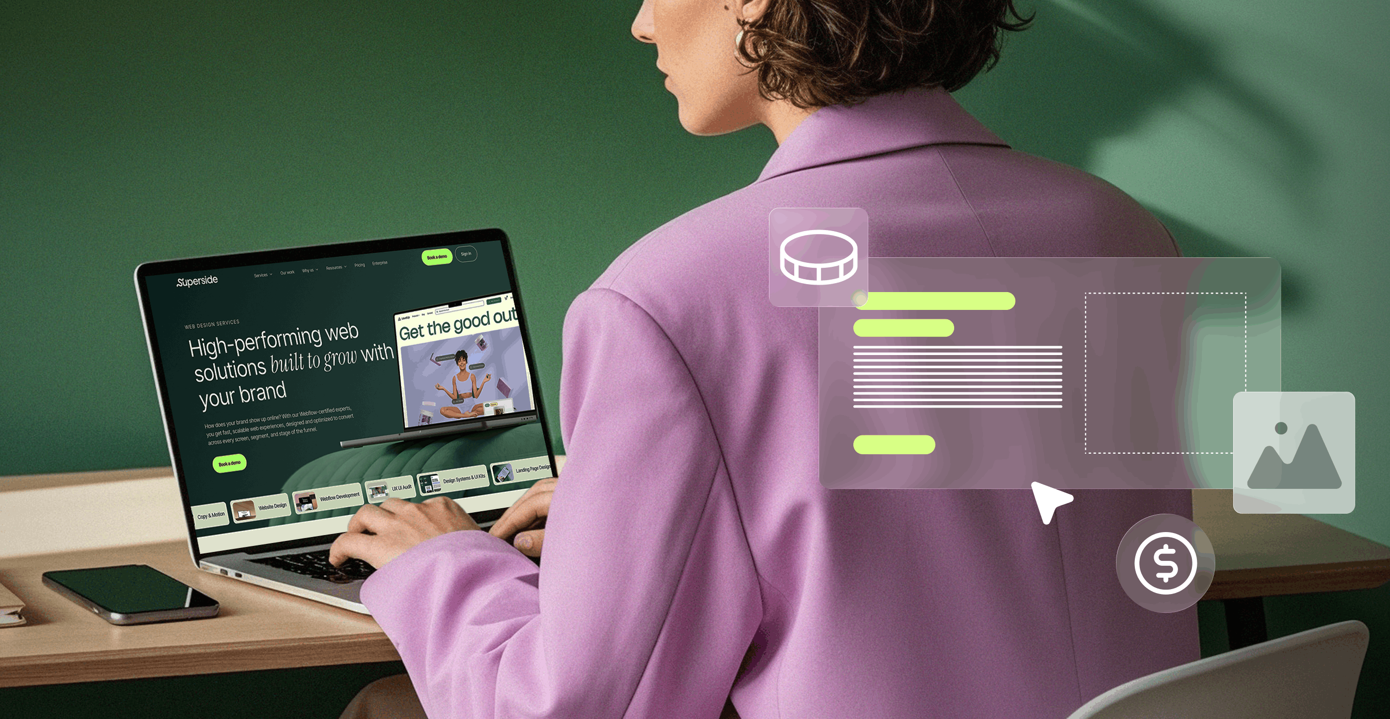
- Web design and Webflow development
- Social media and ad creative
- Email design
- Print design services
- Packaging and merch design
- Digital marketing strategy & consulting
- Design systems and product design services
- Immersive design services for AR / 3D solutions
- eBook and digital report design and copywriting services
As the top extension of your creative team, we’ll give your employees room to focus on strategic priorities while our creatives handle production and conceptual work. With brands seeing a three-year ROI of 94% while working with us, you can also outsource design and dedicate your efforts to what matters most.
Imagine what your business could achieve with this kind of support. From standout PowerPoint presentations to high-converting pitch decks and slide templates, we’re here to help you create on-brand, creative presentations that turn your unique vision into results.
Our flexible subscription model means you get reliable, on-brand creative across various design disciplines—all while keeping costs predictable and manageable.
Book a call to learn more.
FAQs


What 200+ creative leaders had to say
There’s a reason we called it the Overcommitted Report.
But, is there light at the end of the carpal tunnel?


Brand systems that scale with you
From one-off email assets to AI-powered workflows,
we make sure your brand grows with no compromise.
Schedule a chat to learn more.


Your creative team's creative team
Choose the world's leading AI-powered creative service
and get high-performing ads, videos, experiences and
more at scale, on your schedule and to your standards.