

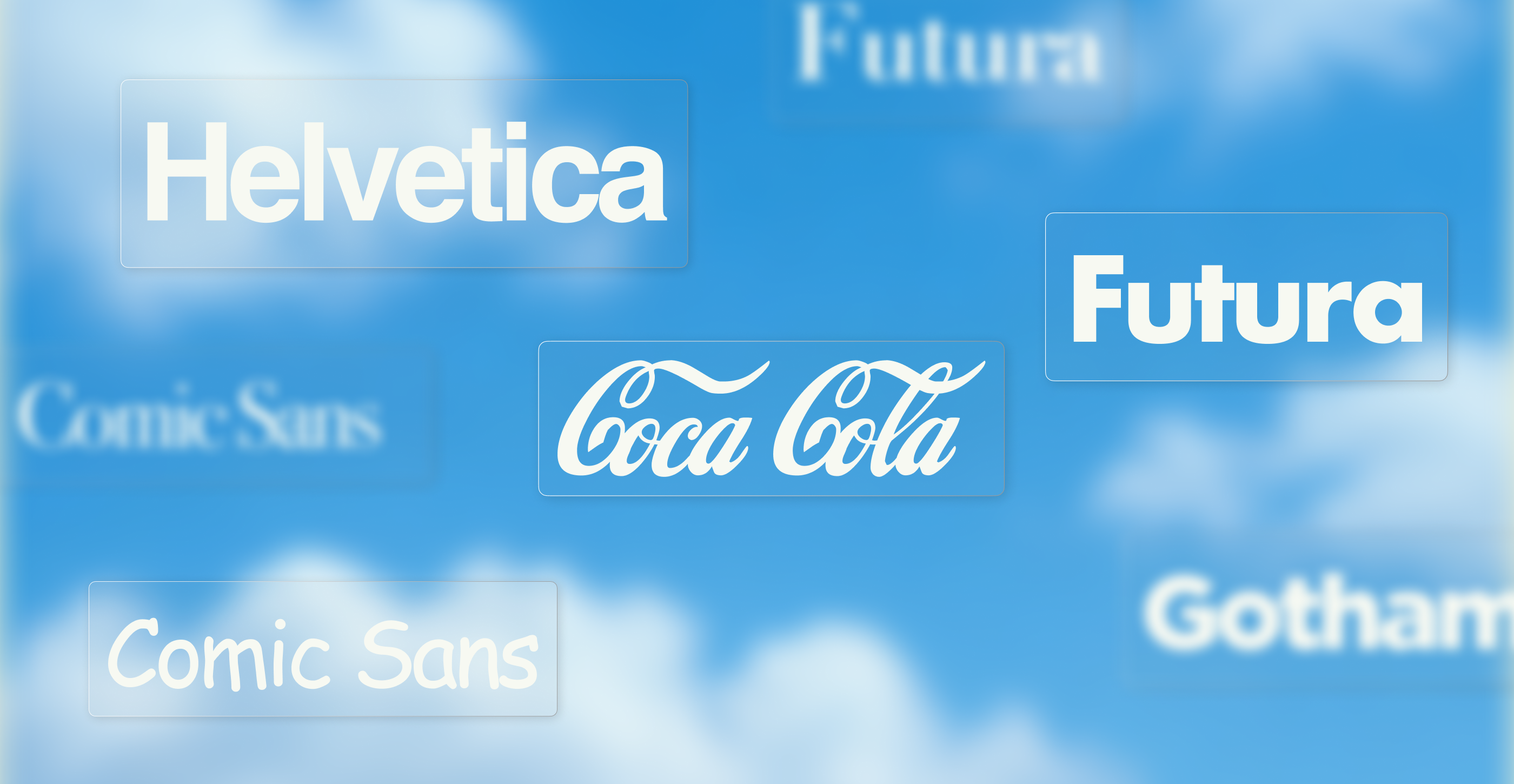
The world's most famous fonts and iconic typefaces have shaped everything from books and street signs to some of the biggest brands. This guide explores the classics and the modern brand typefaces. It also explains why companies like Netflix, Google and Apple invest in custom fonts to build a more distinctive, consistent and ownable brand identity.
Type is everywhere, hiding in plain sight. You know the shape of a letter long before you'd ever think to name its font. The Coca-Cola script, the Netflix wordmark, even the Futura etched onto the Apollo 11 plaque on the Moon.
On this page, we cover what makes each font iconic, who designed it and where you've seen it, split into timeless classics and modern brand fonts. We also look at why the world's biggest brands now commission their own typefaces, and how that same craft scales into enterprise design systems.
If you love type, or you're a brand leader thinking about how typography shapes recognition, this is your practical field guide to the most famous fonts and iconic typefaces of all time.
Along the way, Pía Llanos, Creative at Superside, shares what it takes to keep a typeface consistent once a whole organization is using it.
Font vs. typeface, and the main categories
First, a quick clarification: a typeface is the overall design of a family of letterforms, like Helvetica. A font is a specific weight, style or size within that typeface, like Helvetica Bold Italic at 12 point.
In everyday use the two are treated as synonyms, and we use both here, but graphic designers care about the distinction.
Most typefaces fall into a few broad categories:
- Serif typefaces have small strokes, called serifs, attached to the ends of letters' main strokes. They often look like tiny feet at the baseline. Look closely at a capital "T" in Times New Roman and you'll see them. Serifs are associated with traditional or authoritative design and are widely used for long-form text. Garamond is another famous example.
- Sans serif typefaces don't have serifs, which gives them a cleaner, often more modern appearance. Helvetica and Futura are famous examples.
- Script typefaces draw on handwriting or calligraphy, which adds personality. Coca-Cola's wordmark uses custom Spencerian script lettering.
- Display or decorative typefaces are designed primarily for impact at larger sizes, such as headlines and logos, rather than extended body copy. Cooper Black is a famous display typeface.
The most famous classic typefaces
These are among the most influential typefaces in modern design. Many are still in daily use more than half a century after they were cut.
Helvetica

Called "the little black dress" of fonts and, thanks to its ubiquity, a typeface so common it "feels like air", Helvetica was designed by Max Miedinger and Eduard Hoffmann at the Haas Type Foundry in Switzerland in 1957. Interestingly, it was initially released as Neue Haas Grotesk.
As the defining neo-grotesque sans serif, it's arguably the most used typeface in the world and the definitive expression of clean, neutral modernism. Its versatility made it the default for corporate branding, wayfinding and everything in between. In 2007, MoMA acquired a 36-point cut of Helvetica Bold as the first typeface in its collection, marking the occasion with the exhibition "50 Years of Helvetica."
One piece of Helvetica lore is worth correcting, though. The New York City subway's famous signage didn't start with Helvetica. Unimark's 1970 graphics standards manual, developed with Massimo Vignelli and Bob Noorda, specified Standard Medium, a cut of Akzidenz-Grotesk. Helvetica only became the official subway typeface with the revised 1989 manual.
It appears in fewer new corporate identities today than during its heyday, but you'll still see Helvetica everywhere, from transit systems to brands like American Apparel.
Futura

Paul Renner designed Futura for the Bauer Type Foundry in 1927. Renner was a Deutscher Werkbund figure rather than a Bauhaus one, but Futura shares that era's modernist conviction that letterforms should be built from pure geometry. Constructed from clean circles and triangles, it still feels modern nearly a century later.
It's also famous for literally leaving the planet. Apollo 11 left a plaque bearing the typeface on the Moon, though type researchers note that several Apollo-era items used Spartan, the near-identical American clone, so "Futura or its clone" is the safer description.
On Earth, it underpins the Louis Vuitton wordmark and Supreme's modified Futura Heavy Oblique logotype, and it's long been the signature of directors like Wes Anderson, who used it for years before switching to a custom face for Moonrise Kingdom. As then Monotype Creative Type Director Steve Matteson put it, Futura is "equally at home next to a redwood tree as it is next to a steel table."
Times New Roman

After Stanley Morison, typographical adviser to Monotype and consultant to The Times, sternly critiqued the newspaper's existing type, The Times of London commissioned a replacement in 1931.
Victor Lardent, then in the paper's advertising department, drew it under Morison's direction, using Plantin as a model. It first appeared in the paper on 3 October 1932 and was released commercially the following year, going on to become the default serif of the 20th century.
Economical, legible and authoritative, it set the standard for newsprint and spent decades as the default in word processors. That's where most people first met it.
Garamond

Based on the work of the 16th-century French punchcutter Claude Garamond and revived many times since, this is one of the oldest, most iconic typefaces still earning its keep.
Old-style in the truest sense, with the warmth of a hand still faintly present in its curves, its serene bracketed serifs and modest x-height (the height of a typeface's lowercase letters) give it a quiet, unhurried elegance. That's exactly why it has remained a favorite for book printing.
There's a wrinkle worth knowing: several famous "Garamond" revivals aren't based on Garamond at all. Beatrice Warde established in 1926 that a number of them derive from the later punchcutter Jean Jannon.
Apple used Apple Garamond, a version of ITC Garamond condensed to 80% by Bitstream, from the 1984 Macintosh launch until 2002, when Myriad replaced it. That makes it the typeface of the "Think different" era.
Baskerville

John Baskerville cut this transitional serif in England around 1757, refining older forms with higher contrast between thick and thin strokes and sharper serifs.
The crispness unsettled his contemporaries. Benjamin Franklin recounted in a 1760 letter to Baskerville that a connoisseur insisted the types would blind the nation. Franklin then showed the man a Caslon specimen while claiming it was Baskerville's, and the man reported the same pain. It's one of typography's better anecdotes about how much of taste is suggestion.
Baskerville reads as refined and trustworthy. Paula Scher's 2006 Pentagram identity for The Metropolitan Opera is set in Baskerville and Avenir, and Kate Spade New York's current wordmark is a custom Baskerville-derived logotype drawn by Christian Schwartz at Commercial Type.
Bodoni

Under the patronage of the Duke of Parma, who called him to Italy in 1768, type designer Giambattista Bodoni spent his career chasing an ideal of typographic perfection that pushed Baskerville's contrast to its logical extreme. Hairline serifs so fine they seemed to vanish, set against strokes of near-mechanical thickness, all held upright on a rigid vertical axis.
It's a typeface that has inspired both devotion and disgust. William Morris wrote in The Ideal Book (1893) of "the sweltering hideousness of the Bodoni letter, the most illegible type that was ever cut, with its preposterous thicks and thins."
Massimo Vignelli took the opposite view so firmly that Bodoni made his famously short list of acceptable typefaces, and he went on to co-design WTC Our Bodoni. Two centuries on, it remains the reference point for high-contrast editorial and fashion typography.
Didot

Firmin Didot cut the first Modern typeface to appear in print in Paris in 1784, emerging almost simultaneously with Bodoni in Italy. The two are still often confused, to the consternation of both nations, thanks to their striking similarity.
Didot is the archetypal fashion serif. Its extreme stroke contrast, paired with tight line spacing, reads as elegant at large sizes, which is exactly why the Didone style became the visual language of luxury fashion.
Vogue's masthead is a bespoke Didone logotype that has stayed essentially consistent since 1955, with no single credited designer. Harper's Bazaar uses HTF Didot, which Fabien Baron commissioned from Jonathan Hoefler for the magazine's 1992 redesign. Zara's 2019 logo, by Baron & Baron, is a Didone too, with famously tight letterspacing.
It's the closest typography gets to haute couture.
Caslon

William Caslon opened his London foundry in 1720, cut his first roman around 1725 and issued his first dated specimen in 1734. His types were the first of English origin to win international standing, though type historians point out they followed 17th-century Dutch models closely enough that Stanley Morison called them "a happy archaism."
They were popular enough to earn an anonymous printer's proverb: "when in doubt, use Caslon."
Caslon carries genuine historical weight. The first printing of the United States Declaration of Independence, John Dunlap's July 1776 broadside, was set in Caslon. The famous engrossed parchment, by contrast, is handwritten.
Gill Sans

Released in 1928 as Britain's answer to the geometric cool of Futura, Gill Sans has a completely different temperament. Its circular O is pure geometry, but its lowercase a and g curl with the memory of a pen in someone's hand.
Sculptor and letterer Eric Gill created this humanist sans serif for Monotype, drawing on Edward Johnston's lettering for the London Underground, commissioned in 1913 and completed in 1916.
Warm yet clean, it became quintessentially British. It appeared on Penguin's original 1935 tri-band covers, designed by Edward Young, and Jan Tschichold standardized the series around it in the late 1940s. The BBC adopted it as part of Martin Lambie-Nairn's 1997 identity and used it until BBC Reith arrived in 2017. George Lois also used it in Tommy Hilfiger's 1985 identity.
Frutiger

Swiss designer Adrian Frutiger originally designed this sans serif, first called Roissy, for signage at Charles de Gaulle Airport around 1970. Stempel released it commercially in 1976 in conjunction with Linotype. Engineered for legibility at a distance and at speed, it became a benchmark for airport wayfinding systems around the world.
Of his design, Frutiger famously said: "If you remember the shape of your spoon at lunch, it has to be the wrong shape. The spoon and the letter are tools; one to take food from the bowl, the other to take information off the page… When it is a good design, the reader has to feel comfortable because the letter is both banal and beautiful."
Univers

Released in 1957 by Deberny & Peignot, the same year as its great rival Helvetica in one of typography's stranger coincidences, Univers has a cooler, more rational, more deliberately engineered feel than its Swiss cousin. Less warmth, more precision.
Adrian Frutiger designed it as one of the first typeface families conceived as a single coordinated system: 21 styles mapped onto a numbered two-axis grid of weight and width, built together from the outset rather than added one at a time. That systematic thinking shaped how modern type families and design systems are built.
Univers is UNICEF's brand typeface, specified by weight in its brand guidelines.
Akzidenz-Grotesk

Berlin's Berthold Type Foundry, working with its Stuttgart subsidiary Bauer & Co., released Akzidenz-Grotesk in 1898 for everyday commercial printing: business cards, invoices, letterheads. It grew out of Bauer's Schattierte Grotesk of 1894. It's the grandfather of the neutral sans serif and the direct predecessor of both Helvetica and Univers.
Its designer is unknown. Akzidenz-Grotesk was long credited to Ferdinand Theinhardt, but that attribution has been disproven, and research published by Klim Type Foundry concludes he may never have cut a sans serif at all. The punchcutters were anonymous, as they often were for jobbing type.
"Akzidenz-Grotesk was produced at a time where sans-serif typefaces were starting to come into their own," says Tom Rickner, then creative type director at Monotype, in Creative Boom. "The low contrast forms and the lack of serifs meant they could stand up to more use and abuse than fine serifed fonts, which would wear down or even break off after thousands upon thousands of impressions."
Berthold marketed it steadily from the start, but it worked quietly as jobbing type for half a century before Swiss designers rediscovered it and built an entire school of type design around its plain, sturdy bones: the International Typographic Style that emerged in Switzerland and Germany in the 1950s. Its influence is hard to overstate. The American Red Cross still specifies the Akzidenz-Grotesk Standard family in its brand standards.
Franklin Gothic

Morris Fuller Benton created Franklin Gothic for American Type Founders in the early 1900s, with sources dating its release to either 1902 or 1905. It hits the page like a fist, which is why it became the workhorse American face for headlines, advertising, book covers and posters. Where Akzidenz-Grotesk aimed for quiet neutrality, Benton's letters were loud on purpose.
Named for Benjamin Franklin, a printer before he was a statesman, it was engineered to shout a headline across a crowded newsstand. Benton followed it in 1908 with a lighter, more restrained sibling, News Gothic, for text-heavy settings where Franklin Gothic's bulk would be too much.
A typeface with grit rather than the polished neutrality its Swiss cousins chased, it carried TIME's display typography from the 1977 Walter Bernard redesign until Pentagram's 2007 overhaul. Ivan Chermayeff also set the Museum of Modern Art's logotype in Franklin Gothic No. 2 in 1964, and Matthew Carter later redrew it as the custom MoMA Gothic in 2004.
Clarendon

First issued by London's Fann Street Foundry in 1845, generally credited to Robert Besley and engraved by punchcutter Benjamin Fox, Clarendon was registered under the Ornamental Designs Act of 1842 in an early attempt to protect a typeface design.
It's often described as the unofficial typeface of sheriffs, saloons and outlaws, though that story really belongs to French Clarendon, a reverse-contrast American wood-type variant cut by William Page in 1865. Besley's original is a different, more sober design.
The real Clarendon has a quieter legacy in poster and wood-type printing, on Great Western Railway nameplates and, in Craw Clarendon Bold, across the United States National Park Service's signage. Designers still reach for it whenever they want typography that feels sturdy, familiar and steeped in history.
Rockwell

Released by Monotype in 1934 and believed to have been developed under works manager Frank Hinman Pierpont, Rockwell is a bold geometric slab serif, mechanical and confident.
It didn't come from nowhere. Rockwell revives Litho Antique, cut for the Inland Type Foundry around 1910, and ATF had already issued its own "Rockwell Antique" in 1931.
Its monoline strokes and unbracketed slabs read less like ink and more like stamped metal, which is exactly why it found work in signage that needed to feel solid and unambiguous. Look for the serifed apex on the capital A. That's the tell.
Cooper Black

Oswald Cooper designed this ultra-bold, soft-serifed display face for Barnhart Brothers & Spindler in Chicago in 1922, and it has never really gone out of style. Its smooth, slightly inflated look was unlike anything anyone had designed before.
Cooper had a wry sense of what he'd made, describing it as a face "for far-sighted printers with near-sighted customers."
An immediate advertising hit in the 1920s, it enjoyed a huge resurgence in the 1960s and 1970s, adorning album covers including the Beach Boys' Pet Sounds, where it sets the band name and album title. It remains the go-to for warm nostalgia and retro branding.
Comic Sans

The most hated typeface ever designed, besides Papyrus? We'll let you decide.
Vincent Connare drew Comic Sans in 1994 for Rover, the cartoon dog in Microsoft Bob, wanting speech-bubble lettering that didn't look like a business memo. It missed Bob's beta deadline and never shipped in the product, arriving instead in 3D Movie Maker and the Windows 95 font sets. Rover reappeared years later as the Windows XP Search Companion, which is where much of the confusion comes from.
Loved and mocked in equal measure, Comic Sans is also one of the most instantly recognizable typefaces in the world. It's a genuine piece of cultural history, whatever designers think of it.
Trajan

Carol Twombly designed Trajan for Adobe in 1989, based on the capital letters carved into the base of Trajan's Column, the triumphal column commemorating the Roman emperor Trajan's victory in the Dacian Wars, dedicated in 113 AD.
Its timeless, authoritative Roman capitals made it the default typeface of countless movie posters for decades, a visual shorthand for grandeur, gravitas and drama. You'll find it on Avatar, Panic Room and Hidden Figures, and a customized Trajan gives Game of Thrones its series logo.
Verdana

Matthew Carter designed Verdana for Microsoft in 1996, engineered specifically for legibility on low-resolution screens at small sizes, with hinting by Tom Rickner. It shipped that July as part of the Core fonts for the Web.
Its generous spacing and open characters made it a backbone of the early web and one of the most influential typefaces of the period. It's a reminder that some of the most important fonts were created for digital design, not paper.
In 2009, IKEA sparked outrage by dropping IKEA Sans, a customized Futura drawn by Robin Nicholas, along with IKEA Serif, in favor of Verdana. The design press promptly christened the fallout "Verdanagate." IKEA moved on again in 2019, to a customized version of Noto.
Minion

Robert Slimbach designed Minion for Adobe in 1990. It's an old-style serif in the Renaissance tradition, though Adobe is careful to note it isn't based directly on any single historical Italian or French type.
Highly readable and quietly elegant, Minion became a staple of book and academic typesetting and ships with Adobe software used by designers worldwide.
The Smithsonian specifies Minion Pro as its primary typeface, and the institution's wordmark is set in Minion Pro Regular. Brown University uses it as its primary serif across the whole university.
Iconic modern and brand fonts
The second wave of famous brand fonts belongs to the digital and branding era, when type became a core part of brand identity and eventually something the biggest companies chose to own outright.
Gotham

Commissioned by GQ in 2000 and first drawn as "GQ Sans," Gotham was designed at Hoefler's foundry by Tobias Frere-Jones with Jonathan Hoefler, drawn from the honest, no-nonsense architectural lettering of New York City, notably the Port Authority Bus Terminal. It appeared on a GQ cover in January 2001 and went retail in 2002.
Confident and distinctly American, Gotham reached iconic status as the typeface of Barack Obama's 2008 campaign. Michael Gericke of Pentagram also set the Freedom Tower cornerstone in it in 2004, though that stone was quietly removed in 2006 when the tower was redesigned. Gotham survives at the site in the One World Trade Center logo.
It has been a fixture of brand identity elsewhere too: Netflix used it before commissioning its own face, Saturday Night Live set its 2012 to 2014 title sequence in Gotham Ultra and DC Comics used it in the Landor wordmark introduced in 2012.
Avenir

Another Adrian Frutiger design, Avenir is French for "future." He drew it in 1987 and Linotype released it in 1988 as a warmer, more readable take on geometric sans serifs like Futura.
Frutiger wrote about it in Typefaces: The Complete Works, calling the draftsmanship his masterpiece: "It was the hardest typeface I have worked on in my life. Working on it, I always had human nature in mind. And what's crucial is that I developed the typeface alone, in peace and quiet, no drafting assistants, no one was there. My personality is stamped upon it. I'm proud that I was able to create Avenir."
The City of Amsterdam built its identity on Avenir from 2001, when thonik introduced it, and used it for two decades before replacing it with the bespoke Amsterdam Sans.
Arial

Designed by Robin Nicholas and Patricia Saunders at Monotype in 1982, originally for IBM's laser printers, Arial was built to be metrically compatible with Helvetica, so the two could be swapped without reflowing text. Monotype maintains that its actual design lineage runs back to Monotype Grotesque rather than Helvetica.
It became ubiquitous through Microsoft Windows, and whatever purists think, few fonts have been seen by more people. Monotype notes that even luxury brands lean on it as a workhorse: Dior pairs Century Gothic with Arial as a system font on its website.
Coca-Cola (Spencerian script)

The Coca-Cola logo was written out in 1886 by Frank Mason Robinson, bookkeeper and business partner to Coca-Cola's creator John Pemberton. Robinson suggested the name itself, reasoning that "the two Cs would look well in advertising," then adapted the Spencerian penmanship style of the era into the script by hand.
By the company's own account, the mark has seen only slight changes in more than a century, though there have been around a dozen variants, including an 1890 redesign it calls the greatest departure from Robinson's original, the 1941 standardization and the 1969 Dynamic Ribbon.
It's among the oldest continuously used logotypes in the world, though Twinings, dating to 1787, generally holds that title. It's proof that a distinctive script can become a permanent brand asset.
Product Sans

When Google rebranded in 2015, it replaced its old Catull serif logo with Product Sans, a custom geometric sans serif designed in-house.
Product Sans worked as a logotype but not as an interface font, so Google Sans followed. Created in 2017 and rolled out from 2018, with Colophon Foundry commissioned to help optimize it, it became the company's broader product and interface typeface. Google has since expanded the family and open-sourced parts of it, while Product Sans remains proprietary.
Together, these typefaces unified Google's visual identity across an expanding ecosystem of products and platforms.
Netflix Sans

Netflix worked with typeface design studio Dalton Maag to create Netflix Sans, introduced in 2018 as a bespoke replacement for Gotham, which it had been licensing.
"With the global nature of Netflix's business, font licensing can get quite expensive," Netflix brand design lead Noah Nathan said, as reported by It's Nice That.
"Developing this typeface [also] created an ownable and unique element for the brand's aesthetic."
Airbnb Cereal

Dalton Maag also built Airbnb Cereal, launched in May 2018 after roughly 18 months of work, to create consistency across every screen and printed surface. It replaced Circular, and it's a model for how a growing brand invests in a proprietary typeface to unify its experience.
"As a global company, we're excited to better represent our diverse community by continuing to develop our type across all languages." wrote Karri Saarinen, then a design lead on Airbnb's Design Language System team.
"It's not a fast or light endeavor, but it does feel rewarding to create something unique to us that will improve how the global community experiences our product and brand."
Circular

Circular is arguably the most representative typeface of mid-2010s tech and startup branding.
Designed by Laurenz Brunner and released by the Swiss foundry Lineto in 2013, it became something like a uniform for Silicon Valley. Airbnb picked it up in 2014, just after the Bélo rebrand, and Spotify switched to it in 2015, which became the typeface's defining brand association until Spotify built its own variant on the same bones.
It's still licensable today through Lineto, where the current cuts are Circular XX, and it remains one of the most imitated "startup sans" typefaces of the 2010s.
Spotify Mix

In May 2024, Spotify rolled out its own bespoke variable typeface, Spotify Mix, developed with Berlin foundry Dinamo and its in-house creative team. The rollout started with Latin scripts and Vietnamese and ended the company's reliance on a licensed font.
It's a recent example of a major brand deciding that owning its type is worth the investment.
San Francisco

Apple first showed San Francisco to developers in November 2014 alongside the Apple Watch, then rolled it out as the system font across iOS and macOS in 2015.
It's Apple's first in-house system typeface since Chicago in the 1980s, and it replaced two licensed faces: Helvetica Neue on iOS and Lucida Grande on the Mac. Designed for maximum clarity at all sizes, it now spans iPhone, Mac, Apple Watch, Apple TV and the rest of the ecosystem.
For more, check out our dedicated explainer on Apple's fonts.
Why brands invest in their own custom typefaces
Notice a pattern in that second list? Netflix, Airbnb, Spotify, Google and Apple didn't simply choose from a list of the most popular fonts. They all commissioned or built their own.
This is one of the most important shifts in modern branding, marking the point where type stopped being something brands rented and became something they own outright.
Brands make this move for three compelling reasons:
| Reason | What it means in practice |
|---|---|
| Ownership and cost | Licensing a popular typeface across a global organization gets expensive fast. A custom font is a one-time investment that removes recurring licensing fees |
| Differentiation | When half of Silicon Valley uses Circular, using Circular no longer sets you apart. A proprietary typeface is a distinctive asset no competitor can copy |
| Consistency and control | A custom font tuned to a brand's exact needs behaves predictably across every size, weight and platform, which is what makes brand consistency possible at scale |
Pía Llanos is candid that the investment doesn't make sense for every brand.
If the brand doesn't have the scale or budget to maintain a typeface long-term, meaning new weights, licensing, cross-platform testing and ongoing updates, a well-licensed standard face is the best realistic choice. Custom type only pays off when a brand is investing in a broader system, not just a one-off rebrand.

In other words, type has become a strategic brand asset, not just a design choice. Which raises the question every enterprise brand eventually asks: who builds this, and how do you scale it across everything?
How to choose the right fonts for your brand
You don't need to commission a custom typeface to use type well. Most brands build a strong identity by thoughtfully choosing and combining existing fonts. Five principles help.
1. Start with your brand personality
Decide what your brand should look, feel and sound like, whether that's authoritative, playful, luxurious or modern, then choose type that expresses it. In luxury branding, a high-contrast serif like Didot is the default choice for a reason. It reads as elegant and editorial at large sizes.
2. Limit the typefaces you use
Most brands need only two: one for headlines and one for body copy, sometimes a third accent. More than that and brand consistency at scale gets harder.
Llanos lists what a team actually needs in place to apply a typeface consistently.
Teams need a documented type scale and clear rules for weights, sizes and pairing. A short usage guide with real do and don't examples matters more than a long spec nobody reads, plus one source of truth, like a shared Figma library, so no one is pulling type from an old deck.
3. Pair for contrast
A classic approach pairs a serif with a sans serif so the two are clearly different but complementary. The goal is harmony with a clear hierarchy.
4. Prioritize legibility and range
A great brand font has to work across a broad range of applications, from a tiny mobile caption to a billboard. Choose families with enough weights and strong on-screen readability.
5. Check licensing
Fonts are licensed and costs scale with use across web, apps and markets. That's why large enterprise brands eventually commission their own.
Llanos describes the point where design freedom starts working against the brand.
When every team can justify a font choice individually, but the brand looks different depending on who last touched it, that's the tipping point. If you find yourself explaining in a review why five decks don't match, instead of just checking them against a spec, freedom has already become a liability.
For more on building a distinctive visual identity, explore our guides to typography trends and color theory, two elements that work together to shape how a brand looks and feels.
How Superside creates iconic typography and scalable design systems
For enterprise brands, a typography project involves more than selecting a font from a list of famous typefaces. It involves creating a distinctive typographic identity, then making sure it works consistently across thousands of touchpoints, products, markets and teams.
That's exactly the kind of challenge Superside, the world's leading AI-first creative partner, is built to solve.
We help brands build brand identities where typography is a core pillar, from selecting and pairing fonts to developing distinctive custom brand typefaces. Our branding services bring together the strategy and craft needed to create an identity that sets you apart.
But creating the identity is only half the job. The harder part is making it work at scale.
Llanos knows the signs of a typeface being applied inconsistently across teams.
It's easy to spot. Marketing decks using one weight, social assets another, product UI quietly defaulting back to a system font because no one exported the web version. Once you spot three different bold or italic treatments doing the same job across teams, that's the signal governance has slipped.
That's where our role extends beyond brand creation. Through our design systems work, we build your typography and other brand elements into robust systems you can apply consistently across channels and markets. We can also help roll out a global rebrand, as we did for our own brand.
Adopting a custom typeface changes how a team works day to day, and Llanos says the first stretch is the hardest.
There's a learning curve at first. You can't default to a system font when something doesn't fit, so every size and context needs testing before it ships. Once templates and components are built around it, it actually speeds things up. Teams stop making one-off typographic decisions and just apply the system.
Our AI-first, human-led approach combines top-tier creative talent with systems like Superspace and Brand Brain to capture and apply your brand across every brief and creative project. Being AI-first means AI isn't just powering individual tools. It's embedded across the entire creative model, from how teams are trained to how brand knowledge compounds over time. That's the thinking behind our human-led, AI-powered approach: great creative still needs great creatives.
The impact goes beyond brand consistency. As reported in the Forrester Total Economic Impact study commissioned by Superside (April 2025), a composite organization saw a 94% ROI over three years and 60% fewer review and feedback rounds.
If your brand needs a typographic identity worthy of this list, plus a system that can scale it everywhere, book a call and let us become your creative team's creative team.
FAQs


Stuck in AI testing mode?
Get a quick, practical checklist
for implementing AI across your team.


Your creative team's creative team
Choose the world's leading AI-powered creative service
and get high-performing ads, videos, experiences and
more at scale, on your schedule and to your standards.