

Most "logo inspiration" pages are walls of uncredited images that tell you nothing about why a mark works. The best modern logos share a few clear moves: they simplify, drop what they don't need and are built to flex across every screen and format, though a few are now bringing depth back. Below are 40 real, sourced examples grouped by style, plus how Superside keeps a new identity consistent once it has to show up in thousands of assets.
A new logo usually looks great on the day it launches. The hard part is whether it still reads on a 16-pixel app icon, a vertical video and a sales deck three years later.
A modern logo is simple, distinctive and built to work at any size, on any screen, in one color or many. The strongest recent examples, like Instagram’s 2026 typography change and PayPal's 2024 refresh, strip out whatever doesn't help the mark read instantly on a phone.
This quick guide covers what makes a logo modern, 40 annotated examples grouped by style, a quick-reference table, where to find more inspiration and how to design a mark that lasts.
What makes a logo modern?
A logo is the graphic mark that lets people recognize a brand at a glance. "Modern" describes how that mark is built today, and it's less about a trend than about where logos now have to live.
Ten years ago, a logo mostly lived on signage, packaging and a website header. Today it has to survive favicons, app icons, social avatars, motion and dark mode, often at tiny sizes. That pressure explains nearly every modern logo decision you'll see below.
Most modern marks share these traits:
- Flat by default. Chrome, bevels and drop shadows break down at small sizes, so brands like Volkswagen, Nissan and Toyota flattened theirs. The newest twist is that a few brands, including Xbox and Twitch, are deliberately bringing gloss back.
- Fewer elements. Outer rings, taglines and extra colors get cut. What's left has to carry the brand on its own.
- Custom type. Bespoke wordmarks and house typefaces give a brand something competitors can't license off the shelf.
- Built for motion. Many recent marks, from Meta's loop to Pepsi's "pulse", were designed to animate from day one.
- A system, not a single file. Modern identities flex into icons, monograms and color variants without losing recognition.
The U.S. Chamber of Commerce's guide to logo elements lists simplicity, memorability, timelessness, relevance and versatility as the core elements of a strong business logo. If you want the full grounding, our guides to the types of logos and the principles of design go deeper.
5 places to discover unique logo design ideas
To create new logos that resonate with your clients, brand or work, you need to find a place where your mind feels comfortable to explore. Let’s pick 5 different websites that you can browse to find plenty of detailed logo ideas before continuing your creative journey.
1. Logo Moose
Logo Moose is an online community where you can check professional logo designs from around the world. It provides a platform for designers to submit their own logos for feedback and critique, fostering a collaborative environment where ideas can be shared and refined.
2. LogoLounge
LogoLounge boasts a massive library of over 400,000 logo related designs, serving as an efficient reference resource for designers. The platform also facilitates discussions and the exchange of ideas among peers and clients, making it a valuable tool for inspiration and collaboration.
3. Behance
Behance is an extensive online gallery for designers, featuring a vast array of design projects, including high-quality logos, corporate brand design and more. Founded in 2005 and acquired by Adobe in 2012, Behance showcases a wide range of creative works, making it a treasure trove of inspiration for designers seeking fresh ideas and innovative approaches.
4. Logo Design Love
Created by graphic designer David Airey, Logo Design Love features both contemporary and classic logo designs. The platform offers insights, opinions and news on logo design, providing a balanced perspective that celebrates past masterpieces and where designers can learn more to shape their logo art.
5. Logospire
Logospire offers a minimalist platform to showcase logos, emphasizing simplicity and clarity. The site features a continuous scroll of logo designs, each linked to the designer’s website, making it a streamlined source of inspiration free from distractions.
40 modern logo examples and ideas
Here are the 40 logo examples we present today from top-tier agencies and in-house work. These logos are divided into 7 bigger categories to help you filter and compare properly.
Flattened and simplified logos
The single biggest shift in modern logo design is the move from glossy, 3D-effect marks to flat ones. Flat logos reproduce cleanly at any size, animate more easily and look native on screens, which is where most brand impressions now happen. Carmakers led the charge, largely because their logos now have to work on digital dashboards and apps as well as grilles.
1. Volkswagen
 (Source: Volkswagen)
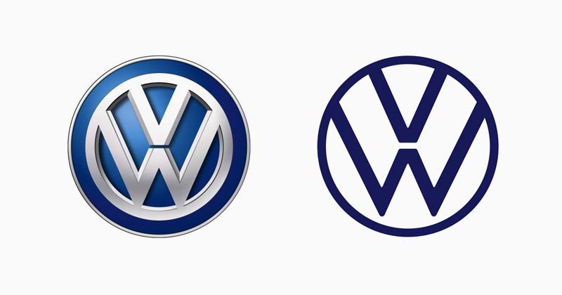
Volkswagen unveiled a flat, two-dimensional logo at the IAA Frankfurt motor show in September 2019, replacing its chrome-effect 3D badge. According to Dezeen, the lines got thinner and the "W" now floats inside the circle instead of touching it.
What to borrow: small structural changes, like opening up negative space, can make a heritage mark feel new without losing recognition.
2. BMW
 (Source: The Verge)
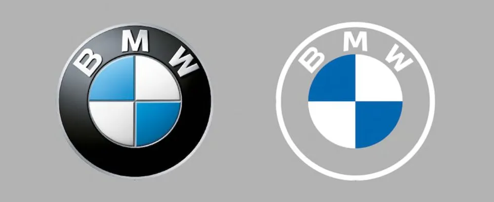
In 2020, BMW introduced a flat communications logo with a transparent outer ring, replacing the black ring it had used since 1917, per the BMW Group press release. The flat roundel is for marketing and digital, not the badge on the car.
What to borrow: it's fine to run a simplified communications version of a logo alongside a physical or product version, as long as the rules for each are clear.
3. Toyota
 (Source: Hype&Hyper)
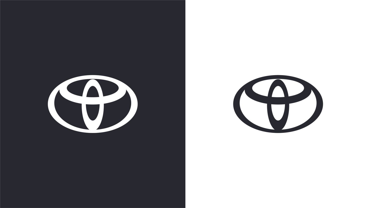
Toyota Motor Europe dropped the wordmark from its logo in 2020 and flattened the three-ellipse emblem into a 2D, mostly monochrome mark with a red accent. Dezeen reported the London agency The&Partnership led the work, which also introduced a Toyota Type typeface.
What to borrow: a regional identity can test a simpler mark in one market before a brand commits to it everywhere.
4. Nissan
 (Source: Nissan)
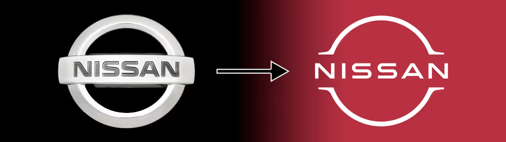
Nissan's in-house Global Design team flattened its badge in 2020, stretching the lettering with more spacing. Dezeen notes the illuminated version for EVs uses 20 LEDs, one for each year since the previous redesign.
What to borrow: give a physical logo a detail with a story behind it. It gives people and the press something to repeat.
5. Renault
 (Source: Wikimedia)
Renault unveiled a flat diamond made of two interlocking lozenges drawn as a line in January 2021, on the Renault 5 Prototype. Renault Group explains the design echoes its line-based logos of 1946, 1959 and 1972.
What to borrow: a flat mark doesn't have to feel generic when it's clearly rooted in the brand's own history.
6. Nokia
 (Source: Designhill)
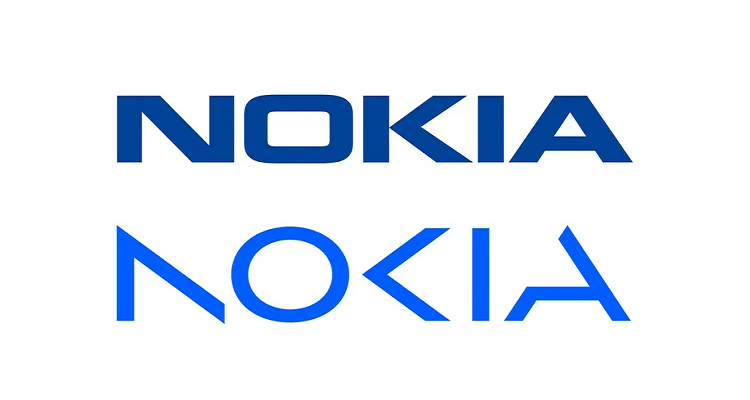
Nokia's 2023 rebrand, designed with Lippincott, broke the N, O and K into fragments that only read as "Nokia" together. It was a deliberate signal that the company had moved on from phones to network technology.
What to borrow: a modern wordmark can carry a strategic message, here collaboration and a new direction, without adding a single extra element.
7. Intel
 (Source: Creative Bloq)
Intel dropped its familiar swirl in 2020 for a flat, lowercase wordmark with a square dot on the "i", a nod to its original 1969 logo, as Brand New reported. The update arrived with a new house typeface.
What to borrow: digging into your own archive can give a modern redesign a story that feels earned rather than trendy.
8. Pfizer
 (Source: Wikimedia)
 Pfizer replaced the pill shape it had used for about 70 years with a two-tone blue double helix, rolled out in early 2021. Design Week credits New York agency Team with the design and Landor & Fitch with strategy.
What to borrow: when a company's business changes, the symbol can change with it. Pfizer moved from "pills" to "science".
9. Warner Bros.
 (Source: Wikmedia)
Chermayeff & Geismar & Haviv flattened the Warner Bros. shield, and the new version became the official consumer-facing logo in May 2023. Design Week reports the "W" and "B" were redrawn to match the stroke weight of the shield outline, with solid and outline versions for corporate and creative use.
What to borrow: matching line weights across a symbol makes it feel engineered as one piece rather than assembled from parts.
Symbols confident enough to drop the name
Only a handful of brands can remove their name and still be recognized. The ones that pull it off show how far simplicity can go, and they're a useful reality check for anyone considering a symbol-only mark.
10. Mastercard
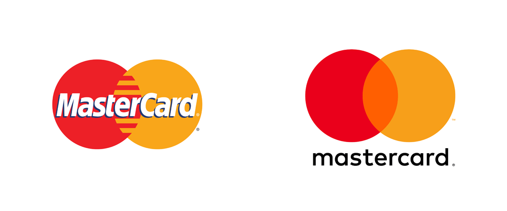 (Source: UnderConsideration)
Pentagram redesigned the Mastercard interlocking circles in 2016, mixing the overlap as light rather than ink so the circles look translucent. In January 2019 the brand began using the symbol without its name in some settings, after research found more than 80% of people recognized it unaided.
Earn recognition first, then simplify. Mastercard only dropped the name once the data showed the circles could carry it.
11. Starbucks
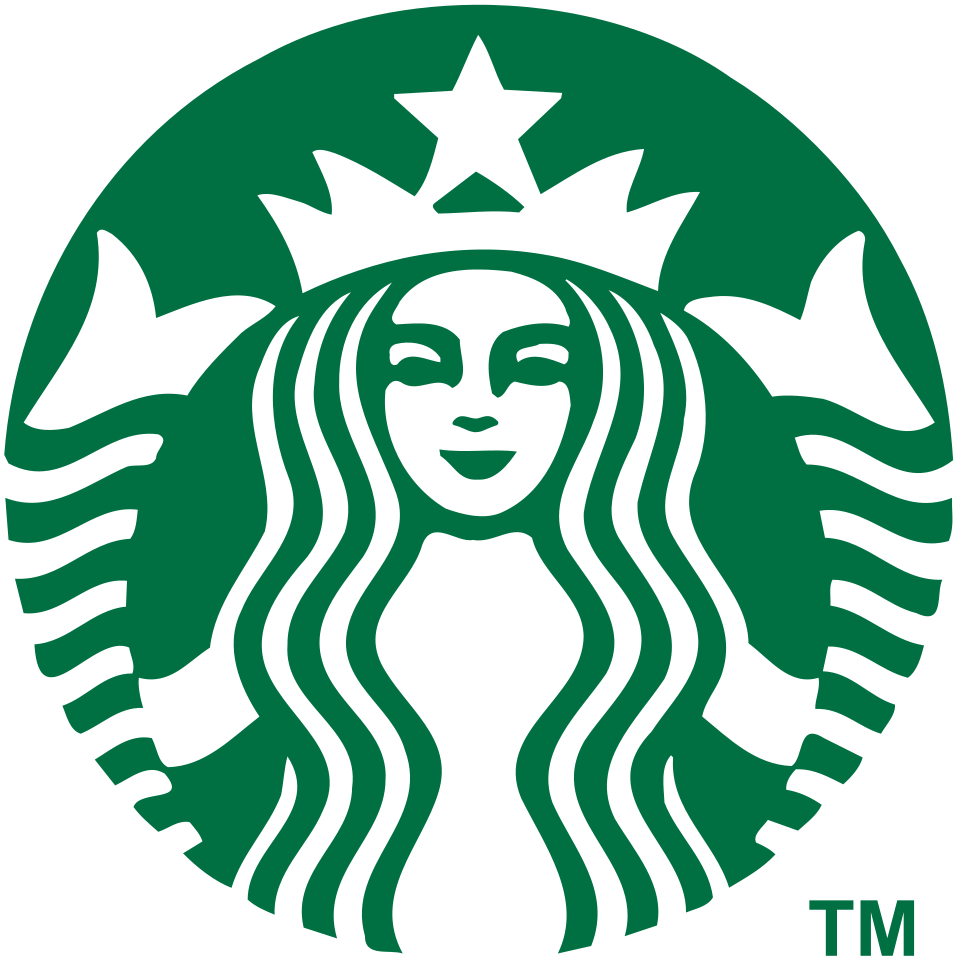 (Source: Wikipedia)
For its 40th anniversary in 2011, Starbucks removed the outer ring and the words "Starbucks Coffee", leaving the siren on her own in green. Logo Design Love's logo history traces how each earlier version led to this one.
What to borrow: removing words from a logo also removes the limits they imply. "Coffee" no longer fenced in what Starbucks could sell.
12. Airbnb
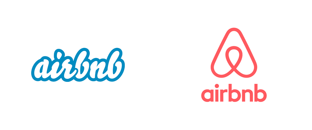 (Source: UnderConsideration)
Airbnb's Bélo, designed with DesignStudio in 2014, combines a person, a location pin, a heart and the letter A. Dezeen's launch coverage notes it shipped with a tool that let hosts create their own version.
What to borrow: a symbol that holds several ideas at once gives people more reasons to remember it, and more to talk about.
13. Meta
 (Source: Mint)
When Facebook became Meta in 2021, its in-house team designed a single continuous loop that reads as both an infinity sign and an "M". Dezeen reported the mark was built to move and rotate in 2D and 3D.
What to borrow: if your brand lives in motion or immersive formats, design the logo to animate from the start rather than adding motion later.
14. Discord
 (Source: Video Games Chronicles)
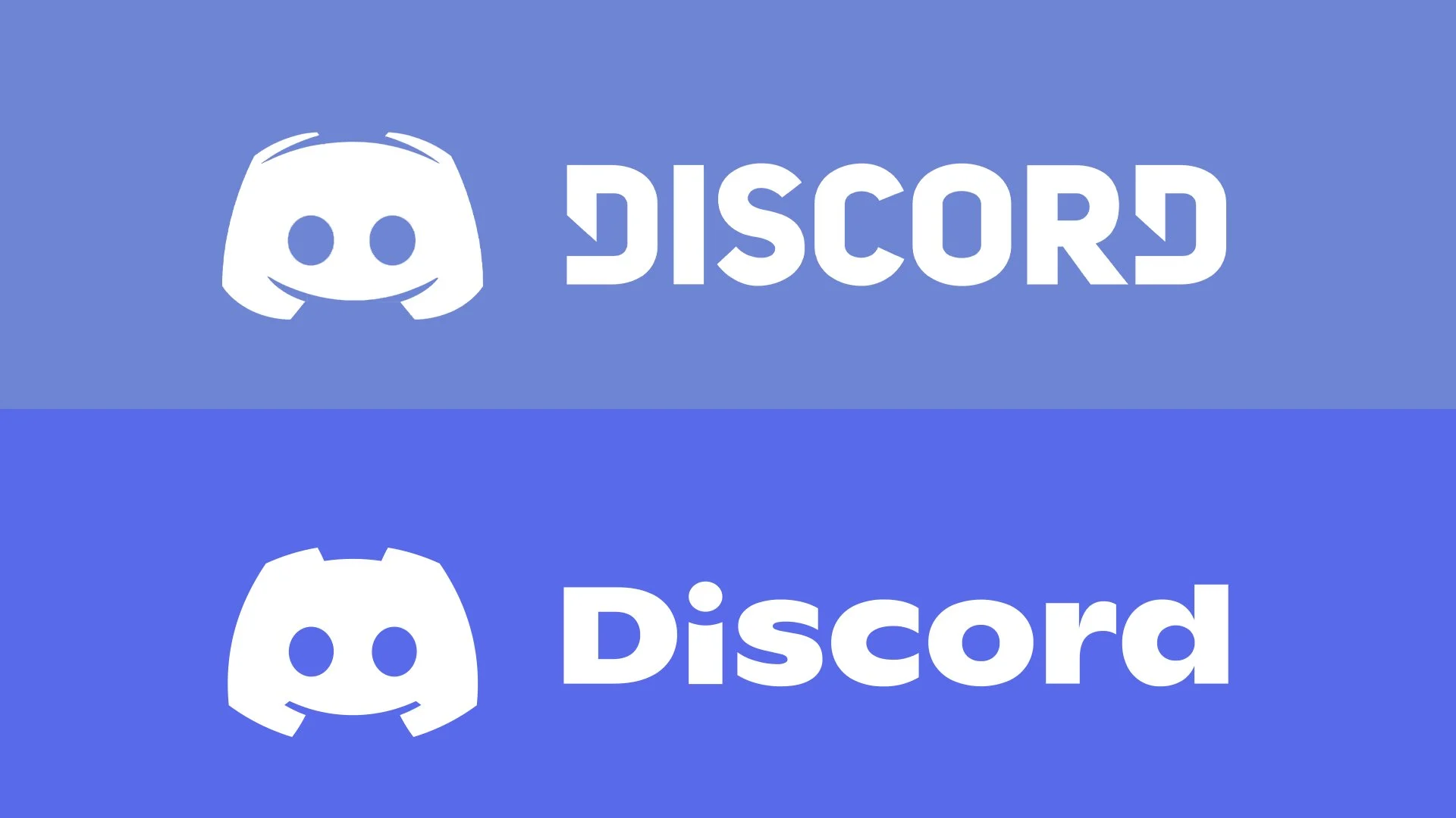
For its sixth birthday in 2021, Discord took its mascot Clyde out of the speech bubble, made it symmetrical and softened its sharp antennae into rounded shoulders. Discord's announcement also moved the wordmark from all caps to title case and brightened its signature "blurple".
What to borrow: freeing a character from its container can turn a friendly icon into a symbol that stands on its own.
Retro revivals with a modern finish
Not every modern logo looks forward. Some of the most talked-about redesigns of the last few years went back to an older mark and rebuilt it for today's screens. The trick is reviving the idea, not the dated execution.
15. Burger King
 (Source: Dezeen)
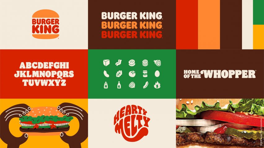
Burger King's 2021 rebrand by Jones Knowles Ritchie brought back a flat bun-halves logo inspired by its 1969 to 1999 marks. It replaced the glossy 1999 logo and its blue swoosh, and came with a custom typeface called Flame.
What to borrow: a retro mark feels modern when everything around it, from type to color to packaging, is designed as one system.
16. Pepsi
 (Source: PepsiCo)
Pepsi's 2023 identity moved the wordmark back inside the globe, a nod to the 1990s, and introduced electric blue and black. PepsiCo's announcement says the black ties the brand to Pepsi Zero Sugar and the logo was designed with a "pulse" for motion.
What to borrow: use color strategically. Pepsi's black does commercial work, not just decorative work.
17. Burberry
 (Source: CreativeBloq)
In 2023, under creative director Daniel Lee, Burberry revived its Equestrian Knight Design, first created through a public competition in the early 1900s. The knight carries a flag reading "Prorsum", Latin for "forwards", and the new version replaced the sans-serif wordmark introduced in 2018.
What to borrow: a heritage symbol can give a luxury brand distinctiveness that a clean sans-serif wordmark alone rarely achieves.
18. Peugeot
 (Source: Graphéine)
Peugeot Design Lab introduced a lion's head inside a shield in 2021, reviving a format the brand used in the 1960s. Dezeen notes it's the first Peugeot logo without the lion's full body since 1975.
What to borrow: cropping in on the most expressive part of a symbol, here the head and mane, can make a familiar mark feel bolder.
The return of depth
After a decade of flattening, a few brands are deliberately bringing gloss and dimension back. The difference from the 2000s is intent: depth is now a choice layered on a mark that already works flat, not a default effect applied to everything.
19. Twitch
 (Source: DesignCompass)
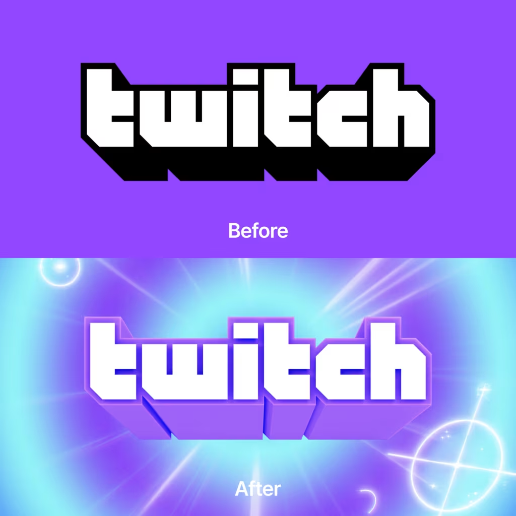
Twitch's 2024 identity refresh by Porto Rocha turned its "Glitch" icon from a flat mark into a glossy 3D one, backed by 3D motifs and a customized version of the Roobert typeface. Creative Review's coverage walks through the system.
What to borrow: if your audience lives in games and streaming, a tactile, dimensional logo can feel more native than a strictly flat one.
20. Xbox
 (Source: IGN)
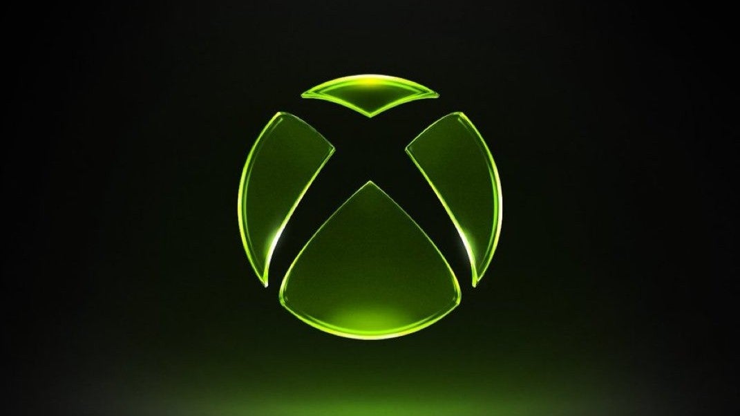
In 2026, Xbox updated its sphere-and-X logo with a translucent, glossy 3D treatment and a green glow while keeping the outline it has used since 2001. TheSixthAxis reported the change arrived with a new "We are Xbox" mission.
What to borrow: keep the silhouette people know and change only the finish. It's the lowest-risk way to make a legacy mark feel current.
Custom wordmarks and lettering
A wordmark built from custom letterforms is one of the most ownable assets a brand can have. These examples show how far lettering alone can push a brand's personality, for better and occasionally for debate. Our roundup of famous fonts and iconic typefaces is a good companion read here.
21. Kia
 (Source: Transform magazine)
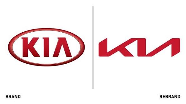
Kia unveiled a new logo in January 2021, dropping the oval and joining the letters in a single line that recalls a handwritten signature. Brand New covered the in-house work, and plenty of people famously read it as "KN" at first.
What to borrow: test legibility with people who've never seen the brand. A striking wordmark that's misread still needs the rest of the identity to explain it.
22. Jaguar
 (Source: Jaguar Media)
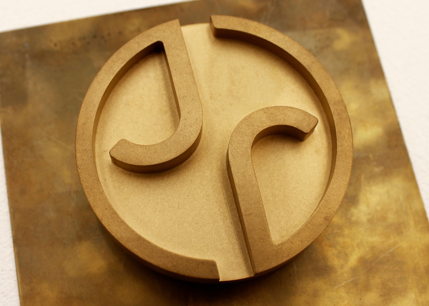
Jaguar's November 2024 rebrand introduced a mixed-case "JaGUar" wordmark, dropped the growling cat and turned the leaper into a brass "maker's mark". Creative Boom's coverage details the in-house team's new double-J monogram too.
It's one of the most divisive logo changes in years, which makes it a useful case study in how far a heritage brand can move before its audience pushes back.
23. Google
 (Source: Brand Vision)
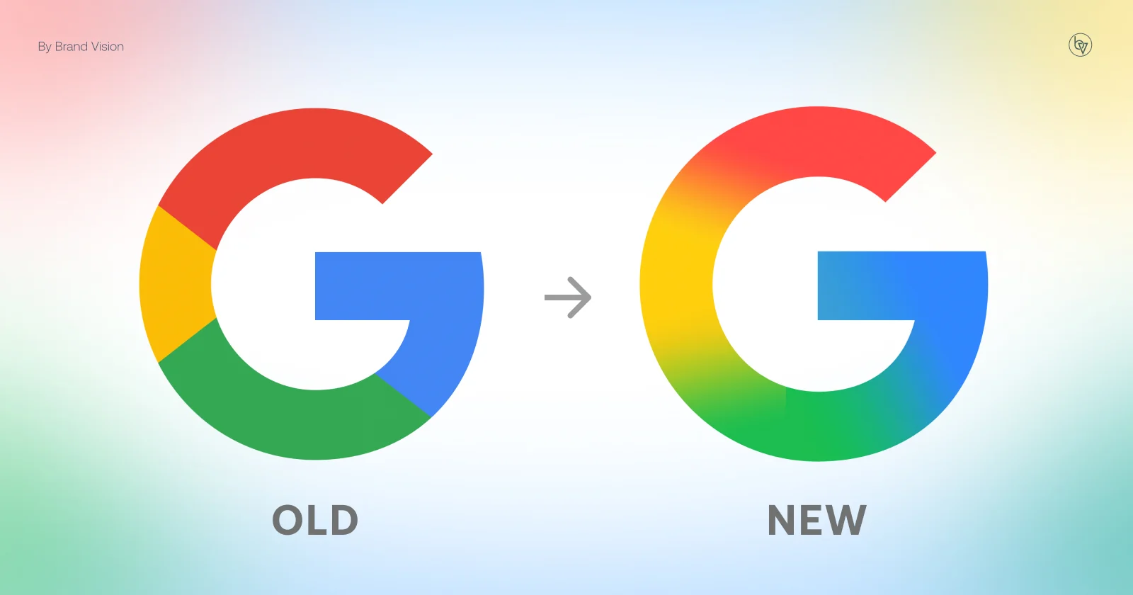
Google moved from a serif logo to its geometric Product Sans wordmark in 2015, keeping the tilted "e" and four colors, as Dezeen reported. In 2025 it updated the "G" icon with a brighter gradient and made it the company-wide icon.
What to borrow: a wordmark and an icon can evolve on different timelines, as long as they clearly belong to the same family.
24. Instagram
 (Source: Variety)
Instagram rebuilt its gradient in 2022 to look brighter and "lit from within" and launched its Instagram Sans typeface, per TechCrunch. In August 2026 it followed up with a redesigned wordmark, while the app icon stayed familiar. It was met with criticism.
What to borrow: refresh the supporting cast first. Instagram updated color, type and wordmark without touching the icon people tap every day.
25. PayPal
 (Source: Pentagram)
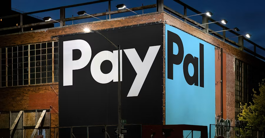
Pentagram's 2024 refresh for PayPal removed yellow from the system, refined the double-P monogram and set the wordmark in PayPal Pro, a custom version of the LL Supreme typeface. Creative Boom explains the monogram and wordmark now work independently, with motion based on tap, swipe and flip gestures.
What to borrow: motion inspired by how people use your product makes a logo feel like part of the experience.
26. Dunkin'
 (Source: Major Tom)
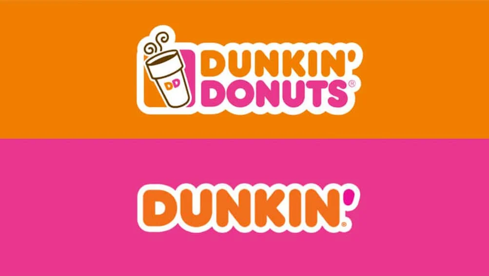
In 2018, Dunkin' Donuts became simply Dunkin', with Jones Knowles Ritchie keeping the chunky rounded wordmark and the orange and pink colors. Brand New covered the change as the new identity rolled out from January 2019.
What to borrow: sometimes the most modern move is editing the name, not redrawing the mark. Recognition stays, the limits go.
27. Uber
 (Source: Wolff Olins)
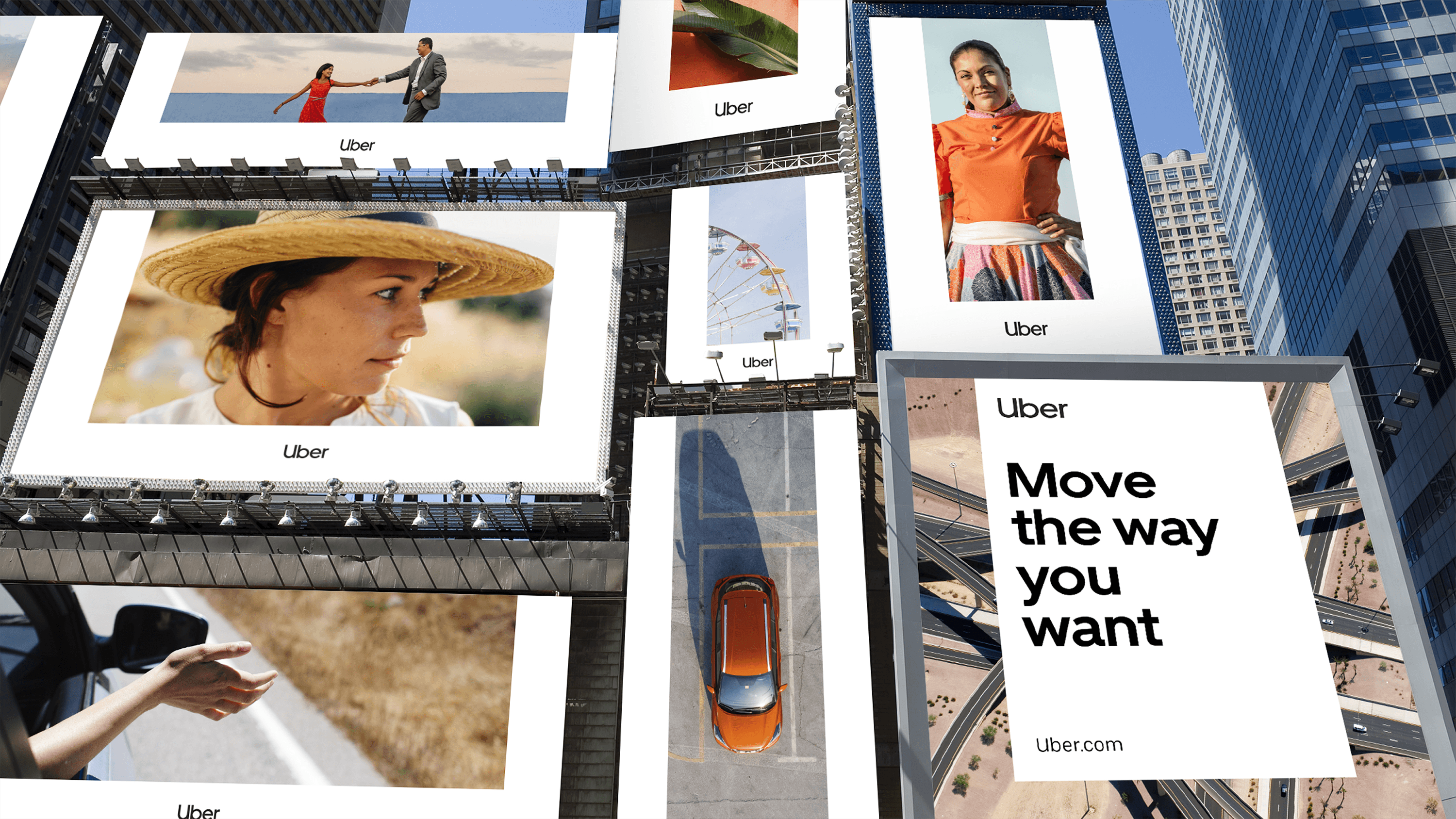
Uber's 2018 rebrand with Wolff Olins replaced the confusing 2016 "bit" symbol with a plain wordmark in white on black. Dezeen reported the custom Uber Move typeface draws on transport wayfinding like the New York subway and London Underground.
What to borrow: if an abstract symbol confuses people, a clear wordmark is a perfectly modern answer.
28. Walmart
 (Source: Fox)
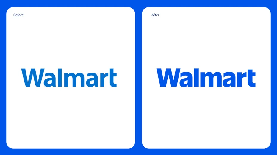
Walmart's in-house team refreshed its logo in January 2025 with fuller, tighter letters inspired by Sam Walton's trucker hat, a refined Spark with rounded rays and a brighter "True Blue". Dezeen's coverage notes the typeface is Everyday Sans.
What to borrow: a subtle refresh rooted in founder history can modernize a mass-market brand without alienating anyone.
29. Škoda
 (Source: Skoda)
Škoda's 2022 identity made the ŠKODA wordmark the lead element, working the háček (the small accent over the S) into the lettering and introducing Emerald Green and Electric Green. Škoda's announcement says the winged arrow stayed on, flattened to 2D.
What to borrow: a distinctive character in your name, like a háček, can become the most ownable part of a wordmark.
30. Wise
 (Source: Wise)
Wise's 2023 rebrand with Ragged Edge strengthened its "fast flag" so it could stand alone as an icon and shifted the brand from fintech blue to bright green. Creative Review reports the Wise Sans typeface borrows letterforms from scripts around the world.
What to borrow: for a global brand, type that reflects many cultures can say "international" better than any symbol.
Logo systems built to flex
The most forward-looking modern logos aren't a single fixed file. They're systems with rules for color, motion and variation, built so a brand can stay recognizable while looking different in every context. If you're building one, a solid design system is what keeps the flexibility from turning into chaos.
31. LA28
 (Source: LA28)
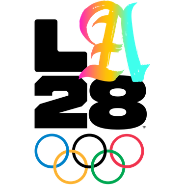
The LA28 Olympic and Paralympic Games logo keeps "L", "2" and "8" fixed while the "A" changes. It launched in 2020 with 26 versions of the "A" created by athletes and creatives, according to Design Week, and LA28 has kept adding more since.
What to borrow: a fixed frame with one variable element lets a community co-create the brand without breaking it.
32. Slack
 (Source: Pentagram)
Slack's 2019 logo, designed with Pentagram, cut its palette from 11 colors to four and rebuilt the hashtag from rounded, speech-bubble-like shapes. Slack's own announcement explains the old mark looked wrong on anything other than white.
What to borrow: if your logo only works on one background, that's a design problem worth solving before it's a brand problem.
33. Firefox
 (Source: Mozilla Firefox Blog)
Mozilla's 2019 system gave Firefox a more abstract fox and introduced a separate parent brand mark that sits above a family of product icons. Fast Company reported the work involved Johnson Banks and Ramotion alongside Mozilla's team.
What to borrow: when a single product becomes a portfolio, give the portfolio its own mark so each product icon doesn't have to carry everything.
34. Mozilla
 (Source: Mozilla Firefox Blog)
Mozilla's 2024 rebrand by Jones Knowles Ritchie rotates an "M" 90 degrees to form a flag, with one displaced pixel acting as an eye in a nod to the Mozilla dinosaur. Creative Review's write-up covers the pixel version and the new Mozilla typefaces.
A hidden detail rewards the people who look closely, and it gives a simple geometric mark a personality.
35. Spotify
 (Source: Spotify)
Spotify's circle with three sound waves is instantly recognizable, but the identity around it does the heavy lifting. Collins' 2015 refresh introduced bold duotones and expanded the palette, and in 2024 Spotify launched its own typeface, Spotify Mix.
What to borrow: a simple icon can stay put for a decade when color, type and imagery keep the brand feeling current.
36. Dropbox
 (Source: Dropbox Blog)
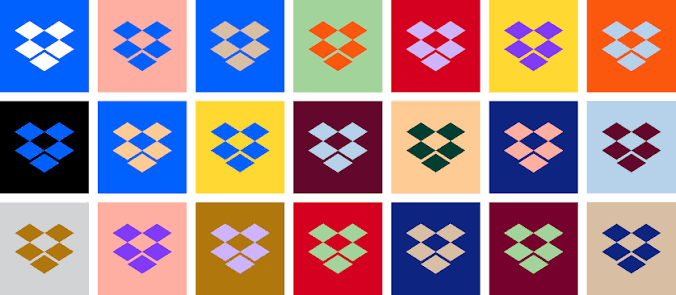
Dropbox's 2017 rebrand by Collins flattened its open-box mark and let it change color, paired with the Sharp Grotesk typeface, a bright palette and sketch-style illustration. Creative Review's write-up covers the thinking behind the system.
What to borrow: a simple mark gives you room to be bold everywhere else.
37. Duolingo
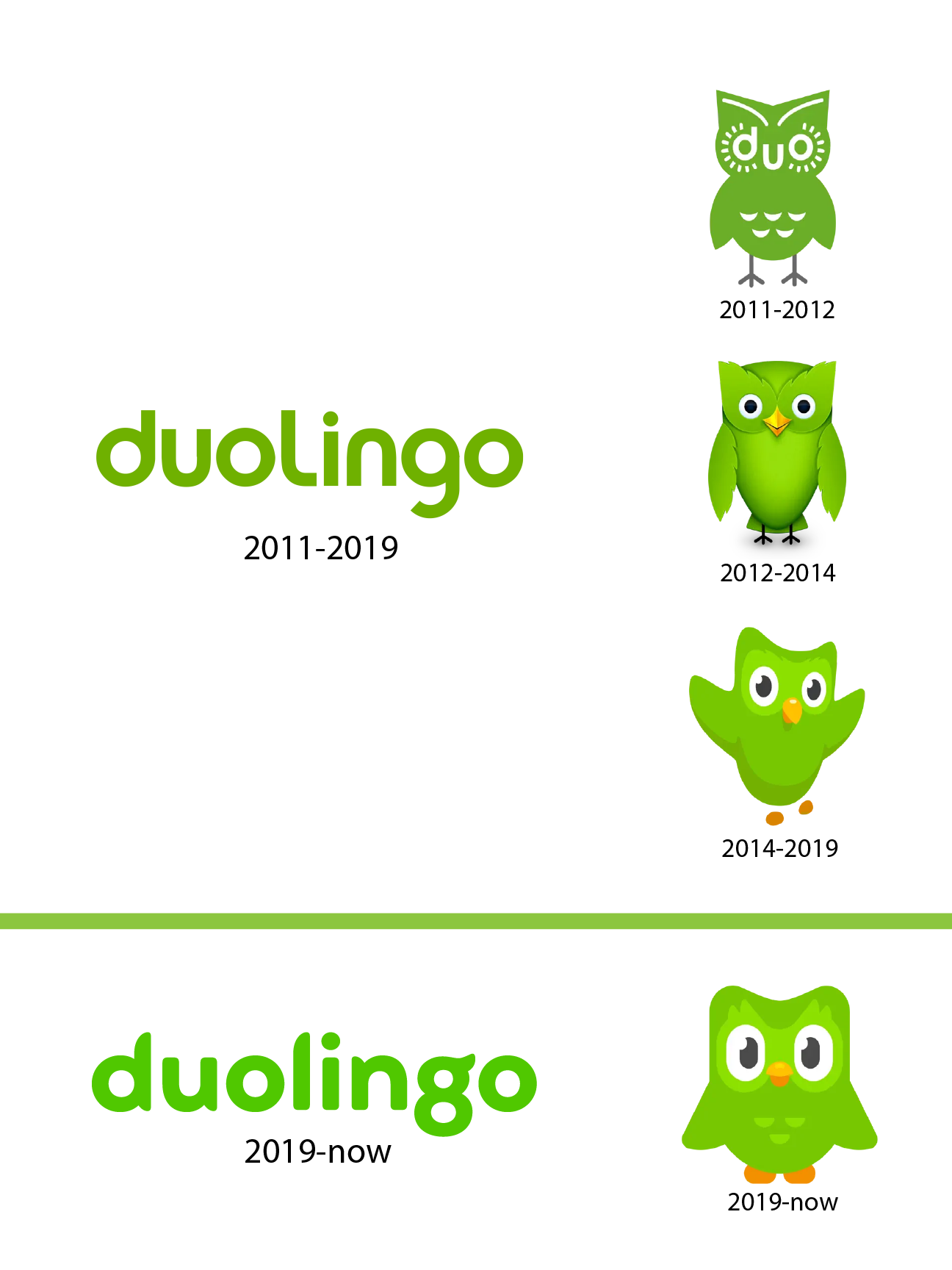 (Source: Duolingo)
Duolingo's 2019 refresh by Johnson Banks, with Fontsmith, simplified its owl mascot Duo into rounder, more geometric shapes and introduced a custom typeface, Feather Bold. Creative Review notes the letterforms borrow from Duo's feathers.
What to borrow: when a mascot is your most recognizable asset, let the logo and type take their cues from it.
38. Reddit
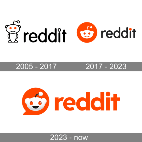 (Source: Kimp)
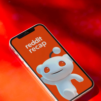
Reddit's 2023 refresh turned its alien mascot Snoo into a 3D character and made Snoo's head inside a red chat bubble the new logo. TechCrunch reported the update also introduced an open-source Reddit Sans typeface and a wider color palette.
What to borrow: open-sourcing a brand typeface can turn a community into ambassadors for the identity.
Enterprise logos that hold up at scale
Superside is the world's leading AI-first creative partner, and brand identity work, from logo design to visual systems and guidelines, is part of what our branding services team delivers. Our 500+ creatives across 67 countries pair craft with AI-powered workflows, always human-directed.
Your creative team's creative team, in practice, means we don't stop at the logo file. We build the system around it and then produce the assets that put it to work, starting with our own brand.
39. Superside
When we refreshed our own brand in 2025, we didn't throw out the logo. We refined it by condensing the signature Superside squiggle to make it sharper and sleeker, and paired it with Inter Tight and Instrument Serif to bridge the human and tech sides of the brand.
The rebrand was made with Superside's own creative services, from research through rollout, and the full story covers how we did it. The squiggle itself dates back to our 2019 rename from Konsus.
40. Antler
 (Source: Antler x Superside)
Global early-stage investor Antler came to Superside to align a new message with a refreshed visual identity. Superside's branding team delivered the full brand refresh in 3.5 months, ahead of a four-month deadline, working with Antler's leadership across multiple locations.
The refresh then scaled across email, landing pages, social media, video, reports and eBooks, which is where a new identity either holds together or quietly falls apart. See more of our work in the Superside portfolio.
Here's every example in this guide in one table, so you can scan by style or by who designed it. Each one links to its full breakdown and source further down.
| Brand | Current logo introduced | Style | Designed by |
|---|---|---|---|
| Volkswagen | 2019 | Flattened | In-house |
| BMW (communications logo) | 2020 | Flattened | BMW |
| Toyota (Europe) | 2020 | Flattened | The&Partnership |
| Nissan | 2020 | Flattened | Nissan Global Design |
| Renault | 2021 | Flattened | In-house |
| Nokia | 2023 | Flattened wordmark | Lippincott |
| Intel | 2020 | Flattened wordmark | Intel |
| Pfizer | 2021 | Simplified symbol | Team, with Landor & Fitch |
| Warner Bros. | 2023 | Flattened shield | Chermayeff & Geismar & Haviv |
| Mastercard | 2016 (symbol-only use from 2019) | Wordless symbol | Pentagram |
| Starbucks | 2011 | Wordless symbol | In-house, with Lippincott |
| Airbnb | 2014 | Abstract symbol | DesignStudio |
| Meta | 2021 | Abstract symbol | In-house |
| Discord | 2021 | Character symbol | In-house |
| Burger King | 2021 | Retro revival | Jones Knowles Ritchie |
| Pepsi | 2023 | Retro revival | PepsiCo Design & Innovation |
| Burberry | 2023 | Archive revival | Burberry |
| Peugeot | 2021 | Archive revival | Peugeot Design Lab |
| Twitch | 2024 | Glossy 3D | Porto Rocha |
| Xbox | 2026 | Glossy 3D | Xbox |
| Kia | 2021 | Custom wordmark | Kia Global Design, with Blackspace |
| Jaguar | 2024 | Custom wordmark | In-house |
| 2015 (gradient G icon 2025) | Custom wordmark | In-house | |
| 2022 refresh, new wordmark 2026 | Gradient icon and wordmark | In-house | |
| PayPal | 2024 | Monogram and wordmark | Pentagram |
| Dunkin' | 2018 | Custom wordmark | Jones Knowles Ritchie |
| Uber | 2018 | Custom wordmark | Wolff Olins, with Uber |
| Walmart | 2025 | Wordmark and symbol | In-house |
| Škoda | 2022 | Custom wordmark | In-house |
| Wise | 2023 | Wordmark and icon | Ragged Edge, with Wise |
| LA28 | 2020 | Dynamic logo | Jeremy Mickel and collaborators |
| Slack | 2019 | Simplified symbol | Pentagram, with Slack |
| Firefox | 2019 | Icon system | Mozilla, with Johnson Banks and Ramotion |
| Mozilla | 2024 | Flexible system | Jones Knowles Ritchie |
| Spotify | 2015 identity | Flexible system | Collins (2015 identity) |
| Dropbox | 2017 | Flexible system | Collins |
| Duolingo | 2019 | Mascot-led system | Johnson Banks, with Fontsmith |
| 2023 | Mascot-led system | In-house | |
| Superside | 2025 refresh | Refined wordmark | Superside |
| Antler | Refresh delivered in 3.5 months | Identity refresh | Superside |
How to design a modern logo that lasts
Every example above started with a problem, not a style. Here's the process we'd recommend, whether you're redesigning a heritage mark or creating one from scratch.
- Start with strategy. Define what the brand stands for, who it's for and what's changed. Nokia and Pfizer redesigned because their businesses had moved on. Our list of questions to ask when designing a logo is a good starting brief.
- Audit what you already own. Intel, Renault, Peugeot and Burberry all found their answer in the archive. Keep the equity people already recognize.
- Design small first. Test the mark at favicon and app-icon size before you look at it on a billboard. If it fails at 16 pixels, simplify.
- Choose type deliberately. Custom or modified lettering is more ownable than an off-the-shelf font. Kia, PayPal, Uber and Wise all invested here.
- Limit the palette. Slack went from 11 colors to four and PayPal dropped yellow. Fewer colors make a mark easier to reproduce and easier to remember. Our guide to color theory covers the basics.
- Plan for motion and variants. Decide how the logo animates, what the icon-only version looks like and how it behaves in dark mode.
- Write the rules down. Clear-space, minimum size and misuse examples belong in your guidelines. Brand guidelines are changing in the AI era, so make them usable by people and systems alike.
The trendy vs. timeless question has a practical answer: keep the core mark simple and let color, motion and finish carry the trends. That's how Spotify's icon has stayed put while its identity keeps moving, and how Xbox could add gloss without redrawing its sphere. For more on what's shifting this year, see our take on branding trends for 2026.
If you're tempted to shortcut the process, our review of AI logo generators covers what they're good for and where a designer still makes the difference.
The logo is the easy part
Look back at the examples above and a pattern shows up. The logo change got the headlines, but the real work was everything after: hundreds of templates, ad variants, decks and product screens that all had to feel like the same brand.
That's where most identities drift. A new mark launches with a tidy guidelines PDF, then three agencies, a dozen freelancers and a busy in-house team each interpret it slightly differently. Rolling out a global rebrand is its own discipline for a reason.
This is why every Superside engagement runs on Brand Brain, which holds your logo rules, clear-space specs, color and type decisions and past feedback as validated brand knowledge. Because every brief starts from that same understanding, new work is on brand from the first draft, with fewer review rounds spent correcting logo misuse.
Being AI-first means AI is embedded across the entire creative model, from how teams are trained to how brand knowledge compounds over time. You can read more about how Superside pairs human talent with AI.
Planning a new logo or a full identity refresh? Book a call and we'll show you how we'd approach it.
FAQs

How 400+ brands get more work done, without doing more
They Superside it. Fast, high-quality creative from the
AI-powered creative service that handles it all.


Get solutions to enterprise design challenges
Struggling to deliver creative at scale?
Check out these resources to find a better way.