


Your product packaging is much more than a physical container. It reflects your brand identity and serves as a powerful marketing tool that ultimately determines whether customers buy from you or not. Discover how creative packaging design can woo consumers at first glance and be inspired by 20 superb packaging design examples.
While it’s true that you can’t judge a book by its cover, the opposite holds true in the world of product packaging.
Here, it’s all about the presentation. In fact, 72% of U.S. consumers report that packaging design influences their purchasing decisions, and 67% place value on the materials used.
Also, with the global packaging market projected to expand from $1,080.13 billion in 2024 to $1,452.86 billion by 2032, it’s essential to ensure your brand stands out in online stores and on shop shelves.
Superside can help. This article begins with essential due diligence: We address the challenge of how to select suitable product packaging and provide a guide to help you evaluate your options. Then, we showcase 19 effective packaging design examples and examine their success.
What makes packaging design so important for my brand?
Your product’s packaging design is a powerful marketing lever that can build trust, shape brand perception and drive sales.
Packaging is often the first tangible interaction a customer has with a brand, which makes it an ideal platform to showcase your brand’s character, values and positioning.
The label, the box, the jar. Whatever you use, your packaging can also set your product apart from competitive products and be the deciding factor when customers decide what to add to their cart. And if the packaging is memorable, there’s a good chance these individuals will become return customers.
Of course, good design also ensures that the packaging is easy to ship, store, open, use and dispose of. It not only saves you money but also helps the environment and delivers an excellent experience.
How can I choose the best product packaging?
It’s important to match your product packaging to your brand identity, budget, sustainability goals, product shelf life and the overall customer experience you hope to achieve.
Let’s take a look at what to focus on:
1. Budget: What you can afford today and in the future
Besides production costs, include storage, shipping and returns in your packaging ROI.
- Low budget: Stick to standard shapes, limited colors, recycled paperboard or kraft paper.
- Mid-range budget: Add sophisticated touches, such as good-quality paper, foil or interior printing.
- High budget: Go for gold. Think magnetic closures, QR codes that lead to AR experiences and luxury finishes.
Insider tip: Begin with a budget-friendly option and upgrade as you expand and grow.
2. Sustainability: Consider the environmental impact
As consumers become more environmentally conscious, it’s critical to keep sustainability in mind. About half of U.S. consumers are happy to pay more for sustainable products.
To reduce your company’s environmental impact and attract eco-conscious consumers:
- Choose recyclable, biodegradable or compostable materials.
- Avoid mixed materials (e.g., plastic-laminated paper) as they’re hard to recycle.
- Design for reusability, if possible.
- Use minimal ink or water-based materials.
Insider tip: Choose product packaging partners that align with your sustainability goals. They should also be transparent about how they source materials.
3. Visual impact: Your brand identity is key
Good packaging design can help you convey your brand identity and ultimately attract the right customers.
To grab attention and communicate your brand’s personality:
- Use unique colors, fonts and finishes.
- Maintain a consistent visual look and feel across your product range.
- Align your packaging design with the market position you aim for (e.g., “premium” for high-end customers or “playful” for kids).
Insider tip: Request prototypes or samples to evaluate brand fit before you finalize your packaging design.
4. Customer engagement: The unboxing experience
If a container or label has tactile appeal, people tend to respond positively to it.
Top tips:
- Make a strong impression with textured surfaces or embossed letters.
- Make it enjoyable and intuitive to open, use and dispose of the packaging.
- Optimize the unboxing experience. Incorporate unique elements, such as custom-printed tissue paper or branded seals.
Insider tip: A personal touch, such as a handwritten note or complimentary samples, can further enrich the experience.
5. Materials: Why they matter
High-quality packaging materials ensure safety, preserve the products inside, build brand perception and promote sustainability. Experiment with innovative materials that will reflect your brand’s story accurately and resonate with your target market.
Stay updated on the top trends in product packaging design to keep your packaging relevant and impactful in 2026 and beyond.
Insider tip: In retail? Explore mushroom packaging, an innovative, sustainable alternative to traditional plastic. It’s plastic-free, ocean-friendly, water-resistant, biodegradable and natural.
6. Logistics: Optimize for shipping, storage and durability
Stackable and space-efficient designs help maximize storage. Choose lightweight materials to reduce shipping costs. Also, make sure containers are durable to prevent damage during transit, and integrate a 3PL WMS to optimize logistics by improving warehouse management.
Insider tip: Test the materials thoroughly before you scale things up.
Why Superside is the top packaging design service for successful brands

Effective packaging design combines several key elements: Functionality, aesthetics, brand consistency, sustainability and clarity. Superside can help you tick all these boxes.
Our talented creative teams are skilled at creating eye-catching product packaging that helps brands stand out and make a memorable impression. We know what makes good graphic design exceptional and understand its importance in creating a distinctive visual identity for your brand.
Importantly, we’ve demonstrated excellence in packaging design. The numbers say it all:
- Superside has completed over 11,000 packaging and merchandise design projects to date. This translates to more than 85,000 hours spent perfecting creative packaging for our customers.
- Over 180 enterprise brands have successfully used our packaging design services.
If you’re on the hunt for custom packaging advice, we’ve compiled a list of tips and tricks to help shape your direction. However, if you’d prefer a packaging design partner to elevate your brand to iconic status, you’ve landed on the right website.
Superside is the only AI-powered creative service built to be your creative team’s creative team. We provide in-house teams at enterprise companies with a flexible, scalable method for creating custom packaging that meets their budget and marketing needs.
Are you ready to Superside your creative? Just do it!
19 best examples of packaging design in 2026
It’s time to set the bar for what’s possible. Use this curated list of product packaging design examples to kickstart your own creative process.
1. AcreMade: Packaging design that scales with brand growth

(Source: Superside)
Industry: Food and wellness
Overview: When AcreMade launched its pea-protein egg alternative, the company wanted to refine its brand identity, produce high-quality creative and have a degree of flexibility. The dynamic team partnered with Superside to access top global creatives through our convenient subscription model.
Key packaging design insights: As AcreMade’s design requirements grew, Superside’s flexible creative team scaled its creative output accordingly. Our top-quality work enabled AcreMade’s leadership team to focus on its go-to-market strategy and maximize the product’s potential for market success.
2. Scanwood: Packaging design that tells a story

(Source: Pinterest)
Industry: Kitchenware
Overview: Scanwood, a Danish company that manufactures wooden kitchen utensils, sought to communicate that its products are crafted from natural, sustainable materials and that they use an eco-friendly production process.
Key packaging design insights: Clear graphics showcase the products’ connection to nature and sustainability, and the “Designed in Denmark, made by Nature” tagline underscores the story. Together, these elements provide consumers with a direct connection to the products’ source.
3. Girlfiend Collective: Reusable packaging design that serves a purpose

(Source: Looka)
Industry: Athleisure wear
Overview: Girlfriend Collective operates under a transparent, ethical business model. Everything, from the materials they use to the factories in which they operate, reflects this commitment. For example, the brand includes a reusable pouch made from 100% recycled cloth with every purchase.
Key packaging design insights: Every time a customer receives a reusable pouch with an order, the brand sends a strong sustainability message. The packaging’s clean, minimalist style and neutral, natural colors also reflect the brand’s commitment to nature and sustainability.
4. Sonoco: Eco-friendly packaging design that promotes sustainability

(Source: Sonoco)
Industry: Dry foods, powdered beverages, snacks and other shelf-stable goods.
Overview: As pressure mounts on food and beverage companies to eliminate mixed-material packaging that complicates recycling, Sonoco has introduced an all-paper tube. It replaced its traditional metal bottom with a fiber-based one, which means the entire container is now made from recycled paper fiber.
Key packaging design insights: This multi-layered paperboard can is a recyclable packaging hero. It’s durable, keeps products fresh and is 100% recyclable, unlike standard composite cans that require special sorting.
5. Martini: Packaging design that maintains relevance

(Source: Dieline)
Industry: Beverages
Overview: Martini hasn’t skipped a beat as the shift towards a sober-curious culture continues to gain momentum. In fact, the brand has given its new non-alcoholic aperitivos a fresh look that also hints at its iconic style.
Key packaging design insights: With this design, Martini illustrates how a classic brand can stay relevant. The new packaging mirrors the brand’s instantly recognizable quality and stays true to Martini’s traditional Italian roots, yet it feels 100% in step with today’s design trends.
6. Let's Chill: Packaging with a bold color profile

(Source: Packaging of the World)
Industry: Beverages
Overview: Let’s Chill is a fresh take on ready-to-drink cocktails. The brand’s packaging, designed to connect with a predominantly female audience, features fun illustrated characters, mood-specific taglines and bold typography.
Key packaging design insights: This quirky packaging design strikes the perfect balance between playful and premium. Its fresh matte aesthetic enhances the bold, color-coded designs and instantly conveys personality for maximum shelf appeal.
7. One Trick Pony: Solution-oriented packaging

(Source: Trend Hunter)
Industry: Food
Overview: One Trick Pony has redesigned its peanut butter jars to tackle oil separation, a common issue for natural peanut butter fans. The new, leak-proof lid allows the jar to be stored upside down, so the oil settles at the bottom. When flipped upright, the perfectly mixed peanut butter doesn’t create a mess.
Key packaging design insights: One Trick Pony’s unique packaging remedies a significant obstacle that stops many consumers from choosing unprocessed peanut butter. The simple solution offers the convenience that natural nut butters usually lack.
8. Tokri: Packaging that's a work of art

(Source: Dieline)
Industry: Food
Overview: Tokri is a spice company that celebrates Afghan heritage through its flavors. Its glass jars feature bold, block-printed designs in rich jewel tones, accented with vibrant saffron. The gold lids add a vintage touch, which makes the products stand out on shop shelves.
Key packaging design insights: Tokri’s packaging is a warm tribute to Afghan heritage. The design strikes a balance between handmade and meticulous, and makes consumers feel as though they’ve stepped into someone’s kitchen for an authentic culinary experience.
9. Coca-Cola: Innovative shapes

(Source: Coca-Cola)
Industry: Beverage
Overview: Recently, the Coca-Cola Company launched redesigned, lighter PET bottles. These new shapes, the first in a decade, use innovative materials to create lightweight, high-quality bottles that maintain carbonation levels.
Key packaging design insights: The new packaging shapes align with the company’s sustainability goals. Coca-Cola aims for a 17% reduction in per-bottle emissions and a cut of approximately 800 million plastic bottles this year.
10. Rollr: Sustainable packaging that prioritizes design

(Source: Dieline)
Industry: Personal care
Overview: Rollr has redefined the world of deodorant. It offers a refillable, concentrated natural antiperspirant in an elegant glass bottle with a stylish gemstone roller. Users add water, which cuts shipment weight and emissions.
Key packaging design insights: While the brand is highly focused on sustainability, it understands the appeal of minimalist design. Rollr’s luxurious deo delivery system is crafted from high-quality materials. We simply love how the brand has turned a daily chore into a covetable experience.
11. Wild: Innovative packaging design

(Source: Morrama)
Industry: Personal care
Overview: Personal care brand Wild is on a mission to shake up the throwaway culture of bathroom products. One of the innovative materials it uses to construct its plastic-free refillable shower gel is Vivomer, a 100% home-compostable material.
Key packaging design insights: Wild lets customers unscrew an infinitely recyclable aluminum bottle and add a compostable refill. Fans can select stylish aluminum cases that suit their decor, which adds a bit of fun to the recycling process. The brand also offers monthly refill subscriptions to help decrease packaging waste.
12. Dwell: Clever carry-ready packaging

(Source: Dieline)
Industry: Food and beverage
Overview: Verve Coffee Roasters showcases its Dwell Dripper with creative packaging that engages customers while they wait in line. The bold packaging makes a strong impression and protects the product during shipping, which helps keep production and logistics costs in check.
Key packaging design insights: Dwell’s packaging design reveals the perfect balance of form and function. The clever casing serves as stage and storage, and highlights the product’s colors and features.
13. York Coffee: Fascinating packaging

(Source: York Coffee Emporium)
Industry: Food and beverage
Overview: It can be hard to find your perfect brew online. And since customers can’t taste or smell the coffee, it’s a tough sell for brands. York Coffee Emporium devised a great solution: The company updated its standard craft bags with a new brand identity that features characters inspired by York’s rich heritage.
Key packaging design insights: Each coffee bag displays the brand’s heritage in a quirky way. The bags also emphasize the unique flavors of each coffee type to get customers’ attention.
14. Nijasol: Irresistible packaging

(Source: Design & Paper)
Industry: Food
Overview: This product packaging design features a monster with a craving for tomatoes. The cherry tomatoes can be seen through a mouth-shaped window. A tomato-stalk crest serves as a closure, and the slogan “Monsters are cool and so are tomatoes” invites kids to enjoy cherry tomatoes in a fun, interactive way.
Key packaging design insights: This example demonstrates how successful packaging design can seamlessly blend creativity and innovation to capture the attention of both children and parents. It turns the simple act of eating veggies into an enjoyable experience.
15. Black Bee Honey: Buzz-worthy packaging

(Source: Design Everywhere)
Industry: Food
Overview: Black Bee Honey offers pure, single-origin British honey to combat the rise of manufactured honey. The label supports its “Keep British Honey Wild” strategy and showcases wild characters that reflect the brand’s values.
Key packaging design insights: The product packaging tells the story of each honey’s origin through carefully designed labels that feature a range of landscapes and seasonal elements. The design showcases the company’s commitment to the preservation of vital habitats for bees.
16. Totem Cereals: Packaging to play

(Source: Moss & Fog)
Industry: Food
Overview: Totem Cereal’s containers resemble a fun toy rather than a typical cereal box. The colorful, stackable tubes can be reused for stationery, small toys or other items. Inspired by Aztec totems and masks, each cylindrical shape doubles as a vibrant character that can be stacked like a totem pole.
Key packaging design insights: The product packaging is not only beautiful; it demonstrates Totem Cereals’ commitment to sustainability.
17. Okiedoggie: Playful and unique packaging

(Source: Packaging of the World)
Industry: Pets
Overview: The business owner behind Okiedoggie is a real-life chef who wanted to create premium, oven-baked pet treats that humans could also enjoy. The brand aimed to reduce its environmental footprint in this way.
Key packaging design insights: It’s difficult to match the playful graphics on Okiedoggie’s dog treats. The brand’s packaging bursts with personality and stands out in the pet food aisle. Vibrant colors and playful illustrations make the packaging design synonymous with fun.
18. The Sunday Standard: Minimalist product packaging

(Source: The Sunday Standard)
Industry: Beauty
Overview: The Sunday Standard, a plant-based, science-backed skincare brand, updated its packaging from a stark white design to sophisticated cool-toned boxes embellished with black foil print. The product packaging range includes glass bottles and jars screen-printed with white ink.
Key packaging design insights: The packaging design combines a minimalist aesthetic with a refreshing tactile twist. The overall feel is fresh without being overly clinical or cold. The design also still perfectly aligns with The Sunday Standard’s minimalist brand identity.
19. Beyond: Classic packaging with a bold twist

(Source: Studio Mezcla)
Industry: Food
Overview: Peruvian brand Beyond put a modern spin on classic sweets. Its bold packaging design showcases a unique “B” symbol that also acts as a practical tab: When you open the box, the “B” expands to reveal the Beyond logo. This creates a sense of “going beyond,” as the brand’s name suggests.
Key packaging design insights: The brand knows how to enhance its product and create a joyful unboxing experience. With its red and pink color scheme, Beyond’s bold packaging design also captures the attention of consumers, young and old.
Nail your brand’s packaging design with Superside
Your brand deserves a partner that understands the art, science and strategy behind world-class product packaging design.
That’s where Superside comes in. With a proven track record across 11,000+ packaging projects and the trust of 180+ enterprise brands, we combine deep expertise and AI-powered efficiency to deliver standout design every time.
Why wait? Let’s help you design product packaging that stops your target customers in their tracks.
Key takeaways
- Packaging shapes first impressions, builds brand recognition and directly influences whether customers buy from you.
- The global packaging market is experiencing rapid growth. Design is a key differentiator.
- Six core factors drive packaging success: Budget, sustainability, visual impact, customer engagement, materials and logistics all play critical roles.
- Eco-friendly materials, minimal waste and reusable designs are essential for modern brands.
- Your packaging design must match your brand and target audience. From playful to premium, the right visual identity and tactile experience can turn casual buyers into loyal fans.
- Creative shapes, interactive features and clever solutions (like easy-open lids or reusable pouches) enhance both usability and brand perception.
- Superside ensures your packaging design isn’t only beautiful but also strategic, sustainable and ready for market success.
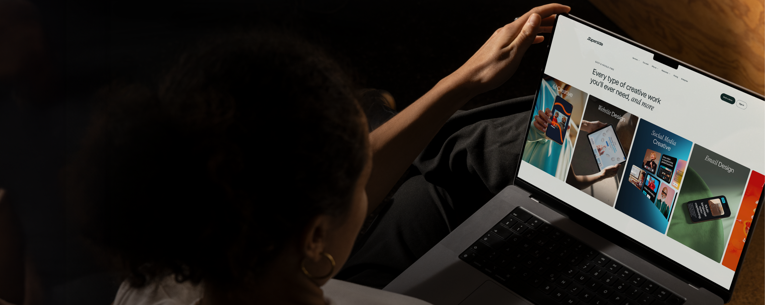
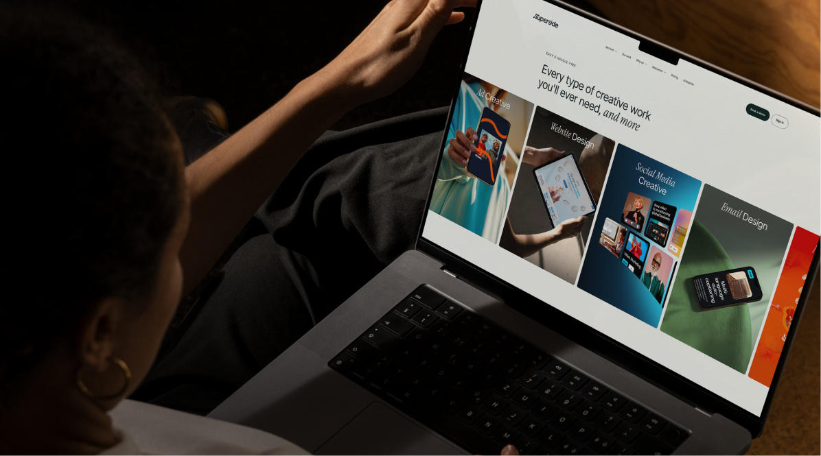
This is the quality you can create with Superside
Discover how Supersiders help global brands
launch high-impact campaigns at scale with top design.
We're your creative team's creative team.
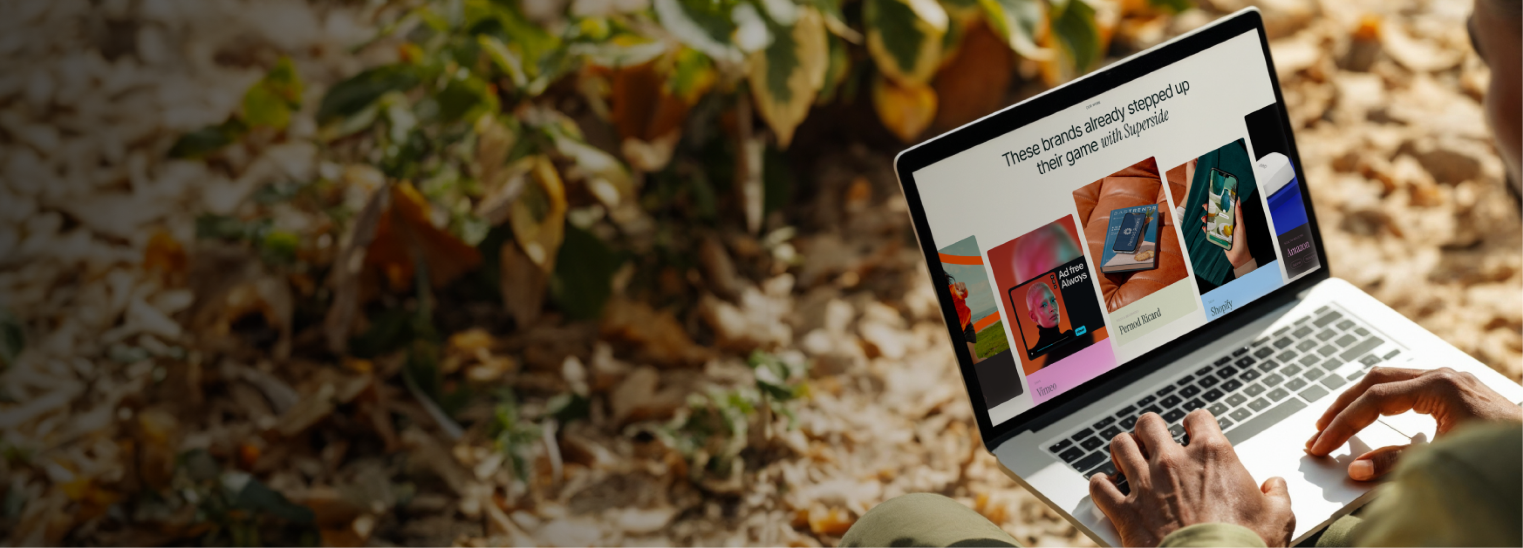
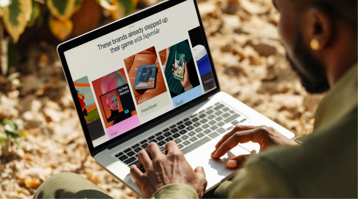
See how top brands do it
Looking for extra inspiration?
Check out more of Superside's brand projects.


How 500+ brands get more work done, without doing more
They Superside it. Fast, high-quality creative from the
AI-powered creative service that handles it all.


Your creative team's creative team
Choose the world's leading AI-powered creative service
and get high-performing ads, videos, experiences and
more at scale, on your schedule and to your standards.


