When a product works but feels “off,” it’s almost always a missing layer of interaction design. It’s a distinct specialization, different from UX or visual design, and most enterprise teams don’t have it in-house. This article breaks down what strong interaction design looks like at Apple, Wise, Airbnb, Google and Stripe, and how to access the expertise on demand through an external partner like Superside.
Your product works.
Features ship, flows complete.
Yet something feels off.
Buttons misbehave, transitions are jarring and loading states leave users guessing.
Most of the time, this isn’t a failure of the product team. It’s a structural gap.
Many enterprise teams have strong UX design, user research and visual design expertise. But interaction design, the specialization that defines how a product actually behaves in response to users, often goes missing.
Without this layer, products launch with solid functionality but deliver suboptimal engagement. Over time, that compounds into friction, support tickets and lower product satisfaction. Nielsen Norman Group has long argued that interaction design is the discipline that most directly shapes whether users feel a product is “good”, and the difference is rarely visible in a static screenshot.
The fix usually isn’t a full-time interaction designer. Most companies don’t have sustained need for one. The fix is bringing in outsourced specialists who live inside the small user interactions, transitions, button states, loading animations and feedback loops that make digital products feel responsive, intuitive and alive.
This article breaks down what great interaction design looks like, why generalist product design teams struggle to deliver it and why outsourced tech design specialists from an AI-first creative service like Superside offer the ideal solution.
Why teams struggle with product interaction design
Most enterprise product designers handle everything from user research and information hierarchies to wireframing, visual design, prototyping, usability testing and developer handoff.
Add the pressure of launching new products and features on time, and interaction design is often treated as a luxury rather than a necessity.
What interaction design is and isn’t
Part of the problem is that many product designers aren’t true masters of interaction design. They understand the principles at a conceptual level and know good interactions matter, but not much more.
Product designers are generalists who focus on what should be built and how it fits into the overall experience. They consider details like hover states and animations, but they don’t necessarily know how to refine those details to deliver a high level of polish.
A senior interaction designer, in contrast, lives in those details. They focus on how interface elements respond when clicked, how transitions communicate state changes, how motion guides user attention and more.
This skillset requires specialist knowledge of:
- Micro-interaction design
- Motion design for product applications
- User behavior and cognitive psychology (how users perceive cause and effect)
When interactions get deprioritized
Product teams often treat interaction design as “polish” on a “good enough” product. That makes it among the first things pushed aside when timelines and budgets tighten.
But when a product’s interactions feel unresponsive or unclear, users perceive the entire product as lower quality, even if the underlying functionality is solid. A missing loading state doesn’t read as “we ran out of time.” It reads as “this feels off.”
These issues compound quickly into complaints, negative reviews and poor user engagement, a potential death sentence for even the most useful product.
The real cost of the interaction gap
If a competitor’s app feels faster and more responsive, yours can look like a downgrade or an unfinished product. Few companies can afford that in a competitive market.
Worse still, by the time you realize that engagement and conversion rates are affected, the poor interaction design is baked into dozens of features and hundreds of screens. Fixing it then is far more expensive than designing it properly from the start.
The interaction design process
So how does interaction design actually differ from typical product design, and what does the process involve?
Moving past graphic design
Many teams confuse visual design with interaction design.
Visual design focuses on aesthetics, layout and brand expression. Interaction design focuses on behavior and responsiveness. A visually strong product can still feel unresponsive if the interactions don’t work well.
Where a visual designer asks whether a button looks clickable, an interaction designer asks:
- What happens when a user interacts with it?
- What feedback appears during loading?
- How are errors communicated and resolved?
Interaction designers work with motion and state, not static screens.
Interaction and UX design as two sides of the user journey
UX designers define structure, user flows and how users move through a product to complete tasks. Interaction designers focus on what happens within those steps:
- How actions are acknowledged.
- How transitions behave.
- How feedback reinforces progress.
Put simply, UX defines the journey. Interaction design defines how that journey feels.
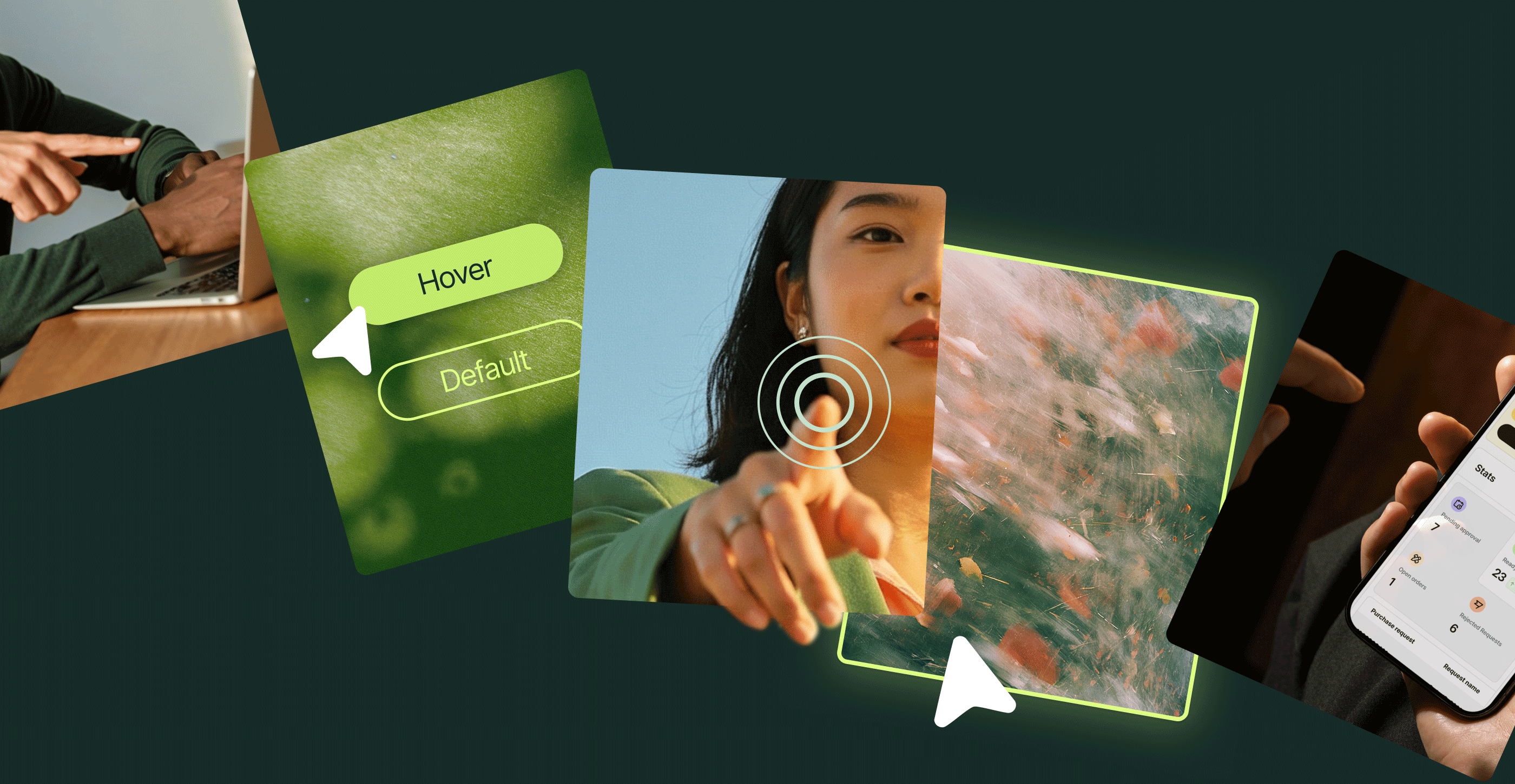
The five dimensions of interaction design
At its core, interaction design creates a continuous feedback loop between the user and the product. The five dimensions of interaction design are:
- Words (e.g., button labels and feedback)
- Visual representations (e.g., icons and graphic design elements)
- Physical objects or spaces where users interact
- Time (including animation and pacing)
- Behavior (e.g., how the system responds)
Strong interaction design for enterprise brands combines these components into interactions that feel natural and predictable. It defines consistent patterns for how visual elements behave across states like hover, active, loading and error, so users don’t have to relearn interactions across the product.
Systems thinking in interaction design
The best interaction designers contribute to design systems that standardize rules across interface elements, making it easier for enterprise teams to scale products. Apple’s iOS is a strong example. Its design system defines consistent motion and gesture principles that create a cohesive user experience across the platform.
What world-class interaction design examples looks like in practice
Interaction design is the difference between products people use and products they love. Here’s how five brands get it right.
1. Apple: Interaction as brand language

(Source: Developer.Apple)
Apple is widely seen as the gold standard for interaction design, with dedicated specialists focused on how iOS and macOS respond to user input.
Their Human Interface Guidelines codify these patterns, helping them create experiences that feel instantly intuitive.
A simple example is the “pull-to-refresh” gesture used across apps like Mail and Safari. Features include:
- An interface that responds to touch with resistance, mimicking a rubber band.
- A loading indicator that appears as you pull down to signal that release will trigger an update (confirmed with an elastic snap).
- A rotating spinner during content refreshes, indicating it’s working in the background.
- New content that appears seamlessly at the top of the list, making the process feel continuous.
Every part of the interaction is tuned to feel immediate and natural. That consistency reflects a mature design strategy grounded in user behavior.
2. Wise: Payments through micro-interactions

(Source: Wise.Design)
Online payments platform Wise uses micro-interactions to make complex transaction flows feel smooth and simple. Elements include:
- Subtle color changes that indicate hover state.
- Progress indicators that give instant feedback.
- Error states that are subtle and a little playful. Fields gently shake to draw attention to an incorrectly filled field.
- Success states that reinforce completion. Wise’s signature paper plane glides across the screen alongside the message “Your money’s on the move!”
Together, these micro-interactions create a smooth, confident user experience.
3. Airbnb: Interactions that guide without instructing

(Source: Figma Airbnb Design System)
Airbnb’s booking flow is deceptively simple. The interaction design subtly guides users and prevents errors.
- Unavailable dates are clearly marked with a strike-through, preventing selection errors and frustration.
- Selected date ranges are highlighted, another clear visual cue.
- Pricing updates in real time, so users always see changes as they adjust selections.
- Transitions are fast. Users go straight to payment with key details up front.
Airbnb has created a “less is more” booking flow that feels smooth and intuitive without users noticing why.
4. Google Material Design motion principles

(Source: Google Material Design)
Google’s Material Design system codifies interaction design into reusable guidelines, with clear rules for motion, timing and curve-easing across its products. The core principles are:
- Responsive. Interactions should feel immediate, and animations should be fast so users never feel delayed.
- Natural. Motion should follow real-world physics, with curve-easing and scale that feel intuitive.
- Aware. Elements should respond to input in context, move with user actions and animate from the point of interaction.
- Intentional. Motion should guide attention, show relationships and communicate state changes.
The result is interaction design that uses motion and animation techniques to guide users through the product.
Side note. If you work with a partner or UX agency, make sure they understand how to build this kind of design system.
5. Stripe: Onboarding that builds confidence through feedback

(Source: Stripe)
Stripe’s onboarding flows are designed to handle complex financial setups. They don’t overwhelm users with long forms and delayed validation. Instead, Stripe uses interaction design to create a continuous feedback loop throughout the process. Elements include:
- Inline validation that responds in real time. As users enter details like business information, fields provide immediate visual confirmation (or correction).
- Progress indicators that reinforce momentum. Multi-step flows use animated progress states to show how far users have come and what’s left.
- Error states that guide. When something goes wrong, feedback appears inline with clear messaging, often paired with subtle motion (a shake or highlight) to draw attention without disrupting the flow.
- Consistent loading and processing feedback. Actions like saves trigger clear loading states, so users always know the system is working in the background.
- Clear completion signals. Visual confirmation reinforces progress when a step is successfully completed.
Individually, these interactions are simple. Together, they create an onboarding experience that feels responsive, predictable and trustworthy, which is critical for a product that handles sensitive financial data.
What lets these companies deliver high-quality interaction design?
Apple, Wise, Airbnb, Google and Stripe all invest in dedicated interaction designers focused on refining user interactions. Their scale gives them the resources to support this level of specialization. Most mid- to enterprise-level companies can’t afford full-time interaction designers.
But that doesn’t have to result in lower-quality products. Many ambitious teams now turn to specialized user experience agencies or user interface design services with a proven track record in interaction design. An AI-powered, subscription-based creative service like Superside is ideally placed to fill this gap.
How Superside closes the interaction design gap
By now, it’s clear that interaction design is a specialist discipline. If you’re reading this article, chances are your team doesn’t have the right skills in-house.
You know you need to close the skills gap. But hiring full-time is slow and inflexible, traditional design agencies are siloed and hard to integrate, and freelancers lack consistency and system-level thinking.
Superside exists to solve exactly this gap. Partner with us and we’ll build a dedicated team around your needs and integrate directly into your workflows. We operate inside your Figma files, align with your sprint cycles and work hand-in-hand with your in-house creative team. As your creative team’s creative team, we slot in rather than hand over.
Being AI-first means AI isn’t just powering individual tools. It’s embedded across the entire creative model, from how teams are trained to how brand knowledge compounds over time. That’s the thinking behind our Human-Led, AI-Powered approach, and it shapes how our interaction designers work with your product team.
Our interaction designers and motion specialists are well-versed in UX interaction design, high-fidelity motion, micro-interactions and design system behaviors.
When a project wraps, you can dial that support back and shift effortlessly into our other creative services, from motion design at scale to product design, web design and ad creative development.
Motion designers who understand product context

The best motion graphics companies know that product motion design differs significantly from marketing motion design. Superside excels at both.
Our motion and product designers have a deep understanding of UX, UI and integration best practices. We also regularly design systems that scale across hundreds of UI components without chaos.
Don’t believe us? Take a look at the design system upgrade we rolled out for TransACT. Our designers collaborated with the investment platform to develop a comprehensive design system (typography, design elements and an overarching grid) so teams could self-serve as needed.
Integration with product teams and design systems
We integrate with the tools and workflows you already use, from your Figma flows to your component libraries and developer handoff processes, so no inconsistencies or errors creep in.
Our interaction designers can also extend your design system, help define state behaviors, standardize interaction patterns and document all your reusable components.
Fast interaction turnarounds that match sprint cycles
Product teams move quickly. If interaction design support doesn’t keep up, gaps appear, and the experience suffers.
Superside delivers work within sprint timelines, so your engineers aren’t waiting for designs and UX debt doesn’t accumulate. That’s how you deliver products that shout “premium” from day one.
Specialists across the full interaction stack
Finally, Superside has expertise across the full spectrum of interaction design, including:
- Micro-interactions
- Motion and transitions
- Interactive prototyping
- Interaction systems
- Accessibility-focused design
This flexibility lets you match the right expertise to each project, without the operational burden of multiple vendors.
Close the interaction design gap with Superside
If your product feels unpolished, it probably isn’t because your product team lacks talent or doesn’t care. They might simply not have the expertise to take interactions from “good enough” to next-level polish.
A good interaction design partner can help you get the talent you need, in the timeframe you need it, without the cost of hiring full-time. And when the right specialists step in, your product stops feeling merely functional. It comes alive.
Your team already knows what good looks like. The issue is bandwidth and depth. If it’s time to bring in the specialized expertise you need, Superside’s practical, low-overhead model is the answer.
FAQs


Design products people love
From UX flows to final UI, our Product Design
experts craft seamless experiences that drive
engagement and retention.
Websites built to scale
Meet the Superside Web Services Team.
Strategy, design and Webflow development
working as one.
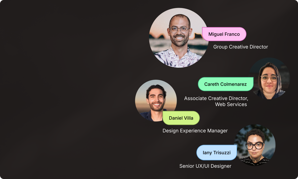
“One great page doesn’t scale
a business. A connected digital
ecosystem does.” - Miguel Franco.
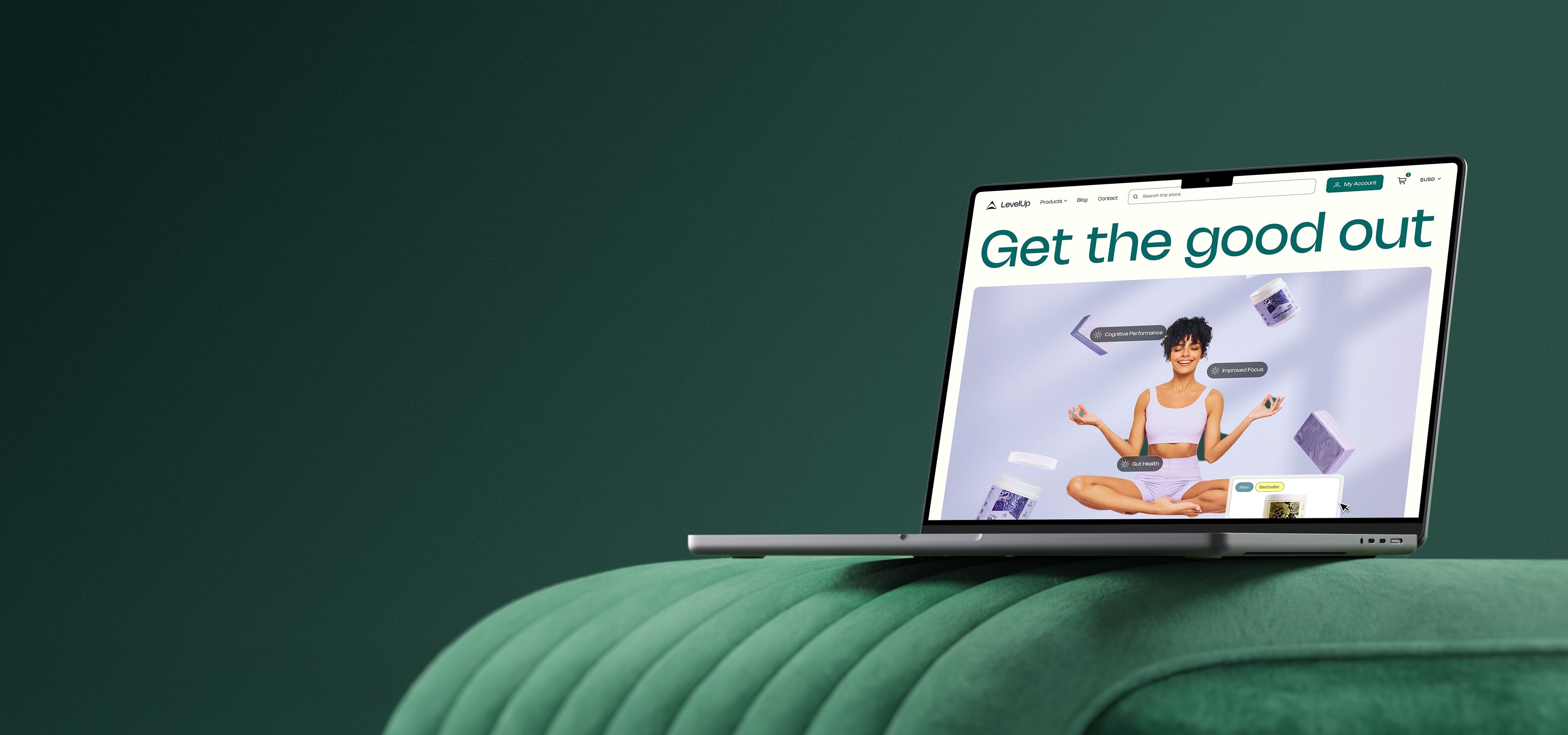
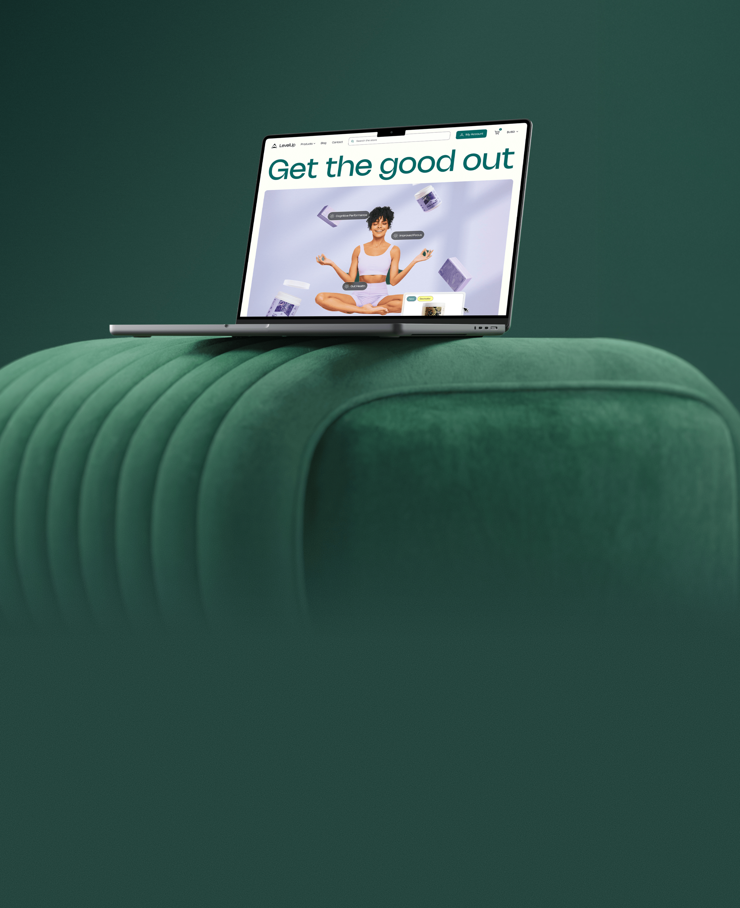
Top UX/UI and web design
We use atomic design methodology to
create cohesive, scalable and high-performing
digital experiences.
Our accessibility-first approach creates
unique assets, made to engage and convert.


Your creative team's creative team
Choose the world's leading AI-powered creative service
and get high-performing ads, videos, experiences and
more at scale, on your schedule and to your standards.