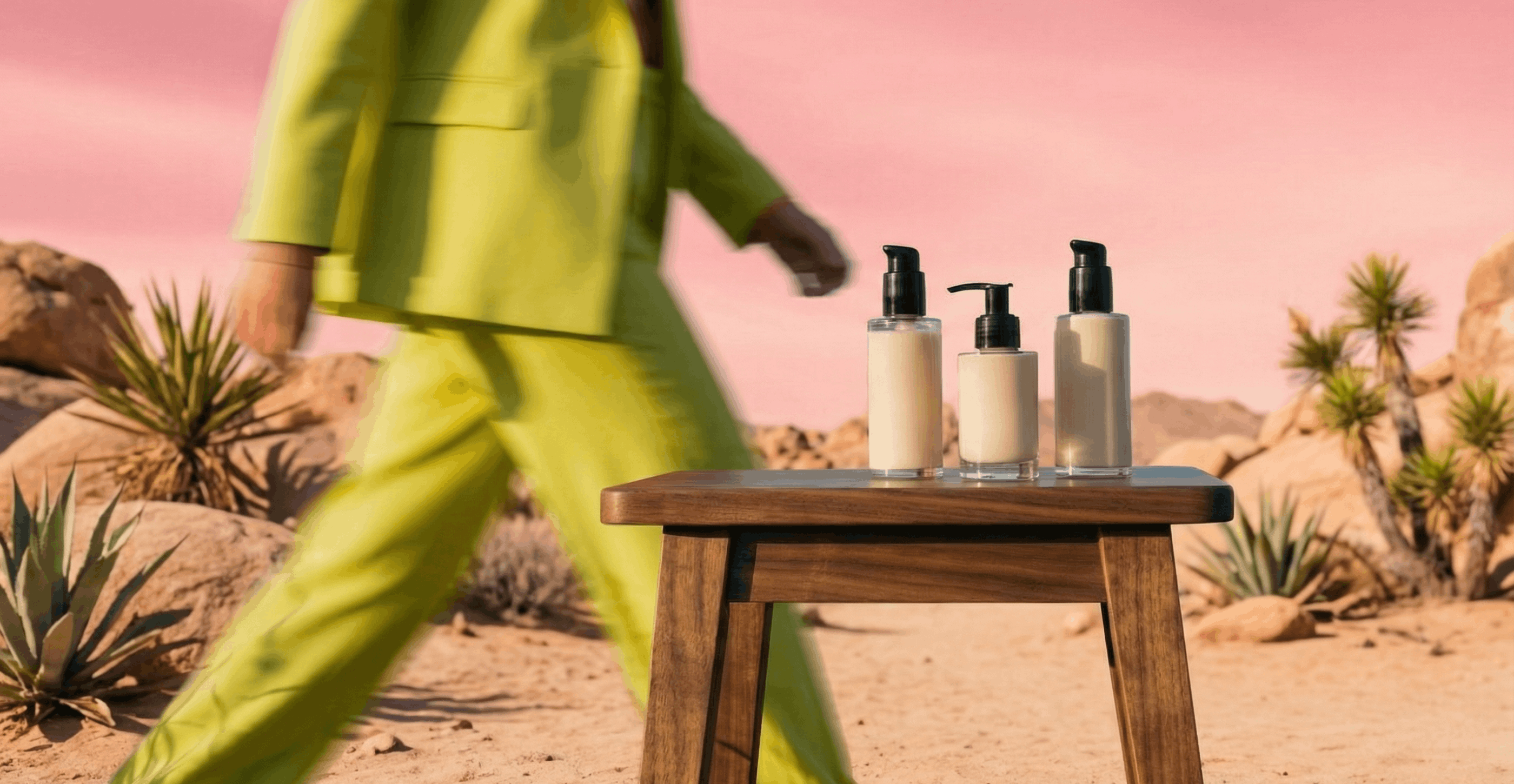
A product's packaging has seconds to win attention, which is why top brands go beyond one-off designs. They build scalable systems that perform across channels and refresh cycles — on physical shelves and digital ones. Explore eight real-world CPG packaging examples and learn what separates systems built to scale from one-off design moments.
1.7 seconds online. 1.9 seconds in store. That’s all the time your product gets to win attention before a shopper scrolls past or walks on. In that blink of an eye, packaging has to function as a billboard, a brand campaign and a performance ad all at once. Shoppers scan, compare and move on.
Research shows that 72% of consumers say package design influences their purchase decisions. In crowded categories, it’s often the first brand impression and sometimes the only one before checkout.
That means your product’s packaging isn’t just a supporting asset. It’s one of the most powerful media channels a CPG company has. Your design must stand out from three to six feet away across a shopping aisle and still read clearly at thumbnail size online.
For CPG enterprises that manage large portfolios and constant launch calendars tied to retail media and promotional cycles, this changes the mandate: Packaging design for consumer brands is no longer a periodic refresh. Instead, it’s an operational system that supports performance, consistency and rapid portfolio evolution.
Read on as we unpack why CPG packaging is a critical growth lever and what effective product packaging design looks like. We also explore how enterprise CPG teams can build scalable packaging systems that maintain brand consistency, improve performance and support rapid iteration.
Why CPG packaging is a critical growth lever
When it comes to package design, aesthetics are only part of the equation. To drive growth, the design must perform across three core dimensions: Brand storytelling, performance impact and risk management.
Let’s take a closer look.
1. Brand storytelling as a first impression
On a shelf in a retail store or online, packaging has seconds to communicate who you are, what the product is and why it deserves trust.
A strong CPG packaging design process relies on disciplined visual hierarchy and clear brand anchors so consumers can instantly recognize the masterbrand, product type and primary benefit.
For enterprise brands, storytelling must also remain consistent across sub-brands, formats and tiers. Without consistency, brand recognition can quickly suffer.
2. Packaging as a purchase driver across retail and eCommerce
Packaging now operates within a complex marketing ecosystem where its effectiveness directly impacts several business outcomes.
A product’s label can, for example, drive click-through rates on retail media platforms like Amazon Ads and Walmart Connect, anchor Product Detail Page (PDP) images and carousels, and serve as the visual backbone of paid social, influencer partnerships and shopper marketing displays.
The packaging design can also directly influence metrics such as add-to-cart behavior, conversion rate and even repeat-purchase performance.
3. Design packaging as a compliance and risk surface
As enterprise-level product portfolios expand across markets and channels, packaging typically becomes more complex.
Claims, ingredients, retailer guidelines and localization requirements introduce layers of risk. A single front-of-pack update can, for example, cascade across legal copy, secondary panels and digital assets.
Brands that scale successfully have clear systems and workflows that protect brand consistency and quality as their portfolio grows.
What effective modern CPG packaging design looks like
The most effective CPG packaging today balances standout design with robust systems and strategies that allow for speed and scalability.
Whether a product’s packaging appears on a physical shelf, in a direct-to-consumer unboxing experience or in a digital marketplace listing, the best designs share a few common characteristics.
1. Distinctive yet disciplined brand assets
Winning product packaging designs include distinctive brand elements that stay recognizable as the product portfolio grows. Clear color logic, consistent typography and recognizable iconography ensure the masterbrand remains legible across formats and sub-lines.
Discipline makes this work at an enterprise scale. Without clear rules and strong design systems, inconsistencies and off-brand elements can quickly creep in.
2. A prioritized hierarchy of design elements
Because customers give packaging only a quick glance as they shop, effective CPG packaging organizes information clearly: Product name and primary benefit first, differentiating claims second and supporting details third.
Good packaging design professionals ensure this structure can also flex across pack sizes, promotional overlays and eCommerce adaptations without requiring a redesign every time.
3. A brand identity designed for shelf and screen
Today, packaging design has to succeed both on the shelf and on screen. The design should read clearly when photographed from the front, make the brand, product and variant easy to tell apart, and avoid effects that vanish in small digital thumbnails.
Any eCommerce assets should also feel like a natural extension of the packaging design system, not an afterthought.
4. Systematized for scale
Effective CPG packaging should also be engineered for scale. Today’s top enterprise brands build design systems with shared principles, visual standards, reusable components, templates and rules that help teams roll out new products, local variations and seasonal changes quickly and on-brand.
Rather than creating individual designs for every product, by using these design systems, brands keep things consistent and minimize risk as their product portfolios and marketing campaigns grow.
8 enterprise CPG packaging system examples built to scale
On the hunt for CPG packaging design examples to inform your own? The eight examples below show how a number of best-in-class consumer brands treat packaging as a scalable system rather than a one-off design moment.
From global masterbrand rollouts to eCommerce-first beauty launches and seasonal programs executed at massive scale, each case demonstrates how superb product packaging can drive growth, support performance and reduce operational complexity.
1. S&S Activewear x Superside: Scaling creative output without scaling headcount

- The challenge: S&S Activewear is a national wholesale distributor managing more than 60 brands, including Adidas, Champion, Columbia and Oakley, with a marketing team that also acts as an internal agency for those brands. Nicci Knouse, Graphic and Web Design Manager, ran a team of just three designers supporting an 80+ person sales organization.
The demand for creative, packaging assets, retail media units, sales enablement materials and catalog production was continuous and relentless.
This pressure is common of enterprise CPG teams. Superside's own research shows 78% of creatives can't keep up with the volume of creative work they're asked to produce. Small in-house teams managing large brand portfolios face painful bottlenecks that slow campaigns, delay launches and drain team morale.


- The solution: S&S Activewear partnered with Superside to extend its design capacity without adding headcount. Superside's AI-first approach meant the team could handle high-volume, repeatable production work, packaging variants, retailer-specific assets and resizing for retail media placements, through structured workflows and AI-enhanced pipelines, while dedicated senior creatives maintained brand standards across all 60+ brands.
- The result: S&S Activewear's marketing team produced work 60% faster, took on projects previously outside the internal team's scope and elevated their creative output from reactive production to proactive brand-building — all without growing the in-house team.
- Takeaway for enterprise CPG teams: Volume isn't the only problem. Governance across a large brand portfolio is equally difficult. The right creative partner needs to handle both — and do it through systems that are repeatable, brand-safe and fast.
2. AcreMade: Elastic creative capacity for a growing food brand

- The challenge: Emerging CPG food brand AcreMade faced a different but equally real challenge: wildly variable creative demand. Pre-launch spikes required intense production capacity, packaging systems, eCommerce assets, campaign creative, but these were followed by quieter periods where a traditional agency retainer would sit largely unused. Fixed costs without flexible output.
This is a common scenario for growing CPG brands. Traditional agency models are built for project-based engagements or long-term retainers — neither works well for brands whose creative needs fluctuate with launch cycles, seasonal campaigns and retail expansion.
- The solution: Superside's subscription model gave AcreMade the operational flexibility to match creative supply to actual demand — ramping up during launch spikes and scaling back without penalty when activity slowed. The AI-first workflow infrastructure meant onboarding was fast; Brand Brain captured AcreMade's visual identity and brand parameters early, so new briefs didn't require extensive re-briefing to maintain consistency.
Packaging design, eCommerce hero imagery, retail media ad variations and campaign assets all ran through a single system — keeping brand governance intact across every output, regardless of production volume.
- The result: AcreMade gained predictable creative delivery, strong brand consistency across shelf and screen, and the operational flexibility to grow without committing to agency infrastructure it didn't need yet.
- Takeaway for enterprise CPG teams: For brands in growth mode, creative partners need to flex with the business — not lock it into fixed structures. Scalable subscription models and AI-first workflows make this possible without sacrificing quality or governance.
3. Heinz

(Source: DEPT®)
- The challenge: Heinz’s packaging had drifted over time, with different layouts, typography and visual emphasis across regions. That fragmentation weakened global brand recognition and made it harder for them to manage a complex, multinational portfolio.
- The solution: Heinz partnered with JKR to do a redesign and introduce a single global masterbrand system across 20 product categories.
The redesign elevated the keystone (the white, badge-like shape that surrounds the Heinz logo) as the central element, standardized logo placement and typography, and introduced clear zones for product names, flavors and formats. Local language and regulatory needs were accommodated within the same framework.
- The result: The packaging became instantly recognizable across markets while remaining flexible enough for regional requirements. The design system simplified rollouts, improved shelf and digital consistency and reduced ongoing design complexity.
- Takeaway for enterprise CPG teams: Global scale requires disciplined brand identity rules. A strong masterbrand system enables speed, consistency and governance across regions. At the same time, it also allows for local variations and relevance.
4. Byoma

(Source: Pearlfisher)
- The challenge: Skincare brand Byoma entered a crowded category, targeting Gen Z and Gen Alpha consumers who discover skincare products through eCommerce, social platforms and influencers, rather than traditional beauty aisles.
- The solution: Brand design agency Pearlfisher designed a bold, simplified system built for digital performance. High-contrast color blocking, oversized typography, and a clear claim hierarchy ensured the packaging was easy to read in thumbnails, PDPs and retail media.
Distinctive elements, including the split “O” logo, visually reinforced the brand’s focus on supporting the skin barrier (a core positioning centered on protection, repair and long-term skin health). At the same time, it created a recognizable cue across packaging and digital content.
The products are photogenic and algorithm-friendly, designed to stand out in influencer videos and static posts without additional art direction.
- The result: The impactful packaging grabbed consumers’ attention. The brand exceeded launch expectations and secured distribution at Sephora, Ulta and Target, with social engagement outperforming projections by 300%.
- Takeaway for enterprise CPG teams: Design packaging for how people actually shop today. Treat packs like digital ads from the start, built to stand out quickly in feeds, on thumbnails and in online stores, not just on physical shelves.
5. Oikos Triple Zero

(Source: Designalytics)
The challenge: Danone’s Greek yoghurt brand Oikos Triple Zero was built around old diet culture messaging: Zero fat, zero added sugar, zero artificial sweeteners. As wellness priorities shifted toward protein and functional nutrition, the packaging needed to evolve.
- The solution: The redesign reframed the front of pack around a protein-forward benefit and organized remaining claims into clear, consistent information zones. Protein takes visual priority, with certifications and secondary details placed predictably to maintain consistency across variants.
- The result: The packaging reflects modern wellness values in a competitive market and remains legible on the shelf and in eCommerce stores. The refresh drove an 18% year-on-year sales lift within six months and earned the brand a 2025 Designalytics Effectiveness Award.
- Takeaway for enterprise CPG teams: When consumer narratives change, the solution isn’t always more claims. It’s a clearer packaging hierarchy that helps shoppers understand value faster.
6. Starbucks

(Source: Starbucks)
- The challenge: Starbucks refreshes its cup packaging every holiday season across thousands of stores worldwide. The brand wants to create something new and culturally exciting each year, but it also has to maintain instant recognizability and operational consistency at a global scale.
- The solution: Without disciplined use of its design system, annual seasonal launches could easily fragment the brand or overwhelm internal teams with one-off designs.
To avoid this, Starbucks has anchored its holiday cup designs to a fixed structure: Consistent cup proportions and logo placement. Seasonal illustrations, color palettes, textures and writable details are then added as creative overlays, applied consistently across hot cups, cold cups, merchandise and digital assets.
- The result: Each release feels new yet unmistakably “Starbucks.” Every year’s holiday cups create a sense of urgency and ritual. Plus, it generates UGC, which turns the seasonal packaging campaign into earned media that extends well beyond the brand’s much-loved cafés.
- Takeaway for enterprise CPG teams: Seasonal packaging campaigns are easier to achieve when design processes are systematized. Strong core assets allow creative freedom at scale without sacrificing brand recognition or operational efficiency.
7. Rollr

(Source: DIELINE)
- The challenge: Many “better for you” brands rely on sustainability claims that feel abstract or badge-heavy. Deodorant brand Rollr needed to make its environmental promise tangible.
- The solution: Rollr replaced disposable plastic packaging material with a refillable glass bottle designed to last. Paper refills use 90% less packaging, and the concentrate format reduces shipping weight and emissions, which appeals to environmentally conscious consumers.
The sustainability story is embedded in the product and recyclable packaging, not just the tagline (“the last deodorant you’ll ever buy”).
- The result: Rollr delivers visible proof of sustainable materials across its primary packs, refills and digital assets. This creates a cohesive story across shelves and screens. Rollr earned Best of Show at the 2025 DIELINE Awards for its smart, system-led design approach.
- Takeaway for enterprise CPG teams: The strongest sustainability packaging aligns product design, materials and visual identity into one coherent system that holds up across shelf, screen and supply chain.
8. Yasso

(Source: Designalytics)
- The challenge: Frozen treat brand Yasso rapidly expanded from a single frozen bar into a broad range, including sandwiches, mochi and bite-sized formats. This increased the risk of brand fragmentation.
- The solution: Working with Stone Strategy & Design, Yasso strengthened its visual packaging system with a unifying royal blue brand color and a distinctive drip color block.
Logo placement, flavor cues and food photography were standardized so the system could scale across single-serve packs, multipacks and new formats.
- The result: The packaging remained instantly recognizable despite rapid product expansion. The redesign was so successful that it delivered a 44% sales increase year-on-year and won a Designalytics Effectiveness Award for driving measurable business impact.
- Takeaway for enterprise CPG teams: Yasso illustrates how a disciplined design system, with a strong brand block and scalable visual logic, can keep products instantly identifiable across channels as brands expand into new formats.
How an AI-first design process supports enterprise CPG teams
In CPG packaging, the highest-value work (i.e. visual strategy, brand hierarchy decisions, market positioning…) requires human judgment. AI's role is to eliminate the production drag that slows teams down before they get to that work.
As the world's leading AI-first creative partner, Superside embeds AI across the entire CPG packaging workflow. Not as a bolt-on, but as core infrastructure. In practice, that means:
- Brand Brain holds your visual identity, past campaign assets and brand preferences, so every new brief starts with full brand context, not a blank slate. For CPG brands managing large portfolios across SKUs, this is what prevents brand drift at scale.
- AI-enhanced production pipelines handle versioning across pack formats, resizing for retail media placements, localization workflows and template standardization: the high-volume, rule-based work that drains design teams and slows launch timelines.
- Superspace gives enterprise packaging teams a single environment to manage briefs, feedback, approvals and delivery, with full visibility across concurrent projects, regions and brand lines.
- Human creative oversight governs every output. Senior designers, brand strategists and creative directors review and refine. AI accelerates production, but humans own quality and strategic direction.
The outcome isn't "AI-designed packaging," but rather higher creative throughput, tighter governance and packaging systems that can easily scale as portfolios grow and become more complex.
Packaging that keeps up with your portfolio
The brands highlighted in this article share one common thread: High-performing packaging that’s built on robust infrastructure.
Whether it’s Heinz building a global masterbrand, Starbucks’ seasonal overlays, Oikos reframing wellness messages or Yasso scaling into new formats, the advantage comes from systems thinking.
If you’re an ambitious enterprise CPG brand, packaging can’t rely on occasional redesigns. It must be an operational capability that can easily scale across SKUs, regions and retail media environments.
Not sure where to start? Superside is built for exactly this: helping enterprise CPG teams move from reactive packaging updates to scalable, AI-first creative systems that perform across SKUs, channels and markets.
With 11,000+ packaging and merchandise design projects delivered for 180+ enterprise customers, we've built the infrastructure and the experience to support packaging at real enterprise scale.
Book a call today and learn more about how we can support your business.
FAQs

Design that drives growth
Meet the Superside Product Design Team.
Research-led UX, scalable UI & systems
built for growth.
“Great design is invisible, letting your
product stand out.” - Paulo Marques.


Increase your creative capacity
Let your in-house team reach for the stars,
while Superside keeps your day-to-day creative needs
at an industry-leading level. Ready to scale?