



Design teams rarely argue about whether balance matters, they argue about whose version of balance ships. The elements of design are the raw materials a designer works with and the principles are the rules for arranging them, which is why credible sources count anywhere from 7 to 13 of them. This guide defines all of them with examples, then shows how Superside keeps those decisions consistent across thousands of assets instead of relitigating them in every brief.
The 13 principles of design are the rules for arranging those materials, and they include emphasis, balance, contrast, repetition, proportion, movement, white space, rhythm, pattern, hierarchy, variety, unity and harmony.
You've probably seen some of the 7 elements of design as well. These are the raw materials a designer works with, which are line, shape, form, color, value, space and texture.
Principles are the how; elements mean the what.
That distinction sounds academic until you're reviewing the fourth round of an ad set and nobody can say why version C feels wrong.
Naming the principle that's failing turns a vague brief into a specific one, which is the single cheapest quality upgrade available to any enterprise creative team.
This blog post covers both lists in full, with graphic design examples for each.
What’s the difference between the elements and principles of design?
The two lists do different jobs, and conflating them is where most confusion starts.
- Elements are countable things you can point at in a composition.
- Principles are relationships between those things, so they only exist once you've placed more than one element on a page.
Understanding which is which tells you whether a design problem is a materials problem or an arrangement problem.
The 13 principles of design in short
The principles of design are the guidelines that govern how elements are arranged so a composition reads clearly and holds attention.
They describe relationships, which means a single isolated shape can't demonstrate balance, contrast or hierarchy.
The principles also can't be switched off. A layout has hierarchy whether or not anyone designed it deliberately, and if nobody did, the hierarchy will be accidental.
Click here to read about the principles in detail.
The 7 elements of design in short
The elements of design are the individual visual components that make up any composition. There are seven of them in the standard set used across art and design foundations teaching, including UC Berkeley's design fundamentals guide, and they are line, shape, form, color, value, space and texture.
You can add or remove an element. A logo either has texture or it doesn't. Type either carries color or it's monochrome. That's what makes the elements concrete in a way the principles never are.
Click here to read about the elements in detail.
How elements and principles work together
Every finished design is a set of elements arranged according to a set of principles.
A three-color palette is an element decision. Using the boldest of those three colors on one word in a headline is a principle decision.
The useful habit is diagnostic. When something isn't working, ask first whether you've got the wrong materials or the wrong arrangement.
Swapping a typeface is an element fix. Resizing it so it stops competing with the logo is a principle fix, and it's the cheaper of the two.
The 13 principles of design every creative should know

These are what separate a layout that works from a collection of well-made parts. Every one of these principles is already operating in your work, so the only question is whether you're directing it.
Each principle below gets a standalone definition, a plain explanation of what it does for the viewer and an example you can go and look at.
Individually, they're common sense, and applied together they're what people mean by a considered design process.
1. Emphasis

Emphasis is the deliberate creation of a focal point, so the viewer's eye lands where you intend it to land first. You create it through scale, color, isolation, position, high contrast or motion design.
Emphasis is the principle with the most direct commercial consequence, because it decides whether anyone sees the offer.
A single element that's larger or a different hue from everything around it takes the focal point, which is why one red object in an otherwise muted composition pulls the eye immediately.

(Source: Thimpress)
Emphasis also fails in a specific way. Emphasize four things and you've emphasized nothing, since the viewer has no basis for ranking them.
This is closely tied to how the eye groups visual information, which the Gestalt principles of design cover in more depth.
2. Balance

Balance is the distribution of visual weight across a composition so no single area overwhelms the rest.
It comes in three forms:
- Symmetrical balance, which mirrors weight across a center line
- Asymmetrical balance, which offsets a large element against several smaller ones, and
- Radial balance, which arranges elements around a central point.
Symmetry reads as stable, formal and trustworthy, which is why it dominates financial and institutional branding. Asymmetry reads as energetic and contemporary, and it's harder to execute because the weights have to be judged rather than measured.

Superside's sticker illustration work for Independence Pet Group shows symmetrical balance doing quiet work, with centered elements and evenly spaced text on a neutral background so the illustration carries all the personality.
3. Contrast

Contrast is the deliberate use of difference between elements, in color, value, scale, weight, shape or texture. It's what makes a composition legible, and low contrast is the most common reason creative underperforms without anyone being able to say why.
Contrast operates on more than color. Bold geometric type over a soft organic background is textural contrast. A single heavy weight in a page of light weights is typographic contrast. Light against shadow is value contrast, and it's how designers build depth on a flat surface.
 (Source: Sitepoint)
Apple's silhouette iPod campaign is still the clearest teaching example, where a black figure against a saturated background makes white earphones the only neutral object in the frame and therefore the only thing you look at.
4. Repetition

Repetition is the reuse of a visual element across a composition or a campaign to build consistency and recognition. It's the mechanism by which a brand becomes recognizable, since recognition requires having seen something before.
Fine artists use it for effect, as in Andy Warhol's serial portraits or M.C. Escher's tessellations. Brand teams use it for infrastructure, repeating a corner radius, a grid, a photographic treatment or a single graphic device until it stops needing explanation.
 (Source: Coca-Cola)
The Coca-Cola bottle arrangement forming a smile is repetition doing two jobs at once, building a recognizable shape out of an already recognizable one. That's repetition earning its place rather than repetition as wallpaper.
4. Repetition
In design, repetition is used to create a sense of rhythm and flow...just kidding. Moving on....
5. Proportion

Proportion is the relative size and scale of elements compared with each other and with the whole. It governs whether a composition feels considered or accidental, and it applies to more than dimensions, since the proportion of one color to another in a palette is a proportion decision too.
Get it wrong and the design reads as unresolved even when every individual part is well made. An icon that's marginally too large beside a wordmark makes an otherwise good logo look amateur.

(Source: The North Face)
The North Face logo is a compact lesson in proportion, where the half dome mark and the wordmark are sized so neither dominates and the pair reads as one object at any size.
6. Movement

Movement is the path a viewer's eye travels through a composition, controlled by the designer rather than left to chance.
It's how you sequence information, which matters whenever the order of what someone reads changes what they understand.
You create movement in three main ways.
- Repetition. Repeated shapes, colors or marks establish a rhythm the eye follows from one instance to the next.
- Contrast. Light elements against dark, or large against small, create stepping stones across a layout.
- Hierarchy. Deliberate ranking moves the eye from the most important element to the least.
 (Source: Pola Karola)
Van Gogh's “Starry Night” is the canonical example in painting, where brushstroke direction pulls the eye in a circuit.
In layout work, the same effect comes from directional lines, gradients and the implied line of a person's gaze in a photograph.
7. White space

White space, also called negative space, is the empty area around and between elements, and it doesn't have to be white. It's a design decision rather than a leftover, and treating it as leftover is what produces cluttered work.
White space does three things at once. It isolates elements so they can be emphasized, it groups elements so relationships are legible and it signals confidence, which is why premium brands use so much of it.
 (Source: Creatopy)
High-converting landing pages almost always run generous white space around the offer and the call to action.
The same holds for social media graphics, where an asset has to be parsed at thumb-scroll speed and anything crowded gets skipped.
8. Rhythm

Rhythm is the pattern of repetition and spacing that sets the pace at which a design is read. Where repetition is about what recurs, rhythm is about the interval between recurrences.
Tight intervals read as fast, energetic and urgent. Wide, even intervals read as calm and deliberate. Progressive rhythm, where the interval grows or shrinks steadily, creates a sense of acceleration and is the reason a well-built data visualization can feel like it's moving.

(Source: Maverick)
A row of repeated semi-circles with alternating colors and varying line weights demonstrates all three at once, since the repetition creates rhythm while the variation stops the rhythm from becoming monotonous.
9. Pattern

Pattern is a repeated element used as a consistent surface or motif, closely related to repetition and rhythm but functioning as texture rather than as sequence. Natural patterns such as zebra stripes or sand ripples tend toward irregularity, while manufactured patterns such as chessboards tend toward precision.
Pattern does practical work in brand systems. It fills space without introducing new content, it makes packaging recognizable from across a shelf and it can carry information outright, which is what a barcode or QR code is.

Superside's creatives use pattern this way regularly, building icon and symbol systems that establish a single visual language across packaging, print collateral and digital surfaces, so a brand stays recognizable without repeating the same layout.
You can see the range of that work across our portfolio.
10. Hierarchy

Hierarchy is the deliberate ranking of elements by importance, expressed through size, weight, color, position and space. It's the principle that decides what the viewer understands, as opposed to emphasis, which decides what they notice first.
Every layout communicates a ranking, so the only choice is between a ranking you designed and one you inherited by accident.
Superside's own homepage banner is a worked example, where headline, call to action and supporting visual are sized and placed so the eye moves through them in that order. Overemphasize any one of the three and the sequence collapses.
11. Variety

Variety is the introduction of difference to sustain interest across a composition or a system. Without it, consistency becomes monotony, and monotony gets ignored.
Variety is the principle most often overcorrected. Too little and the work is flat. Too much and it's noise, because the viewer has no stable reference point.
The working balance is variety inside a fixed frame, changing one or two dimensions while holding the rest steady, which is the logic behind good digital design systems.
 (Source: Duolingo)
Duolingo runs this well, holding a single mascot, typeface and interaction model steady while varying color, animation and copy tone constantly. The product feels different every session and unmistakably the same brand.
12. Unity

Unity is the sense that every element in a design belongs to the same system. You build it through shared color, repeated shapes, consistent spacing and a recurring motif.
Unity is what distinguishes a brand from a collection of assets. It's also the principle that scales worst, because unity is easy to hold across five assets and hard to hold across five thousand made by different people in different months.
 (Source: Handprinter)
Excessive unity has its own failure mode, which is flatness, and that's exactly the tension variety resolves. The two principles are a pair and neither works alone.
13. Harmony

Harmony is the overall sense that a composition's parts are working together pleasingly, balancing complexity against simplicity. Where unity asks whether elements match, harmony asks whether the result is worth looking at.
You reach it through repetition, rhythm and pattern working in concert, with enough variety that the eye stays interested. It's the most subjective principle on the list and the one most worth naming anyway, since “it's not quite harmonious yet” is a more useful note than “something's off.”
Spotify Wrapped is an annual masterclass, running consistent typography and rhythmic pattern across dozens of screen types while the palette shifts dramatically from panel to panel. Complex and cohesive at once.
The 7 elements of design to know in 2026
These are the components you're manipulating in every file you open.
They're worth defining precisely because vague element language is what produces briefs nobody can execute, like asking for something “more textured” when the real request is higher contrast.
Each definition below stands on its own, so you can lift any one of them into a brief or a style guide.
1. Line
A line is a mark connecting two points, straight or curved, real or implied. Lines divide space, direct the eye and imply motion without any other element present.
They're also the most commonly overlooked element in layout work.
The invisible line formed by the left edges of three stacked text blocks is doing as much organizational work as any visible rule, which is why misalignment reads as sloppiness even to people who can't name what's wrong.
2. Shape
A shape is a two-dimensional enclosed area, either geometric like a circle or rectangle, or organic like a leaf silhouette. Shapes carry meaning before anyone reads a word, with circles reading as soft and open while sharp angles read as precise or urgent.
Brand systems lean on this hard. A shape language decided once at the identity stage propagates into every ad, deck and icon a team ever ships.
3. Form
Form is a shape with implied or actual depth, so it has height, width and volume. In flat digital work, form is created through shading, perspective, overlap and shadow rather than through genuine three-dimensionality.
Form is having a moment in product and packaging visuals, where depth cues separate a photoreal render from a flat illustration. It's also the element that most reliably signals whether an image was composed or generated carelessly.
4. Color
Color is the perception of reflected light, described by hue, value and saturation. It's the fastest carrier of brand recognition and the element most constrained by accessibility requirements, since contrast ratios are a color decision before they're a typography decision.
Color is also where brand drift shows up first at scale. A palette with four approved tints becomes a palette with nine unapproved ones the moment three agencies start working in parallel.
5. Value
Value is the lightness or darkness of a color, independent of its hue. Squint at any layout and what survives is value, which is why designers check work in grayscale before shipping it.
Weak value contrast is the most common cause of illegible creative. Two colors can be wildly different in hue and nearly identical in value, at which point type placed over an image disappears.
6. Space
Space is the area around and between the components of a design.
Split into positive space occupied by elements and negative space left empty. Space is an element when you're deciding how much of it exists, and a principle when you're deciding how to use it deliberately, which is why white space appears on both lists.
Most crowded layouts aren't crowded because they contain too much. They're crowded because the space between things is inconsistent.
7. Texture
Texture is the implied or actual surface quality of an element, from paper grain to noise overlays to the tactile finish on printed packaging. In digital design texture is always implied, built from pattern, value shifts and layered transparency.
Texture adds warmth and tactility to work that would otherwise feel sterile. It also breaks fastest at small sizes, so it needs testing at the smallest format a campaign will run in.
Why the principles of design matter commercially
None of this is academic once creative volume goes up.
The principles are the mechanism by which quality survives scale, because they're the only part of design judgment that can be written down, taught and reviewed against. Here's where that shows up on a P&L.
Design quality is a conversion variable
Poorly arranged design costs measurable revenue, and the checkout flow is where it's been quantified most rigorously. The Baymard Institute puts the average ecommerce cart abandonment rate at 70.22% across 50 studies, and finds that a large ecommerce site can lift its conversion rate by 35.26% through checkout redesign alone.
Almost every lever in a checkout redesign is a principle. Clarifying which field matters most is hierarchy. Making the primary button unmistakable is emphasis and contrast. Letting the form breathe is white space.
The same logic applies upstream in the funnel, where the Interaction Design Foundation makes the case that visual design principles are what let an interface be understood before it's read.
Consistency is the enterprise version of the problem
At enterprise scale the failure mode isn't a badly designed asset, it's five thousand assets that don't agree with each other. A consistent visual identity has to survive every ad, deck, email, packaging run and video a company ships, often produced in parallel by different teams in different markets.
Principles are what make that survivable. Balance, repetition, white space and hierarchy are transferable in a way that “use good judgment” isn't, which is why they belong in the brief rather than in the reviewer's head. We've written about what that looks like in practice in our guide to brand consistency for enterprises.
Capacity is why the system beats the style guide
The teams that need design principles most are the ones with the least time to apply them. In Superside's Breakpoint report, which surveyed 300 or more creative and marketing leaders at enterprise companies in Q1 2026, 86% said their team is at or beyond capacity.
Burnout follows workload. Superside's Overcommitted report, which surveyed 206 creative leaders in December 2024, found 76% of leaders saying they and their teams have felt burned out.
A team in that state doesn't fail on principle knowledge. It fails because there's no time to apply what it knows, and a PDF style guide nobody opens is not a system.
How many principles of design are there?
There's no single canonical count.
Reputable sources publish lists of 8, 12 and 13 principles because they slice the same underlying ideas at different widths, splitting pattern from repetition here, folding harmony into unity there.
Nobody's wrong. Here's how the common lists reconcile, so you can compare and choose which one to work with.
| List you'll see | What it adds | What it leaves out |
|---|---|---|
| 7 elements | Line, shape, form, color, value, space, texture | All arranging rules, since these aren't principles at all |
| 8 principles | Balance, emphasis, movement, pattern and repetition treated as one, rhythm, proportion, variety, unity | Contrast, hierarchy, white space, harmony |
| 12 principles | The 8, plus contrast, hierarchy and white space, with pattern and repetition split apart | Harmony |
| 13 principles | The 12, plus harmony as its own principle | Nothing material, though some lists swap in alignment or proximity |
We focus on the 13 principles and 7 elements because these are the most detailed of them all, but feel free to use the one that makes the most sense to you.
We use 13 because harmony does work that unity doesn't. Unity asks whether elements belong to the same family. Harmony asks whether the whole thing feels good to look at, which is a judgment about the relationship between complexity and simplicity rather than about consistency.
If your team needs one list, pick any of these and write it down. The consistency of the list matters more than which list you chose, because a shared vocabulary is what makes design feedback reviewable.
How to hold design principles steady at scale
Knowing the principles is one thing. Keeping them applied consistently across everything a brand ships, month after month, by people who weren't in the original conversation, is the part that breaks.
Three things make the difference, and only the first one is about design.
Option #1: Write the list down and make it reviewable
Pick your list of principles, define each one in your own brand's terms and put the definitions where briefs get written. A note saying “hierarchy is off, the offer is competing with the logo” is actionable. A note saying “this feels cluttered” generates another round.
This single change cuts revision cycles more than any tooling decision, because most extra rounds come from feedback nobody could act on.
Option #2: Keep the decisions where the work happens
Written principles still evaporate. The decision you made in March about how much white space a promo tile gets lives in a Slack thread nobody will find in September, so the next designer guesses and the guess is usually different.
This is the problem Brand Brain is built to solve.
It holds your brand's voice, visual rules, specs, past assets and accumulated feedback as connected knowledge rather than as filed documents, so a confirmed decision becomes a rule that's applied to the next brief automatically instead of being rediscovered.
The advantage is that context compounds, since every project adds to what the system knows about how your brand handles hierarchy, spacing and contrast, and creative arrives on brand before the first review rather than after the third. Superside's team maintains it, so there's no training burden on yours.
If you want the mechanics, the intro to Brand Brain in our Help Center walks through how knowledge gets validated before it's applied.
Everything runs through Superspace, our AI-powered creative management platform, where briefing, review, feedback and delivery sit in one place alongside that brand context.
Staff for volume without trading away craft
Principles hold when the people applying them are senior enough to make judgment calls and numerous enough to absorb the volume. That's a staffing problem, and it's the one most in-house teams can't solve by hiring.
Superside works as an extension of your team rather than a vendor you brief and wait on. We're your creative team's creative team, staffing from a global bench of 500 or more creatives across 67 countries, more than 90% of them AI-certified, who've delivered over 200,000 creative projects to date for brands including Intuit, DoorDash, Figma and Reddit.
That's how you get creative at scale without the quality drift that normally comes with it, and it's the same bench behind our creative branding work and our UX and UI design.
The economics hold up to scrutiny. As reported in the Forrester Total Economic Impact™ study, commissioned by Superside (April 2025), a composite organization saw 94% ROI over three years with payback in under six months.
Our pricing runs as an annual subscription with a monthly budget, so you can see the numbers before you commit.
Being AI-first means AI isn't just powering individual tools. It's embedded across the entire creative model, from how teams are trained to how brand knowledge compounds over time. That's the difference between a human-led, AI-powered creative partner and a set of design services you have to manage yourself.
Design principles are a system
The thirteen principles in this guide aren't a scorecard to run against a finished file. They're a shared language, and the value arrives the moment more than one person is making decisions about the same brand.
That's why the list stops being a design topic and becomes an operations one somewhere around the fiftieth asset a month. A designer working alone carries the principles in their head. A team of twelve across four time zones carries them in a system or doesn't carry them at all.
Start with the smallest version. Write down your list, define each principle in your brand's own terms and use those words in your next round of feedback. Then decide where those decisions are going to live, because the ones that live only in people's heads leave when the people do.
If you'd rather not build that infrastructure yourself, talk to us about what your team needs. We'll bring the principles, the people and the system that keeps all three consistent.
FAQs



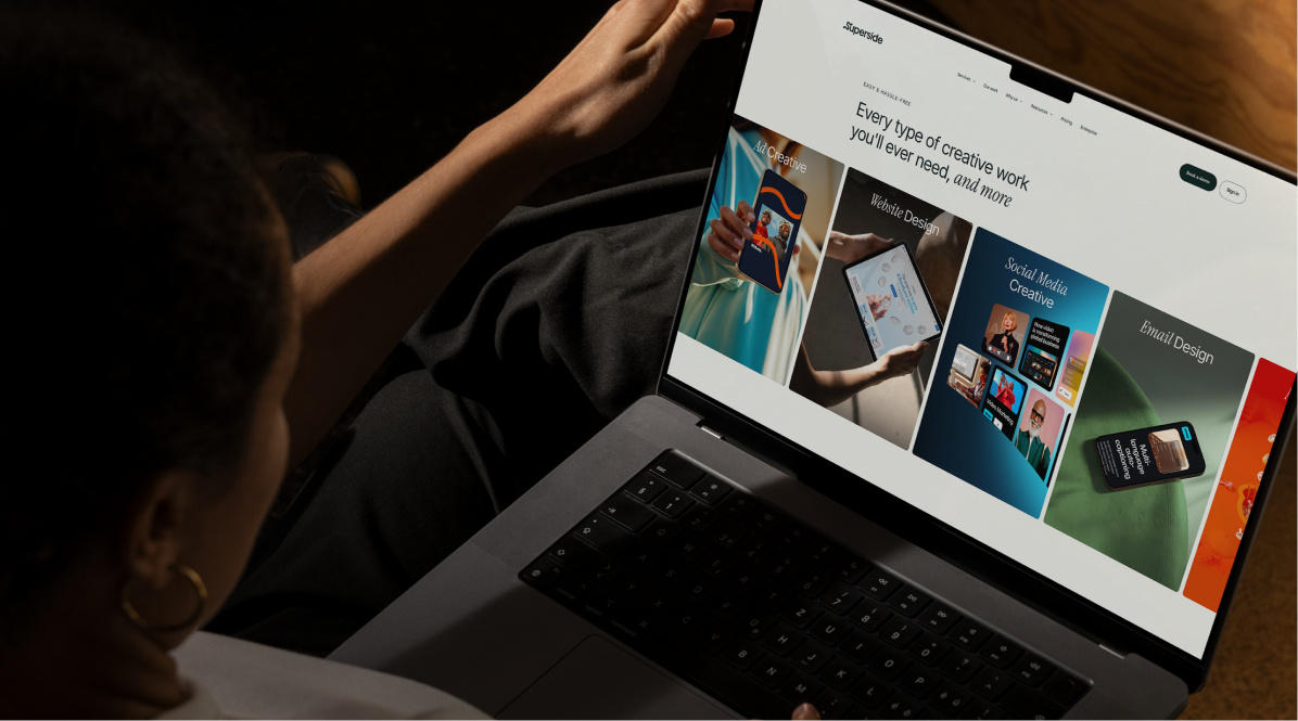
This is the quality you can create with Superside
Discover how Supersiders help global brands
launch high-impact campaigns at scale with top design.
We're your creative team's creative team.


Brand systems that scale with you
From one-off email assets to AI-powered workflows,
we make sure your brand grows with no compromise.
Schedule a chat to learn more.


Solidify brand identity and fuel growth
Check out our portfolio of brand identity work to see how
Superside can help you seize opportunities and
accelerate your creative pipeline.


Top design capabilities
Explore Superside's full range of design capabilities
with creative examples of our work for clients,
like Amazon, Notion and Reddit.


Give your internal teams the power to boost your brand
Publish once. Deliver everywhere. Our Creative Ops platform
puts your brand in front of the right people, everywhere.
Unlock seamless content distribution. Access your audience.