






Marketing design is graphic design with a commercial job: getting a specific audience to notice a message, understand it and act on it. Demand for it keeps outrunning the teams that make it, and Superside's Breakpoint report found that 86% of creative and marketing teams are at or beyond capacity. This guide gives you a clear definition, seven types with examples and the tips and systems that keep marketing design on brand at volume.
Design is all around us, so ubiquitous it's the proverbial water in the goldfish bowl. It's in your clothes, your packaging, your inbox and the billboard on your commute.
Marketing design is the creation of visual assets, such as ads, emails, social posts, landing pages, presentations and print, whose job is to move a specific audience toward a business goal. It's a branch of graphic design that's judged by results: attention, clicks, sign-ups and sales.
That covers everything from Facebook ad design and newsletter templates to out-of-home billboards, plus the brand guidelines that hold it all together. If the design jargon has ever left you nodding along, you're in the right place.
Here's what this guide covers: what marketing design is and how it differs from graphic and product design, seven types with real examples, what a marketing designer does, the process from brief to launch, seven practical tips and how to scale it all without your brand drifting.
What is marketing design?
Marketing design is the practice of creating visual assets that communicate a brand's message to a defined audience and prompt a measurable action. Those assets include ads, emails, social content, landing pages, sales decks, packaging, print and video.
It sits inside graphic design but answers to marketing goals. A marketing designer still works with type, color, layout and imagery, then measures the result in campaign performance rather than in aesthetics alone.
Every piece of marketing design brings together five things:
- A message. The one idea the audience should take away.
- An audience. Who it's for, what they care about and what they already know.
- A channel. Where it appears, which sets the format, size and attention span.
- A brand. The visual identity and voice that make the asset recognizably yours.
- A goal. The action you want, such as a click, a sign-up, a booked demo or a purchase.
Why does marketing design matter?
Marketing design is often the first thing a customer sees, which makes it the first impression of your whole brand. When it's done well, it pays off in several ways:
- Brand recognition. Consistent colors, type and voice help people know it's you before they read a word.
- Engagement. A clear hierarchy and a strong visual stop the scroll and invite the reader in.
- Conversion. A focused layout with one obvious next step turns attention into action.
- Trust and loyalty. Polished, consistent experiences signal a brand that sweats the details, which customers tend to reward.
- Efficiency. A good design system lets your team reuse what works instead of starting from scratch on every request.
Marketing design vs. graphic design and product design
All design balances form and function, but each discipline weighs them differently. Some designs should blend into the fabric of your life. The dashboard in your car or the keyboard under your fingers should just plain work, and if they look good, that's a bonus.
Other designs exist to get noticed. That's the fundamental difference between product design and marketing design, with graphic design as the shared craft underneath both.
Here's how the three disciplines compare.
| Discipline | Primary goal | Typical outputs | How success is measured |
|---|---|---|---|
| Graphic design | Communicate an idea visually | Logos, illustrations, layouts, editorial design | Clarity, craft and fit with the brief |
| Marketing design | Get an audience to notice, understand and act | Ads, emails, social posts, landing pages, decks, print | Click-through, conversion, engagement and brand recall |
| Product design | Help users get value from a product | App screens, user flows, physical products | Usability, task success and retention |
The goal of product design is to deliver value to the user. Product designers think about flows, interactions and edge cases, which is why user testing is non-negotiable. A stunning water bottle is useless if it has a hole in the bottom.
The goal of marketing design is to grab attention, educate and convert. Here, form directly affects function. The stronger the design, the better the asset does its job, whether that job is a click, a sign-up or a sale.
Types of marketing design with examples
Graphic design and marketing go hand in hand, so the list of marketing design types runs well beyond pop-ups and banner ads. The seven types in this section cover the channels most in-house teams are responsible for, from the inbox to the boardroom. Each one has its own constraints, and knowing them is half the battle.
Here's every type in this guide in one table.
| Type | Common assets | Main job |
|---|---|---|
| Email design | Newsletters, promotional emails, lifecycle and onboarding emails | Drive clicks from an audience that already opted in |
| Social media design | Feed posts, carousels, stories, short-form video covers | Stop the scroll and build engagement |
| Ad design | Static, motion and video ads for paid social, display and search | Win attention and clicks from cold audiences |
| Print and out-of-home design | Posters, billboards, transit ads, brochures, event signage | Reach people offline and build recall |
| Website and landing page design | Homepages, campaign landing pages, product pages | Turn visits into sign-ups, demos or sales |
| Presentation and sales collateral design | Sales decks, one-pagers, eBooks, reports | Help sales teams tell a clear, on-brand story |
| Video and motion design | Animated ads, explainers, GIFs, brand films | Hold attention and show what static can't |
Now let's break down each type of marketing design, with what makes it work and real examples from brands that get it right.
Email design
Email design shapes how promotional and lifecycle messages look and read in the inbox, on every screen size. The most important ingredient is relevance, so make sure each email speaks to what that reader cares about right now.
Good email design is mobile-first, with a single clear call to action and a layout that survives image blocking. If it doesn't catch the eye and render cleanly on a phone, it's going straight in the e-bin.

Casper shows how restraint works. The copy pops against a dark blue background that fades into an image of the bed in use, and there's one clear offer instead of a wall of buttons.

Moo takes the playful route, with an animated GIF that invites readers to pop a balloon and reveal a surprise. Adding motion to an email is one of the easiest ways to earn a second look.
Social media design is the creation of platform-native posts, carousels and stories that earn attention in a crowded feed. With AI-generated content flooding every platform, distinctive and recognizably branded social media graphics matter more than ever.
The hard part is balancing organic and promotional. The best social media campaigns look at home in the feed while still pointing somewhere useful.

TargetStyle nails this on Instagram with clean product photography that would look just as at home in a catalog as in your most stylish friend's feed. Shoppable tags take a viewer from browsing to the product page in a couple of taps.
Boomi shows what consistent social design does for a B2B brand. Working with Superside, Boomi tripled its creative output and produced 75+ images, reaching a 24% LinkedIn engagement rate.

Ad design
Ad design is the craft of creating static, motion and video ads that win attention from people who weren't looking for you. Every ad has a few seconds to land one message, so hierarchy, contrast and a single call to action do the heavy lifting.
Paid channels also reward volume. Testing different hooks, visuals and formats is how teams find what works, which is why advertising design increasingly runs on concepts and variants.
PointCard is a good example of that approach. Superside helped PointCard produce 441 ads from about 30 concepts, and the campaign delivered a 240% increase in click-through rate (from 0.54% to 1.84%) and a 275% conversion lift.

The lesson for any ad program is to treat each strong concept as a system you can version across formats and audiences.
Print and out-of-home design
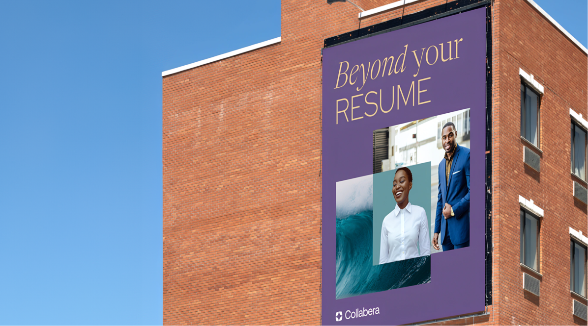
Print and out-of-home design covers posters, billboards, transit ads, brochures and event signage, the marketing people meet in the physical world. It's easy to get so focused on digital that you forget about the subway platform, but offline reach still matters in an omnichannel plan.
Spotify made this famous by taking its streaming data offline, with witty, data-driven lines plastered across billboards and subway walls. The bright color blocks and internet-savvy humor were so eye-catching that photos of the ads traveled back online and multiplied the reach.

To make print measurable, add a QR code or a short vanity URL that leads to a tracked landing page. Print design is far from dead, and our guide to poster design covers the fundamentals.
Website and landing page design
Website and landing page design is where marketing design hands off to conversion. Once an ad, email or post hooks someone, the first place they'll head is your site, and if they find a drab, outdated mess, it's all for naught.
The basics of marketing-focused web design hold up well:
- Use high-quality product imagery, because great photography sells.
- Keep layouts clean, simple and uncluttered, with plenty of breathing room.
- Design mobile-first, so the page works as well on a phone as on a widescreen monitor.
- Keep your branding prominent without shouting. Subtlety is good.
- Follow your brand guidelines, from colors to icons.
- Make the primary call to action obvious and repeat it where it helps.

Harry's follows these principles closely. Clean aesthetics and strong product photography keep the razors front and center, a clear trial offer sits on the homepage and the branding is consistent across every device.

Your homepage carries more weight than any other page, so it's worth studying effective homepage design before you start.
Presentation and sales collateral design
Presentation and sales collateral design covers the decks, one-pagers, eBooks and reports that sales and leadership teams put in front of buyers. It's marketing design at the moment of truth, when a deal is live and the story has to land.
The challenge is variation. One master deck often needs to adapt by account, audience and deal stage, so the strongest presentation design is built as a modular system with locked brand elements and flexible content slots.
That way, a sales rep can tailor slide six without breaking slide one, and every version still looks like it came from the same company.
Video and motion design
Video and motion design brings movement to marketing, from animated ads and GIFs to explainers and brand films. Motion holds attention longer than static and can show a product in action in seconds.
It doesn't have to mean a full shoot. Subtle motion on a static ad, an animated product reveal or a short looping hero on a landing page can lift a campaign without a film crew, while video production covers the bigger brand moments.
What does a marketing designer do?
A marketing designer creates the visual assets for campaigns and channels, working from a brief to meet a specific marketing goal while keeping everything on brand. In-house, they're often the keeper of the company's visual identity. At an agency or creative partner, they apply that same cra
ft across several brands.
Day to day, the role includes:
- Translating briefs into concepts. Turning a goal and a message into visual directions the team can react to.
- Producing assets across formats. Building the hero design, then adapting it for every channel, size and placement.
- Guarding brand consistency. Applying the guidelines and flagging when a request would break them.
- Working with copy and performance teams. Pairing visuals with messaging and using results to shape the next round.
- Maintaining templates and systems. Keeping reusable components current so the whole team can move faster.
The core skills mix craft and commercial sense: layout, typography, color, motion basics, fluency in tools like Figma and Adobe Creative Cloud and a working knowledge of marketing funnels and channel specs. AI fluency belongs on that list too, for exploring directions and producing variants faster.
How does the marketing design process work?
Most marketing design follows the same path from brief to launch, whatever the channel. The details vary by team, but skipping a step is where most rework comes from.
- Write the brief. Define the goal, audience, key message, channels, formats, deadline and how success will be measured.
- Gather the brand inputs. Pull the guidelines, templates, past campaigns and any feedback that applies.
- Explore concepts. Sketch a few directions before committing, so the team can choose the strongest idea.
- Design the hero asset. Build the primary version and get it approved before adapting it.
- Adapt for every format. Resize and version for each channel, size and market.
- Review and QA. Check against the brief, brand rules, specs and accessibility before anything ships.
- Launch, measure and learn. Track results and feed what you learn into the next brief.
Steps two and seven are the ones teams most often rush. They're also where brand knowledge either compounds or gets lost between projects.
7 marketing design tips
Great marketing design starts with your brand guidelines and a clear design style. If you're still choosing a style, our guide to design styles is a good starting point. These seven tips build on the principles of design and apply to every type covered in this guide.
Know your audience and your medium
Think about who you're designing for before you open a design file. Picture presenting to your current and future customers and ask how your visuals and words appeal to them.

Then think about where you'll reach them. The same person goes to different platforms for different things: LinkedIn rewards substance, Instagram rewards aesthetics and X gives you seconds to make an impact. Match the format, tone and density to the channel.
Follow your brand guidelines
Follow. Your. Brand. Guidelines. We can't stress this enough. By all means ride the trends and throw in a Baby Yoda, but only if it fits your brand identity.
Audiences are quick to spot a brand trying too hard and loyal to brands that feel authentic. Use your fonts, colors, icons, logos and voice consistently, so people know whose message they're seeing before they read it.
Build a clear visual hierarchy
Visual hierarchy is the order in which the eye moves through a design, and it decides whether your key message gets seen first. The Nielsen Norman Group describes it as organizing elements so the eye takes them in by intended importance, using color and contrast, scale and grouping.
In practice, make the most important element the biggest and highest-contrast, limit yourself to a few type sizes and group related items together. Squint at the finished design, and whatever still stands out is what your audience will notice first.
Make good use of white space
White space is the space between and behind the elements of your design, and it doesn't have to be white. It can be a solid color, a pattern or a subtle photo background.

Spacing elements properly gives a design balance and lets the important parts breathe. It's also the quickest fix for a layout that feels cluttered.
Keep your designs simple
The media landscape is cluttered enough, so your design shouldn't be. A pile of graphic elements might catch the eye for a moment, but the core message gets lost.
Stick to two typefaces at most, or you risk what designers call font soup. It looks messy, muddies your message and can hurt ad performance.
Design for accessibility
Accessible marketing design reaches more people and tends to read better for everyone. Check that text has enough contrast against its background, using the WCAG contrast guidance as your benchmark.
Don't rely on color alone to carry meaning, keep text out of busy image areas and add alt text and captions where the channel supports them. Small type on a phone is the most common failure, so preview on a real device.
Know your “why” before the first pixel
Before you design anything, write down the single purpose of the piece. Different goals call for different imagery.
A clean product shot works when you're chasing the sale, while images of the product in use tend to earn more engagement. Decide which job the asset has, then design for that job.
How to scale marketing design without losing your brand
The hardest part of marketing design today is keeping quality and consistency as volume grows. Superside's Breakpoint report, a survey of 300+ creative and marketing leaders at enterprise companies, found that 86% of teams are at or beyond capacity and 78% say creative demand exceeds their capacity to deliver.
More channels, more formats and more variants mean every request multiplies. Teams that keep up tend to rely on three things:
- Design systems. Shared components, tokens and rules that let anyone build on-brand assets fast. Tools like Figma's design systems features make them easier to share, and our guide to design systems covers how to build one.
- Templates for repeat work. Locked layouts for recurring formats like social posts, email modules and deck slides, so designers spend time on ideas instead of rebuilding.
- Human-directed AI for production. AI can speed up resizing, versioning and early exploration, while designers keep control of the idea and the final call.
The weak point in most teams is memory. Brand decisions live in a PDF, a Slack thread or one senior designer's head, so they're relearned on every project and lost when people move on, which is one of the fastest routes to creative bottlenecks.
At Superside, those decisions live in Brand Brain, the system at the heart of Superspace that holds a brand's guidelines, past campaigns and feedback, so every confirmed choice becomes a rule applied to the next brief and each new request starts on brand instead of waiting for review to catch it.
How Superside helps teams scale marketing design
Superside is an AI-native creative partner for enterprises. We help in-house marketing and creative teams scale high-quality, on-brand marketing design when demand outgrows headcount, whether that's a product launch, a rebrand rollout or an always-on ad program.
The work runs on a system that keeps improving how your team creates. Briefs, reviews and delivery live in Superspace, our AI-powered creative management platform, with Brand Brain carrying brand context into every project alongside the design systems, templates, brand models and automations we build with each team.
Being AI-native means AI is built into the whole creative model, from how our teams are trained to the systems that keep brand knowledge compounding with every campaign.
Behind that system is a global team of 500+ creatives across 67 countries who've delivered 200,000+ creative projects. They cover ad creative, social media creative, video production, presentation design and branding, with a human-led, AI-powered approach.
The model holds up financially too. As reported in the Forrester Total Economic Impact™ study, commissioned by Superside (April 2025), a composite organization ran 2.7x more effective campaigns with Superside.
That's what it means to be Your creative team's creative team. You can see it in our customer stories, including PointCard and Boomi.
Marketing design that compounds
The best marketing design gets easier and better over time, because every campaign teaches the next one something. Clear briefs, a living design system and brand knowledge that persists between projects turn individual assets into a body of work that looks unmistakably like you.
Whether you're a marketer briefing designers or a designer leading a creative team, start with the fundamentals in this guide and build the system around them.
Book a call and we'll show you how we'd approach your marketing design.
FAQs


How 400+ brands get more work done, without doing more
They Superside it. Fast, high-quality creative from the
AI-powered creative service that handles it all.

Produce ad creative that converts
Explore our ad design services
and get support to scale all from
static and motion ads to out-of-home
and social media campaigns.




Top design capabilities
Explore Superside's full range of design capabilities
with creative examples of our work for clients,
like Amazon, Notion and Reddit.


Craft unique brand experiences
Superside can support all your brand visions.
Check our creative services and plan your next
branding move in the blink of an eye.


Your AI-ready creative team
Superside combines strategic AI consulting with
AI-powered creative workflows to unlock scalable,
efficient and on-brand creative output.


