


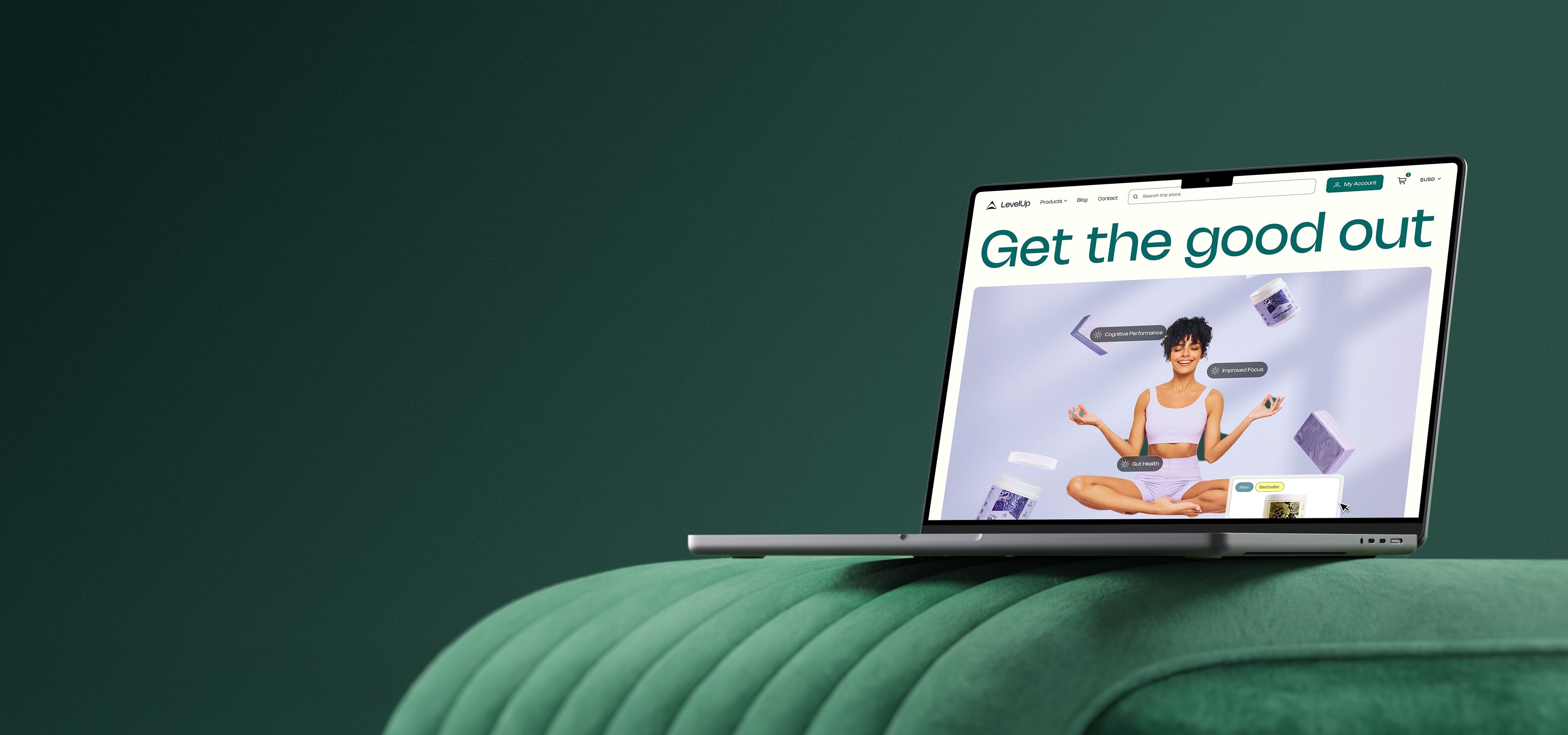
Your homepage not only needs to look great but also needs to drive conversions, and at Superside, we are fully aware of that. From clear messaging to the strategic use of visuals and CTAs, it’s time to take a look at some of the best and most successful homepage design examples out there so we can learn a thing or two from them. If you’re looking for an AI-powered partner to create a custom, conversion-focused homepage, Superside offers expert web design services tailored to your needs. Read on to learn more.
You can have the most beautiful website in the world, but if it doesn’t convert your leads into customers when you need it to, then there’s something lacking in your homepage design. After all, your homepage is likely one of your highest trafficked and converting pages.
If you’ve been looking for inspiration on ways to bump up those website conversions by tweaking your homepage elements, then you’re in the right place.
In this blog post, you’ll find the best home page design examples, made to convert prospective customers and make a great first impression. We’ve also outlined some quick homepage tips and tricks that you can take with you to start optimizing one of the most important pages of your website right away.
The ROI of Homepage Design in 2025
The ROI of a well-designed homepage goes beyond aesthetics—it directly impacts brand trust, user engagement and conversion rates. Your homepage serves as the digital front door to your business, often influencing a visitor’s decision to explore further or leave within seconds. A strategic homepage design combines intuitive navigation, optimized visuals and compelling calls-to-action to guide visitors seamlessly through their journey, resulting in measurable business outcomes.
A high-performing homepage can significantly improve bounce rates, boost click-through rates (CTR), and drive lead generation or sales. With users increasingly demanding frictionless online experiences, even small design optimizations—like clearer messaging, faster load times, or mobile responsiveness—can deliver substantial ROI.
At its core, a homepage designed to align with user intent and behavior ensures every visitor interaction is a step closer to conversion, creating a ripple effect of growth across marketing and sales efforts.
At Superside, we merge AI technology with human creativity to deliver homepage designs that don’t just look impressive—they perform. By focusing on user experience (UX), brand storytelling and conversion optimization, we ensure your homepage becomes a powerful asset that pays dividends in 2025 and beyond.

Getting Started with Homepage Design
Ever heard of KISS? “Keep it simple, stupid.”
Alright, the "stupid" may not be totally necessary, but it helps drive home the point.
The best homepage design examples out there have something in common: they tackle your target audience’s needs with consistent content, well-designed essential elements and creative copywriting.
Though creating a simple homepage design may sound like an easy task, many companies struggle to follow this advice. With the excitement of building a brand new website or revamping your existing one, it’s easy to want to share all the amazing things you have to offer right there on the front page.
First, start by outlining the most important bits of information and determine how to best structure them to get your message across. This will help keep your homepage design simple, yet effective.
Let’s get into why a smartly designed homepage can positively affect your bottom line. (Hint: whether you're an eCommerce site or not, this page holds the most weight!)
What Are The Benefits of a Well-Designed Homepage?
Having an awesome homepage is not optional these days—the power of landing pages to capture the attention of your visitors and convert them into customers is undeniable and a way to win more customers.
Your homepage tells visitors what your website, business or service is about, and having good homepage design on your site has the following benefits.
Helps inform your target audience about what your business does
First impressions are everything: your homepage should clearly communicate:
- Who you are
- What you’re about
- How your audience can benefit
Your homepage is likely the first page website visitors will land on, so it’s important that you nail this down from the start.
Once your potential customers land on your website, they will assess the site’s design to see if they are in front of a reliable business that provides users with what they need.
Improves brand awareness
As a part of communicating who you are, you need to establish your brand image. This can be anything from emphasizing your logo and your brand colors, to crafting that memorable one-liner explaining why you’re here (also known as your tagline). Let the world know what you’re all about through compelling (and on brand) content!
It’s a no-brainer that when visitors come across your website they’re thinking, “What’s in it for me?”. Be sure to communicate what problems you solve, how you solve them, and what makes you stand out from your competitors.
Leads to a boost in website conversions
To best put your conversion optimization skills to work, you’ll need to strategically give visitors the opportunity to convert. Think:
- Lead capture forms to build your email list
- Free trials to give users a chance to explore
- Video demos to help explain and educate.
Great homepage design is not only about being beautiful and focused on different design principles—conversions take center stage. That’s why important elements like a search bar, product photos and primary calls-to-action are crucial for increasing your website’s profitability, especially for online stores that depend on reliable eCommerce Hosting to keep pages fast and responsive.
TIP: When you build a website, put your Call-To-Action (CTA) above the fold on your homepage to help increase the Click-Through-Rate (CTR).
Superside: The Homepage Design Partner Your Brand Deserves
Don’t leave any of your homepage features to chance—your users deserve easy access and intuitive navigation as soon as they land on your company’s site, and that’s what Superside is here for.
With our web design services, which include landing page design and more, we’ll help you not only with the design elements of your website but also with the key features that high-performing homepages have.
Take, for instance, the work we did for Packt—thanks to our web design expertise, we improved their brand identity and delivered a homepage where most visitors feel immediately greeted and ready to move down the marketing funnel.
Superside leverages the latest AI technology, and our single creative subscription includes everything you need beyond just homepage design. Want to learn more? Book a call.
9 Homepage Design Ideas and Examples to Get Inspired
Learning from the best is always a great idea! Let’s take a look at the 9 best homepage examples with an explanation of why they work, so you can take these ideas and apply them to your own website.
1. Foursixty

Why it works:
- H1 Copy: Three statements: “Your UGC.” “Your Instagram.” “Made shoppable.” Right off the bat, their target audience of eCommerce site stakeholders understands that Foursixty is a platform that deals with shoppable Instagram user-generated content. So simple, yet so effective.
- CTA: The CTA copy is clear and informative, telling visitors they can start a free trial that will last for a period of 21 days.
- Social Proof: A sense of trust and authority is established by listing a few reputable companies (of a vast amount) that use Foursixty with “Trusted by over 3000 brands”.
2. Okendo

Why it works:
- H1 Copy: The bold heading with “Customer Reviews” quickly informs their target audience what the platform is about.
- Header Visual: Okendo takes it a step further in the heading by indicating that they’re the new standard in the customer review space, encouraging people to keep them top of mind. Name-dropping the highly successful eCommerce company Shopify is also a nice touch for credibility.
- Body Copy: Okendo’s use of copy highlights feelings of trust and excitement to resonate with site visitors.
- CTA: The “Book a Demo” CTA paired with the email form field is a well-executed tactic to capture leads.
3. Grammarly
Why it works:
- H1 Copy: The powerful heading immediately draws the viewer in, and the proceeding copy touches on common pain-points and how Grammarly can solve them.
- Social Proof: High customer ratings and an even higher number of people who use the service are prominently displayed.
- Animations: Grammarly does a great job of showing the app in action with animations of different uses cases such as email, word docs, and more. Including website animations in your homepage design is an effective (and fun!) way to further illustrate points and grab attention. Check out these 10 great examples of website animations for more inspiration.
4. 500px

Why it works:
- Branding: The bright yellow shape captures the brand’s visual identity while using strong language such as “best” and “incredible”.
- Visuals: A smart move for a photography-based platform to include a photo in the header, especially one where the subject is pointing to the most important bit of information on the homepage.
- Benefits List: Convincing user benefits are listed below, touching on what makes 500px different.
5. Mint

Why it works:
- Compelling Copy: Mint uses emotionally-charged copy to appeal to visitors. They project an encouraging and reassuring vibe which is important for touchy, high-stakes topics like finance.
- Header Visual: A snapshot of the app’s interface gives visitors an idea of what the app looks like — its friendly UI helps ease the anxiety that comes with money management.
- Prominent CTA: The “Sign up Free” CTA pops in orange, inviting users to get started right away with using the service.
6. Mailchimp

Why it works:
- Keeps it Fresh: Mixing it up is a part of the quirky Mailchimp brand, as they often update their website’s homepage design. You almost want to keep revisiting it to see what’s new.
- Originality: Mailchimp’s custom typography makes the already captivating heading even more so with its friendly yet attention-grabbing serif font.
- Use of Color: the bold statement yellow demands attention and works well with the subdued green CTAs that also draw you in.
- Benefits List: Mailchimp does a solid job of answering the “what’s in it for me” question by listing three key benefits for their customers.
7. Asana
Why it works:
- Value Emphasis: Time is valuable and Asana made sure to emphasize this in the very first sentence on their homepage.
- Header Copy: A clear definition of Asana and its purpose are well-summarized in the main header copy, showcasing their value propositions.
- Animations: As you watch the website animation of the app in action, you feel more and more compelled to hit the “Try for free” CTA to get started on managing your own team’s projects.
8. Spotify

Why it works:
- Trial Offer: The trial offer couldn’t be more clearly communicated with the header copy, “Try Premium free for 3 months”.
- Undeniably Great Branding: Spotify is known to use vivid colors throughout their visual assets, and their website is no exception.
- Header Visual: An image of headphones on a contrasting background catches the eye, illustrating that this is a music streaming service. Simplicity wins again!
TIP: We recommend using a brand style guide to help to keep all of your visuals and designs cohesive.
9. Slack
Why it works:
- H1 Copy: Slack takes a confident approach with a captivating headline. They don’t talk about the features of Slack, but rather how Slack can improve and empower your team.
- Compelling Copy: The ease of use and convenience factor is communicated with “put collaboration at your fingertips.”
- Visual Benefits List: As you click through the list of key user benefits on the right-hand side, relevant snapshots of the platform’s user interface appear, showing you exactly what you can expect to see when using the platform.
- CTA: The “try for free” CTA and email capture form field are hard to resist with the gently floating logos of Slack compatible apps, adding a subtle touch of animation to the homepage.
7 Website Homepage Design Tips and Tricks
There’s no magic formula for designing a winning homepage that converts. But, the best website homepage designs do have some common characteristics that we’ve broken down out for you to take note of and carry into your own homepage design.
1. Minimize excess information, maximize what’s important
Introduce your brand in a sentence or two, and have a clear unique selling proposition (USP), ideally in your H1 copy.
On top of that, your key benefits for your target audience should have a prominent place on your homepage, and that’s it. Anything else on top of that is likely to be fluff.
2. Use powerful language that resonates
Play up your copywriting skills by incorporating compelling power words to evoke emotions from your desired audience. Tell them how you can save them time with words like “instantly” and “in seconds”. Emphasize the ease of using your services with words like “effortless” and “no nonsense.”
The more you tap into your audience’s minds with power words, the more likely it is they will convert.
3. Include high quality visuals to accompany your words
With all the time and energy that goes into writing effective website copy, it’d be a shame for that hard work to go to waste with lackluster images. Ensure that you include high quality photos, illustrations or videos that are:
- Relevant to your website design
- Can further drive your concepts home
- Stay true to your brand.

4. Make use of contrasting colors for impact
Contrasting colors is a form of visual salience, which is defined as “the distinct subjective perceptual quality which makes some items in the world stand out from their neighbors and immediately grab our attention”.
In other words, if you’re faced with a series of purple dots with one yellow dot among them, your gaze will naturally go to the lone yellow dot. Apply this knowledge to your website design when creating CTAs for higher conversions.
5. Showcase brand authority
There's no argument that human beings are creatures easily influenced by others, especially those they consider an authority. With well-known and established brands in your arsenal, it becomes easier to sway visitors to take the desired action on your website.
If you don’t have any high authority brands using your product or service, don’t fret. customer testimonials and “star reviews” can help to build that trust.
6. Optimize for mobile
With roughly 51% of website traffic coming from mobile devices, it’s a smart idea to practice mobile-first design. A mobile-optimized website design not only enhances the user experience, but greatly impacts your online conversions as well. This is something that can even affect your SEO and traffic, so it’s pretty darn important.

7. The power of testing
You never really know what will work until you try it. When doing any type of website optimization — whether on our homepage, product page or alike — it’s important to test. Try different color CTAs, banner images, layouts, and more. Find what works for you and what best resonates with your customers.
Having a stellar website that not only looks great but also converts, should be a top priority for any business. Sometimes, it doesn’t take much to start seeing results.
Need a Custom Web Design? Superside Is Here for You
Working with a design team can help elevate websites even further. Strong design teams like Superside incorporate all the necessary elements of websites built to convert.
See how we’ve transformed desktop and mobile web designs for other brands, and how you can get your own custom web design for your business.
Top UX/UI and web design
We use atomic design methodology to
create cohesive, scalable and high-performing
digital experiences.
Our accessibility-first approach creates
unique assets, made to engage and convert.


Elevate design with AI and human creativity
At Superside, our top-notch creatives work with AI.
We use the latest tech to your brand stand out,
scale faster and optimize conversion rates.
Want to learn more?


Give your internal teams the power to boost your brand
Publish once. Deliver everywhere. Our Creative Ops platform
puts your brand in front of the right people, everywhere.
Unlock seamless content distribution. Access your audience.


