Typography is the art and technique of arranging type, including the selection of typefaces, point size, line length, line spacing, and letter spacing. It plays a crucial role in the communication of written language, both practically and emotionally. Its roots go back to the earliest days of written language. But today, it has become an essential aspect of graphic design, influencing how text appears in every medium.
Interactions with Other Design Elements
In graphic design, typography is not an isolated element but interacts with other aspects such as color, texture, and imagery. The alignment of type with these elements can create harmony or discord, depending on the design's intention. Let's delve deeper into its multifaceted interactions.
1. Typography and Color
The relationship between typography and color is akin to the partnership between melody and harmony in music. The right color can elevate a typeface, making it sing with emotion and intent. For instance, red might be used to convey urgency or passion, while muted gray could suggest subtlety or professionalism.
Conversely, a mismatched color can render text unreadable or misrepresent its intended emotion. Moreover, color can dictate the attention a piece of text receives; brighter hues might pull the eye, while muted tones recede into the background.
2. Typography and Texture
Texture in design is about perceived surface quality - whether something feels rough, smooth, soft, or hard. When typography engages with texture, it can either enhance or counteract these perceptions.
Imagine a gritty, distressed typeface against a sleek, glossy backdrop; the juxtaposition creates intrigue. Alternatively, a smooth, elegant script on a soft, velvety background would exude luxury and cohesion.
3. Typography and Imagery
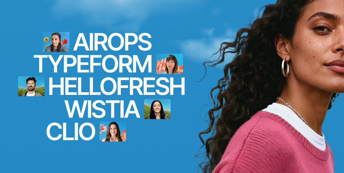
Images convey stories, set scenes, and evoke emotions in ways words cannot. When typography intertwines with imagery, it must either complement the narrative or deliberately contrast it.
A type overlay on an image should be legible, without overshadowing the image’s importance. The scale, weight, and style of the font can either reinforce the imagery's message or provide an unexpected twist.
4. Balance and Contrast
Typography's role isn't static; it flexes and shifts depending on its surrounding elements. When a design is heavy with visuals, the type might play a supportive role, providing balance without stealing the spotlight. In minimalistic designs, typography might stand boldly at the forefront, creating contrast and capturing attention.
5. Hierarchy and Focus
Typography is a master at guiding the reader's journey. By playing with font sizes, weights, and styles, designers can create a hierarchy of information. Larger, bolder fonts scream for attention, while smaller, lighter fonts whisper supplemental details. This orchestration ensures that the most crucial messages are grasped immediately, with secondary information following suit.
Principles for Integrating Type Effectively
Font Selection
Choosing the right font is paramount in delivering the correct message.
Fonts have personalities: Serif fonts, like Times New Roman, often convey tradition and reliability, making them popular for formal publications. Sans-serif fonts, such as Helvetica, feel modern and clean, often used in digital design. Script fonts might evoke elegance, while display fonts can make a statement. The key is to choose a font that aligns with the design's intent and audience.
Line Spacing, Letter Spacing, and Word Spacing
Beyond just the font, the space around and between letters significantly influences readability.
Line spacing, or leading, is the space between lines of text. Adequate leading prevents text from feeling cramped, ensuring a comfortable reading experience.
Letter spacing, or kerning, is the space between individual letters. Proper kerning ensures that letters don't overlap or sit too far apart, which could disrupt reading flow.
Word spacing refers to the space between individual words. Like other spacing elements, the goal is to maintain fluidity and prevent congestion.
Color and Size
Typography isn’t just about the shapes of letters but also their color and size. Colors can evoke emotions, draw attention, or make text recede into the background. The size determines emphasis and hierarchy. The large, bold text captures attention, while the smaller text relays secondary information.
Readability and Legibility
While they sound similar, these are two distinct principles:
Readability concerns how entire blocks of text are perceived and understood. Layout, spacing, and font choice all play into this.
Legibility focuses on the design of individual letters and words. It ensures that each character is distinguishable from another.
Before-and-After Examples
Good Typography vs. Poor Typography
Visualizing the difference between good and bad typography can be enlightening. Good typography seamlessly guides the reader, with every element from font to spacing working harmoniously. In contrast, poor typography feels jarring or confusing, often leading to misinterpretation or loss of interest. Here are two before-and-after examples that demonstrate the effect of good vs. poor typography, focusing on various aspects like font choice, spacing, and alignment.
Example 1: Website Header
Before (Poor Typography):
- Font: Multiple conflicting typefaces are used, causing visual confusion.
- Color: Text color clashes with the background, causing strain on the eyes.
- Alignment: Center-aligned text with inconsistent spacing, leading to a disorganized appearance.
Result: The header appears unprofessional, and the conflicting elements may cause readers to lose interest or trust in the website.
After (Good Typography):
- Font: A consistent, clean sans-serif typeface that feels modern and easy to read.
- Color: A well-contrasted color scheme that makes the text stand out without clashing.
- Alignment: Left-aligned text with uniform spacing, creating a structured and inviting look.
Result: The revised header is sleek and professional, encouraging trust and further reading.
Example 2: Poster for a Music Concert
Before (Poor Typography):
- Font: Overly ornate script that is difficult to read from a distance.
- Size: Uniform size for all text elements, causing a lack of hierarchy and focus.
- Spacing: Tight line spacing and kerning, making the text appear cramped.
Result: The essential information is lost, and the poster fails to grab attention or convey the event's vibe.
After (Good Typography):
- Font: A bold, stylish typeface for the headline, paired with a simpler font for details.
- Size: Varying sizes to create a hierarchy, with the concert's name largest and other details appropriately scaled.
- Spacing: Adequate line spacing and kerning that enhances readability and aesthetic appeal.
Result: The revised poster is eye-catching, clearly communicates the necessary information, and resonates with the concert's intended audience.
These examples demonstrate that good typography is not merely an aesthetic choice but a functional one. It influences how the information is perceived, consumed, and acted upon, whether it's navigating a website or deciding to attend an event. The difference between good and poor typography can be the difference between success and failure in a design's purpose.
Latest Trends in Graphic Design Typography
Modern Typefaces and Fonts
Designers are continually innovating, leading to the rise of unique and modern fonts. These new typefaces often challenge traditional boundaries, offering fresh perspectives and creative avenues for expression.
Technology's Influence on Typography
The digital age has revolutionized typography. Variable fonts, which allow designers to interpolate a font's weight, width, and other attributes smoothly, are gaining traction. Additionally, augmented and virtual reality are opening new dimensions for typographic exploration.
Sustainable and Inclusive Designs
There's a growing emphasis on typography that's accessible to everyone, including those with disabilities. Beyond physical design, the ethos of sustainability is permeating typography, with eco-friendly printing techniques and materials coming to the fore.
Conclusion
Typography, in its essence, is the backbone of design. It's more than just words on a page. It’s a dynamic force that shapes communication, setting tone, intent, and emotion. As we gaze into the future, one thing remains clear: typography’s evolution is endless, promising ever-evolving ways to convey, connect, and captivate.


