





Global ad spend crossed a trillion dollars for the first time this year, so the distance between a campaign that performs and one that merely looks good is now measured in real money. The 14 examples below are grouped by channel and carry the outcome each one produced, including four that Superside made.
An advertising example is a real campaign you can study for its idea, its channel and its outcome, rather than a mockup or a concept board. The 14 here are organised the way media plans actually get built, in four channel families running from paid social through to display, search and SMS.
Each entry names the channel it ran on, explains what made it work and, where the figure is public, gives the result. Four are campaigns Superside built, so those numbers come from our own project data rather than a press release.
Advertising isn’t a quiet business to be in right now. Dentsu’s Global Ad Spend Forecasts put worldwide spend past one trillion US dollars for the first time in 2026, growing 5.1% against a global economy expanding 3.1%, with programmatic accounting for more than four fifths of digital investment.
More money chasing more automated placement means the creative itself now carries a load that targeting used to share, because every advertiser has access to the same optimisation and only the idea is still hard to copy.
If you want the broader map before the examples, we have separate pieces on the different types of advertising design, on digital ad campaigns that performed and on the creative trends shaping campaigns this year.
What makes an advertising example worth copying
A campaign is worth studying when you can name the mechanism that made it work and then apply that mechanism somewhere else. Awards and view counts won’t tell you that, but these four things will.
- One idea, stated once. If you can’t summarise the campaign in a sentence, neither can the audience.
- A mechanism you can lift. Humour, sensory cues, personalisation and inversion of a category convention all travel. A celebrity budget doesn’t.
- Built to multiply. Strong campaigns are designed as systems that throw off dozens of variants, not as single hero assets that then get awkwardly resized.
- A number attached. Click-through, conversion, production time or output volume. Something that says whether it moved.
That last one is where most example roundups quietly give up, which is why we’ve included results wherever they’re public and said so plainly when they aren’t.
The 14 advertising examples at a glance
Here’s the whole list in one view, so you can jump to the channel you’re actually briefing.
Campaigns marked “by Superside” are ones our teams produced, with figures taken from the published customer stories.
| Campaign | Channel | Why it worked | Result |
|---|---|---|---|
| PointCard, by Superside | Paid social | Concepts built to be multiplied, then tested at volume | CTR up 240%, from 0.54% to 1.84%, and a 275% conversion lift across 441 assets |
| OPA!, by Superside | Paid social and mobile | Identity rebuilt to match the category, not the funding round | Full rebrand in one month, output tripled, 5 out of 5 CSAT |
| Boomi, by Superside | LinkedIn and paid social | Volume of on-brand imagery raised without adding headcount | 3x creative output, 75+ images, 24% LinkedIn engagement rate |
| Reese’s | Social and TV | American product translated through British humour | Not published |
| Old Spice | TV, OOH, digital and in-store | Absurd humour aimed squarely at the brand’s own dated image | Not published |
| Magnum | Cinema, TV, digital, print and OOH | A sound the product already owned, turned into the whole idea | Not published |
| Marqeta, by Superside | OOH and motion | Complex motion work compressed into a launch window | Times Square takeover produced in five days |
| The North Face | Social, as fake out-of-home | Impossible scale rendered in CGI at a fraction of real OOH cost | Not published |
| Coca-Cola, “Share a Coke” | BVOD, social and OOH | Personalisation that makes the customer the media | Not published |
| WWF | Visual metaphor doing the work that copy usually does | Not published | |
| Invisalign | Display | A curiosity gap in place of a discount | Not published |
| Microsoft Azure | Display and search | Control handed to the reader inside the CTA | Not published |
| Mando | Social and digital | Four words and one high-contrast CTA | Not published |
| Hoka, with Attentive | SMS | Triggered follow-up tuned to the individual, not the segment | Not published |
Paid social is where creative wears out fastest and where the gap between a good idea and a good system shows up quickest.
All four examples below solved the same underlying problem, which is that you need far more on-brand variants than a single team can comfortably produce, and the variants have to be different enough from each other to actually teach you something.
Three are Superside campaigns with published numbers. The fourth is a masterclass in cultural translation.
1. PointCard, by Superside
Campaign concept: PointCard is a fintech with a genuinely good in-house design team and nowhere near enough hours. They wanted a debit product to feel like a design object, and they wanted to find out which version of that story converted. Superside became the production engine behind roughly 30 concepts.
Channels and platforms: Paid social, static and motion.
Results and impact: Those 30 concepts became 441 static and motion ads over six months. Click-through went from 0.54% to 1.84%, a 240% increase, and click-to-install conversion grew 275% against a target of doubling it.
Why it works: The concepts were designed from the start to be versioned, so the 9:16 cut came first and the feed sizes came off it rather than the other way around. At 441 assets the test results describe the creative rather than the noise, which is how a click-through rate triples instead of wobbling. PointCard also learned what didn’t work, discovering that a lifestyle-led angle underperformed the points and perks narrative. That insight only exists because there was enough volume to see it.
Key takeaway for brands: Design concepts for multiplication before you design them for beauty. A concept that can’t be versioned is a single asset wearing a campaign’s clothes. If Instagram is your main surface, our breakdown of Instagram ad examples goes deeper on the formats.
2. OPA!, by Superside

Campaign concept: OPA! is a food-focused app and gifting brand that had somehow ended up looking like a neobank. Cool blues, clinical type, not a crumb in sight. The company needed a full identity overhaul plus the social assets to launch it.
Channels and platforms: Paid social and mobile advertising.
Results and impact: The rebrand went from concept to rollout in one month, social creative output tripled and the engagement scored 5 out of 5 on customer satisfaction.
Why it works: Category conventions exist for a reason. Food brands use warmth, texture and appetite cues because those cues work, and a fintech palette on a food app creates a quiet mismatch the customer can feel without being able to name. Fixing the identity and producing the launch assets inside the same engagement meant the new look arrived fully dressed rather than as a PDF that someone would have to interpret later.
Key takeaway for brands: If your ads underperform across every channel at once, the problem is usually upstream of the ads. Check whether your identity is telling the audience you’re in a different category than you are.
3. Boomi, by Superside

Campaign concept: Boomi needed more creative for lead generation than its team could ship, particularly on LinkedIn where B2B audiences punish repetition quickly.
Channels and platforms: LinkedIn and paid social.
Results and impact: Creative output tripled, 75 or more images were produced and LinkedIn engagement reached 24%.
Why it works: B2B feeds reward consistency of look and variety of message, which is an awkward combination to deliver by hand. Producing a large image set against one visual system means each post feels like part of something while still saying something new. The engagement rate is the tell, because at 24% the audience clearly isn’t just scrolling past a frame it recognises.
Key takeaway for brands: In B2B, treat creative volume as a targeting input. You can’t learn which message lands if you only ever ship one.
4. Reese’s
 (Source: AdAge)
Campaign concept: Reese’s wanted British shoppers to care about peanut butter in chocolate, a combination that is close to a birthright in the United States and faintly suspicious in the UK. The answer was a social campaign built around the brand’s cheerful willingness to put peanut butter in absolutely everything.
Channels and platforms: TV and social sharing channels.
Why it works: Comedian Henry Paker pouring peanut butter into a chocolate stiletto is the kind of image that survives being described to someone else, which is most of what sharing is. The humour is British rather than translated British, and that distinction carries the whole campaign, because an American brand making American jokes louder would have gone nowhere.
Key takeaway for brands: Localisation isn’t translation. If you’re taking a campaign into a new market, rebuild the joke rather than subtitling it. Our guide to enterprise creative localization covers how to do that at scale.
Video and TV advertising examples
Video is the format most creative teams say they’re least equipped to make in-house, and it’s also the one where a single strong idea buys the most attention.
These two campaigns are decades apart in style but identical in method. Each found one thing the brand already owned and refused to add anything else.
5. Old Spice
Campaign concept: A swashbuckling, Pirates of the Caribbean-themed spot built on the premise that men’s deodorants never last as long as they claim, parodied aboard a spectacularly foul-smelling pirate ship.
Channels and platforms: TV, out-of-home, digital channels and in-store.
Why it works: The 90-second commercial behaves like a blockbuster trailer rather than a body wash ad, which buys it a level of attention no product demo would get. Old Spice has spent years mining its own fusty, grandfather’s-bathroom-cabinet image for comedy, and the audience is in on the joke. Self-aware humour signals that a brand understands how it’s perceived, and that turns out to be disarming in a category built on aspiration.
Key takeaway for brands: Your least flattering brand association is usually your best comedic asset. Naming it first takes it away from everyone else.
6. Magnum

(Source: Magnum)
Campaign concept: “Nothing Cracks Like Magnum” turns the sound of the chocolate shell breaking into the entire proposition, across a series of slow-motion films where elegance, pleasure and chaos collide in the reactions triggered by one dramatic bite.
Channels and platforms: Cinema, TV, digital channels, print advertising and out-of-home.
Why it works: The crack was already the thing people loved about the product. The campaign just noticed. Building around an existing sensory signature means the ad and the product reinforce each other every single time someone eats one, which is a compounding return that no amount of media spend replicates. If you’ve ever had a Magnum, believe us: you’ll crave another after watching the ad.
Key takeaway for brands: Audit what your product already does to the senses before you invent a new idea. Sound, texture and weight are all underused and none of them need a celebrity. Making this kind of work at pace is the core of our video production offer.
Out-of-home, print and experiential advertising examples
Physical and pseudo-physical media are having a strange renaissance, partly because a billboard is one of the few surfaces an algorithm can’t personalise away. The four campaigns here range from a genuine Times Square takeover to a billboard that never existed, and they share a preoccupation with scale. Each one asks the viewer to register size first and message second.
7. Marqeta, by Superside
Campaign concept: Marqeta had a Times Square moment booked and a very short runway to fill it with motion work that could hold its own against the brightest advertising real estate on earth.
Channels and platforms: Out-of-home and motion design.
Results and impact: Complex video and motion work turned around in five days.
Why it works: Times Square punishes hesitation. The screens are enormous, the dwell time is a few seconds and the competition is every other brand with money. Producing motion at that quality inside five days is a resourcing achievement more than an aesthetic one, and it’s the reason the moment happened at all, since a campaign that misses its window is worth nothing however good the file looks.
Key takeaway for brands: For time-bound placements, production capacity is the creative constraint. Book the capacity the same day you book the media.
8. The North Face

(Source: JD Sports and Creative Bloq)
Campaign concept: Fake out-of-home, or FOOH, uses CGI to stage ads in real-world settings that never actually happened. The North Face wrapped a digital Big Ben in an oversized puffer jacket. The jacket looks great on Ben, don’t you think?
Channels and platforms: Exclusively social media.
Why it works: FOOH gets the visual payoff of an impossible installation without the permits, the crane or the eight-figure budget. The surreal scale is what makes people stop, and the faint uncertainty about whether it’s real is what makes them comment, which is how a campaign with no media buy behind it ends up distributed anyway.
Key takeaway for brands: FOOH mimics the outcome of a high-budget campaign at a fraction of the cost, which makes it unusually friendly to smaller advertisers. Yup, if you’ve ever hoped to go viral, this is your chance. Keep the landmark recognisable and the product absurdly oversized.
9. Coca-Cola, “Share a Coke”

(Source: Coca-Cola Co.)
Campaign concept: Coca-Cola replaced its own logo with people’s first names in 2011 and has kept reviving the idea since, most recently pairing physical packaging with digital hubs where customers find named products, customise bottles and make personalised videos.
Channels and platforms: Broadcaster video-on-demand, social platforms and out-of-home.
Why it works: Giving up the most valuable logo in the world for a stranger’s name is a genuinely bold trade, and it converts the customer into the medium, since every bottle photographed and posted is media the brand didn’t buy. The recent relaunches work because they add a digital layer without touching the original mechanic, which was always personalisation plus a reason to hand the thing to someone else.
Key takeaway for brands: The strongest personalisation makes the customer want to show someone. Personalisation that only the recipient ever sees is just good CRM.
10. WWF

(Source: Ads of the World)
Campaign concept: A print campaign of stark, arresting images built on visual metaphor, in the tradition WWF has been refining for decades. Archives like Ads of the World are full of them.
Channels and platforms: Printed media.
Why it works: Print gives you one frame and no sound, which forces the idea to carry everything. WWF’s answer is consistently to show a consequence rather than state a fact, because a deforestation statistic slides straight past you while an image that makes you feel complicit in it doesn’t.
Key takeaway for brands: Constraints improve ideas. Try laying out your next digital concept as a single silent print frame and see whether it survives. Our print design work starts from exactly that discipline.
Display, search and SMS advertising examples
These are the unglamorous formats, the ones nobody enters into awards, and they’re where most performance budgets actually go. Banner blindness is real and getting worse, so the four campaigns here all win by refusing to behave the way their format usually behaves. None of them shouts. Each one gives the reader a reason to act that isn’t a discount.
11. Invisalign

(Source: Wordstream)
Campaign concept: Instead of a product shot and a price, Invisalign ran display advertising offering a free online “smile assessment”, using curiosity to earn the click.
Channels and platforms: Display and online advertising.
Why it works: Most people have no idea what a smile assessment involves and would quite like to find out, which is the whole trick. The quiz also does useful work after the click, qualifying the visitor and collecting the information that makes the follow-up relevant. Display sits at the top of the funnel where almost nobody is ready to buy, so the job is to start a conversation rather than close one.
Key takeaway for brands: Replace the offer with a question. Curiosity converts colder audiences than discounts do, and it gives you data a coupon never will.
12. Microsoft Azure

(Source: Wordstream)
Campaign concept: A small rewrite of a very standard line. “Start your free trial today” became copy that lets the reader decide when the trial ends and the billing starts.
Channels and platforms: Display and search advertising.
Why it works: The unspoken objection to any free trial is the date you forget to cancel. Addressing that inside the call to action removes the hesitation at the exact moment it forms, without adding a word about features. It’s a useful reminder that most banner copy fails because it answers a question nobody was asking, not because it’s badly written.
Key takeaway for brands: Write your CTA against the reader’s last objection rather than your first benefit.
13. Mando

(Source: LocaliQ)
Campaign concept: A men’s personal care brand delivering its entire proposition in four words, set against a high-contrast white call to action on orange.
Channels and platforms: Social and other digital channels.
Why it works: In a feed, the message has to land before the thumb moves, and four words land faster than forty. The colour contrast does the hierarchy work so the eye finds the call to action without being directed, and the wording names the product category rather than saying “learn more”, which means the click arrives carrying intent.
Key takeaway for brands: Specific CTAs outperform polite ones. “Shop deodorant” beats “discover more” every time because it tells the reader what happens next.
14. Hoka, with Attentive

(Source: Attentive)
Campaign concept: Hoka used the Attentive platform to send personalised product recommendations by SMS, helping subscribers narrow down which pair suited them instead of browsing a full catalogue.
Channels and platforms: SMS.
Why it works: When a new subscriber joins the SMS programme and doesn’t convert, an AI ad generator builds a tailored follow-up rather than firing the same coupon reminder at everyone. Adding social proof to that message creates urgency that reads as information instead of pressure. SMS is a small, expensive space where irrelevance gets you unsubscribed rather than merely ignored, so the personalisation is doing defensive work as much as commercial work.
Key takeaway for brands: Decision fatigue is a conversion problem. If your catalogue is large, the winning message narrows the choice rather than restating the offer.
What the best advertising examples have in common
Read the 14 back to back and a pattern shows up that has nothing to do with budget. Every one of them is really a system rather than an asset.
- PointCard’s 441 ads came from 30 concepts.
- Coca-Cola’s names are one mechanic repeated across millions of bottles.
- Magnum’s crack is a single idea rendered across cinema, print and out-of-home without losing anything in the move.
That’s the good news and the hard part at the same time. Systems produce volume, and volume is where brands drift.
The fortieth variant gets made by someone who wasn’t in the kickoff, working from a brand guideline PDF last updated eighteen months ago, and it’s slightly off in a way that no single person catches, but the audience gradually does.
Multiply that across markets and formats and the identity blurs while every individual asset passes review.
Capacity is the second constraint, and it’s biting hard. Superside’s Breakpoint report, a survey of more than 300 creative and marketing leaders at enterprise companies in Q1 2026, found 86% of teams at or beyond capacity and 78% saying creative demand already exceeds their ability to deliver.
You can’t run a 441-asset test programme out of a team that’s underwater.
The third pattern is subtler. Not one of these campaigns would be improved by removing the human judgment from it.
The Reese’s joke, the Old Spice self-mockery, the decision to give up the Coca-Cola logo, all of that is taste.
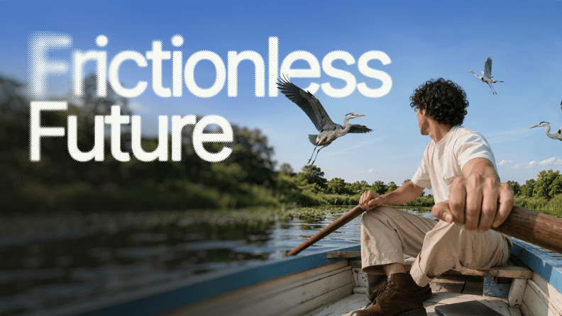
In Superside’s Frictionless Future trend report for 2026, 97% of creatives said it’s extremely or very important that creative output stays distinctly human. Speed comes from the production around the idea rather than from the idea itself, which still needs someone with taste to have it.
How Superside builds advertising that performs
Superside is the world’s leading AI-first creative partner, and the reason we’re in this article at all is that four of the campaigns above came out of our studio. We work as an extension of in-house teams, staffing from a bench of 500+ creatives across 67 countries with more than 90% certified in AI tools, and we’ve delivered over 200,000 creative projects to date, 12,000 or more of them AI-powered. In the last twelve months, 95% or more of projects were rated four or five stars. Simply put, we’re your creative team’s creative team.
The drift problem described above is the one we’ve spent the most engineering effort on. Brand Brain holds your voice, visual rules, specs, past assets and accumulated feedback as connected knowledge rather than a folder of files, and it reasons across those connections instead of just storing them.
It sits at the heart of Superspace, our AI-powered creative management platform, where briefs, reviews, feedback and delivery live in one place. Confirmed brand decisions become rules the system applies with full confidence. New information enters as a learning and only becomes validated knowledge once someone confirms it’s right.
Our team maintains all of it, so nobody on your side is training anything, and it’s included in the engagement rather than sold as an add-on. Being human-led and AI-powered is the whole design.
Being AI-first means AI isn’t just powering individual tools. It’s embedded across the entire creative model, from how teams are trained to how brand knowledge compounds over time. The measurable part shows up in production, where our No-Hype AI Impact Report from September 2025 recorded a 40% average reduction in design time when AI is used, with image production running 10x faster at 75% less time and 85% lower cost per image. That’s what turns a 441-asset test programme into a normal month rather than a heroic one.
Subscriptions start at a $15,000 monthly minimum on an annual term, with a $1,000 monthly software fee covering Superspace and Brand Brain access. Dedicated AI-native teams start at $30,000 a month on a twelve-month term.
Steal the pattern, not the campaign
The temptation with a list like this is to pick a favourite and brief something that looks like it. That almost never works, because what you’d be copying is the surface of a decision made about a different brand in a different market.
What travels is the mechanism. Reese’s rebuilt a joke for a new audience. Invisalign swapped an offer for a question. Marqeta bought capacity at the same time as media. Any of those can be applied to your category tomorrow.
The other thing worth taking from these 14 is the honesty about volume. Campaigns that get results are rarely the ones with the single best asset. They’re the ones that produced enough variants to find out what worked, and stayed recognisably themselves while doing it.
If you want more structured guidance, our digital advertising design guide collects best practices and case studies in one place, and our roundup of creative performance examples goes further into measurement. For the strategic layer, start with ad creative strategy for enterprises.
Or skip the reading. Browse our recent ad creative and social media creative work and tell us what you’re trying to launch.
FAQs



Brand systems that scale with you
From one-off email assets to AI-powered workflows,
we make sure your brand grows with no compromise.
Schedule a chat to learn more.


Your creative team's creative team
Choose the world's leading AI-powered creative service
and get high-performing ads, videos, experiences and
more at scale, on your schedule and to your standards.


