


Youtube design is the art of crafting an attractive, unified aesthetic for your channel. From the banner, to the icon, to your video thumbnails—each element needs to best represent your brand and help your channel stand out. Whether you're a solo creative aspiring to fame or a business building your online presence, effective YouTube channel art is essential to your success.
After all, how you design your YouTube channel is the way that you advertise your business on this massive platform!
The issue is, even if you make incredible content, poor channel art will kill the chances of anyone viewing it. Poor image sizing, the use of text that's too small, or colors that don't stand out well will prevent your message from getting across. And you also need to be sure that your Youtube design works in the context of the new Youtube layout.
Effective YouTube branding starts with design.
In this post we cover the four elements of Youtube channel art and design, along with examples of channels that are doing an incredible job! Read on to find our how to improve your YouTube channel design.
The 4 Elements of YouTube Design
1. Youtube Channel Art / Banner

The Youtube banner is arguably the most important component of your Youtube design. It's the largest and most universal graphic that your channel includes, and the first thing a visitor to your channel will see. It needs to stand out—like the example YouTube channel art above from Tasty's channel.
- Minimum YouTube banner dimensions: 2048 x 1152 px
- Ideal YouTube banner size is considerably larger: 2560 x 1440 px
However, the YouTube banner size isn't universal, and there are still design elements to consider in order for it to look good in all situations.
People use Youtube on devices as small as smartphones and as large as smart TVs, and your banner needs to accommodate all of these options. If it's necessary to use text, then keep it minimal and utilize a very large font size so that it will still be readable while shrunken down. You can check out this free YouTube banner template to make your design fit all scenarios.

Graphically, your banner needs to speak to the character of your brand. Taking a look again at the Tasty example above, the lively, colorful banner highlights one of their newest episodes, giving you all of the details you need to tune in. Contrasting colors and the smiling image of a chef perfectly represent the content that Tasty produces.
You can find more examples of great Youtube banner ideas at this blog post.
2. YouTube Channel Icon/Profile Photo

The same text and scalability rules from banner design apply to your profile photo. Your profile photo is much smaller and is scaled down even further on videos, so the necessity of using little text or none is even greater.
- Profile images should be 800 x 800 pixels
Also consider that the profile image is cropped to a circle, so you should make sure your logo sits nicely in the centre and doesn't get cut off.
For your profile image, we suggest you use either:
- Your brandmark (Starbucks)
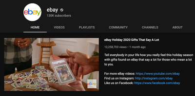
- Your wordmark (ebay)
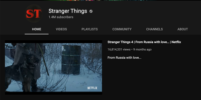
- Or a brand approved abbreviation (Stranger Things)
Simplicity is always your friend when it comes to social media graphic design. That's doubly true when it comes to profile pictures—so stick to your brand and ensure users are clear what channel they landed on.
3. Youtube Video Thumbnails

Video thumbnails are considerably larger than your profile photo, but much smaller than the banner. There's really only one size to adhere to, which makes it easy to template and create multiple variations of (like the example of the camper van account Vanlife Sagas above).
- YouTube thumbnail size: 1280 x 720 pixels
When your video shows up in the sidebar on another video, your thumbnail will be competing with many others. Bright colors and bold text will help draw attention and traffic whether the viewer is using dark mode or light.
Here's what you should include in your YouTube thumbnail:
- Short catchy text that describes the video
- Eye-catching graphics and colors
- And people (faces do well, so ideally it's someone in the video)
The other key to making successful thumbnails is by making effective clickbait.
We all know, love, and hate this phenomenon, and it's the way you'll make your videos irresistible. While clickbait tends to carry negative connotations, it doesn't have to be misleading or dishonest. You can utilize the same proven tactics to draw traffic while still being honest and accurate in advertising your quality content. Leverage this FOMO tactic to get more views.
4. Video Animations and Aesthetic
No matter what type of content your Youtube channel produces, animated intros and outros will serve you well. Virtually all professional media comes with a brief, punchy clip to punctuate the beginning an end. Making use of this sort of animated video for your own Youtube channel will immediately let viewers see the effort you put into your content.
When it comes to making quality intros and outros, there are a few key guidelines:
- Brevity and clarity are your friend, and these clips can easily become tiresome if they're too long.
- Keep it at fifteen seconds long or less.
- Your brand and logo should feature prominently in the video, and it should capture the spirit of your content.
For example, above is a an animated intro we made for our Gather & Grow video series. One of our designers animated the custom logo we made for the series, followed by a brief intro into what the video is covering.
9 Inspirational Youtube Channel Art Examples
Taking the above research and pointers, we've outlined 9 YouTube channels that are doing a killer job with their branding! Use these as inspiration for your designs, but don't feel limited to the ideas below—stay true to your brand.
1. Sephora

Sephora is one of the greatest sources of inspiration that any brand can look to. The banner is dynamic and rich with detail, but doesn't suffer from scaling down to mobile devices. Thumbnails and video titles are also gorgeous and pique your curiosity by promising personal stories and expert tutorials.
2. Mailchimp

A winking monkey with a mailman's hat? Brilliant, whatever Mailchimp is selling, I'm buying. The logo isn't the only win here, either, as the chaotic-yet-organized banner image is full of personality and clues you in on the creative orientation of the brand.
3. Adobe Creative Cloud

The Adobe Creative Cloud features a great deal of interesting, eye-catching design. It uses vibrant colors and creative graphics to show you what they're all about: artistic creativity.
4. Hubspot

Hubspot's simple logo, "Grow Better" banner, and "What is Hubspot?" intro video make for a beautifully effective introduction to this Youtube channel. The thumbnails also explain what each video is about and what a viewer serves to learn with brilliant clarity.
5. Refinery29

Refinery29 has one of the best examples of YouTube channel art that you'll find. It uses the block characters of the name as negative space, which it fills with beautiful places and people. This design does a great job of letting you in on what the page focuses on, while making you want to learn more.
6. Bon Appetit

Bon Appetit displays the power of simplicity across its banners and logo. The name in a classy, all-black font against a yellow background tells you exactly what this channel is about. While this is all very minimalistic, the thumbnails of amazing food speak for themselves.
7. Urban Outfitters

Urban Outfitters has an excellent, minimalist logo that relies mostly on text, but uses block font and a sharp contrast to make it clear. Their video thumbnails are also fantastic, as they seem to capture the emotion and activity of the person in each video perfectly.
8. PrimeGaming

Prime Gaming's banner gives you the impression that this is a broad, accessible channel for anyone who loves video games. Most gaming enthusiasts will be familiar with the characters on the logo, but every parent and child will recognize the LEGO figurines.
9. National Geographic

National Geographic comes up with a new banner regularly, but each one captures its theme excellently. As of November 2020, they're using a brilliant banner to commemorate Reimagining Dinosaurs. It includes elements such as feathers, scales, and varied features that encapsulate the current subject matter in a concise, instantly recognizable way.
Stay True to Your Brand
All of this to be said, there is no hard and fast rules when it comes to YouTube channel art and design. It should be unique to your brand and aesthetic!
The only thing you DO need to follow are the sizing guidelines and profile icon rules—you don't want any cut off text or messy looking images. From there, have fun with it! Change things up and test ideas. Your YouTube banner in particular is a great place to try out different designs and update it regularly.
If you don't feel like putting in the time to do your own designs (we get it, life is busy), Superside can also help with your brand design and YouTube channel designs.


