


How to Make an Infographic in PowerPoint


It doesn't seem like the Infographic marketing trend is going away anytime soon. Companies of all sizes are increasingly learning the value of this amazing visual tool and are including it as a part of their main content strategy.
Whether the goal is to create shareable content and go viral on social media or to create a backlink growth hack, Infographics are becoming the go-to option.
There are a ton of tools on the market with all kinds of bells and whistles to create Infographics. However, the good old PowerPoint still seems to be one of the popular choices.
In this video, one of Superside (formerly known as Konsus) PowerPoint Designers will walk you through the process of how to make an infographic in PowerPoint!
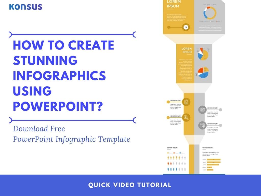
Click To Download Free Infographic PowerPoint Template
Video Transcription
Have you ever wanted to create infographics that are so beautiful they seem out of this world? If you have, then stick around for what’s about to happen.
Welcome to this wonderful video, where one of our Konsus experts will walk you through the process of creating a truly beautiful and exceptional infographic. Without further ado, let’s begin.
First, we establish the slide size you want for the infographic. To do this, we use the “Page Setup” Button. The orientation of the slide can be horizontal or vertical, and we can select whether to have it in A4 or a custom size.
Once that has been defined, we will need to go to the Master Slide and select the main colors you want for the infographic. We will be using a complementary color palette, which includes blue, yellow and grey.
Next, we will insert shapes and graphic elements to build the infographic, just like that. This is starting to take some shape, huh? Don’t get too excited, we are just getting started!
Using rectangles and triangles we can create the illusion of a path. To complete this illusion we can use white rectangles with low opacity, so it looks like a stair. The goal here is to make each rectangle smaller and narrower to give it more depth and make it look like it’s a journey.
We want the header to be nice and big so it’s clear what the topic of the infographic is.
The goal of this infographic is to achieve a clean and minimalist look, which is currently trending. To accomplish this, we have chosen a beautiful non-serif font.
Now let’s add some consistency to the design. It’s now time to add some graphics. Using several circles, we can create this shade and then use it throughout our infographic. By having multiple elements look the same throughout the infographic, this piece of art is starting to lot a whole lot better and consistent. Pretty cool, isn’t it?
Infographics typically hold a lot of data. We want to make all this data easy to look at. We can do this by adding some charts. The first chart we will introduce is the Doughnut chart.
Click on the Chart, and an excel spreadsheet will open up so that we can insert the data we want to present. Of course, we can change the shape and the colors of the chart to match our infographic.
Let’s keep the legend in the chart, so it’s easier for the reader to know what is going on. We can also modify the font so it matches the rest of the presentation.
Another chart commonly used in infographics is the pie chart, which we can design just like the other two charts we have shown here. Let’s add the data and then modify the design so it matches everything else. Remember, consistency is key! For this chart, let’s go ahead and remove the title and the legend and apply our color palette and font type. Ooohhhh, this is absolutely gorgeous!
Next, let’s add a copy of the same pie chart for consistency and speed. Time is money, friend, so working fast for our clients is key.
To modify the data on this copied chart, click on the “Edit Excel Data” button, which you can find at the top-right of the screen. Once this is done, we will have two charts with the same style but different highlighted data, which is perfect for comparisons.
To make this better, we should re-use the element we created at the beginning of the video. After re-using the element, we make sure to change the colors so they match this part of the infographic. By using the Align tool we can make sure they are perfectly aligned. And that, ladies and gentlemen, is how you make things look balanced and professional!
Again, thinking about contrast, we chose white icons. Aside from creating a beautiful contrast with the background, they match the general look-and-feel of the infographic.
Now let’s take our infographic to the next level. To do this, we will present more data using graphic elements.
Keep in mind that chart legends are crucial to conveying a message. We want to make sure our readers know what we are trying to express through the charts. Again, using the alignment tools, our legend will look absolutely exquisite.
Once again, let’s design some icons so we can get that personal and unique-looking infographic we are shooting for. This is simple to do using basic PowerPoint circles and rectangles. Arrange these shapes in the right way, and… Voila! Our new human icon is complete! Now we can copy-paste our little guy and use the alignment tool to arrange everything so it looks like a chart. To end this chart with a cherry on top, let’s make sure our data matches the legend. Great!
To finish off this heavenly infographic, let’s insert some bar charts. The bar charts can be either horizontal or vertical. Our infographic already has too many vertical elements, so we will go ahead and use horizontal charts to add a bit of balance.
Let’s go ahead and introduce some data. Using the ‘quick layout’ tool we can modify the elements of the design so they match our infographic. We will keep the data and the X axis, and delete everything else.
On the footer, we can add a conclusion as well as any sources we’ve used in the infographic. Remember to add the company logo for brand awareness and recognition! If this infographic goes viral, I think you’ll want to make sure people know where it came from… right?
Let’s give one last quick look at the infographic all the way from the top to the bottom. Absolutely beautiful, isn’t it? I think this is love at a first glance.

That is it for this video! If you found this useful in any way or form, please let us know in the comment section or by sending us an email. We value each and every one of you and promise to reply to every single message. If there’s any topic you would like us to cover next, please do let us know. Don’t forget to like the video, subscribe, and share it with everyone you know. Konsus… out!
Built to be an extension of in-house teams, we deliver fast, scalable, world-class design and creative solutions to over 450 globally renowned companies such as Amazon, Meta, Salesforce and Google. Connect with us on LinkedIn.
You may also like these

25 best sales deck examples from top brands in 2025
Forget everything you know about corporate sales decks. Today, the best presentations are dynamic, story-driven and designed to win attention from the very first slide.A sales deck (or sales presentation, pitch or pitch deck) is more than a visual tool. It’s a strategic narrative that clarifies value, addresses pain points and builds trust.For ambitious enterprises, a superb sales deck isn’t optional. It’s essential.But how do brands create sales decks that stand out, even when their in-house teams are stretched to the limit? They turn to sales presentation design experts (that’s us) for persuasive decks and look to industry leaders for inspiration.To help, we’ve curated 25 of the best sales deck examples, unpacked what makes them effective, and included a few insider tips to help you craft presentations that truly sell.
35 enterprise creative presentation ideas for inspiration in 2025
Good presentations are permanently crucial in the corporate world. They improve communication and decision-making, engage audiences and simplify complex information, which helps influence stakeholders and achieve key business goals.Unfortunately, many corporate slide decks fail to engage or inspire their audiences. In fact, 79% of people say most presentations are boring, making it too easy for listeners to tune out.This is hardly surprising when you consider that 78% of creatives feel overwhelmed by routine tasks, leaving little time for them to conjure up captivating presentation ideas. Fortunately, many enterprises are starting to outsource creative services such as brand redesign and presentation design to reliable design partners that can make them at scale and with the consistency and creative excellence that just the top brands know.Whether you’re looking for presentation design ideas, the best presentation design partner or a skilled pitch deck agency, you’ll find what you need on this page. If you prefer a DIY approach, we also show you here the top AI presentation makers and free business PowerPoint templates to set you off on the right track.
12 best presentation design agencies to use in 2025 (update)
It doesn’t matter how great your pitch is: If you can’t communicate your ideas clearly, they won’t get the attention they deserve.But creating an impactful presentation takes more than throwing a few bullet points in the direction of your favorite presentation design app. Designing effective presentations is an art form that requires excellent visual storytelling, graphic design and (most often) motion graphic skills. Additionally, slide decks almost always have to be produced under a deadline.Need someone to assist? Many presentation design companies specialize in creating customized, on-brand slide decks and templates you can use across business divisions. But there’s an even better solution: A partner who can attend to your ongoing presentation and other design needs around the clock.Read on to find out how a presentation design agency can help you, why you should choose a good creative partner, and which top presentation design agencies to opt for in 2025.