


Design services for ambitious brands
Teams at fast-growing companies use Superside to get quality graphic design done at scale. Book a call today and get acess to your dedicated design team.
Book a demo with our experts
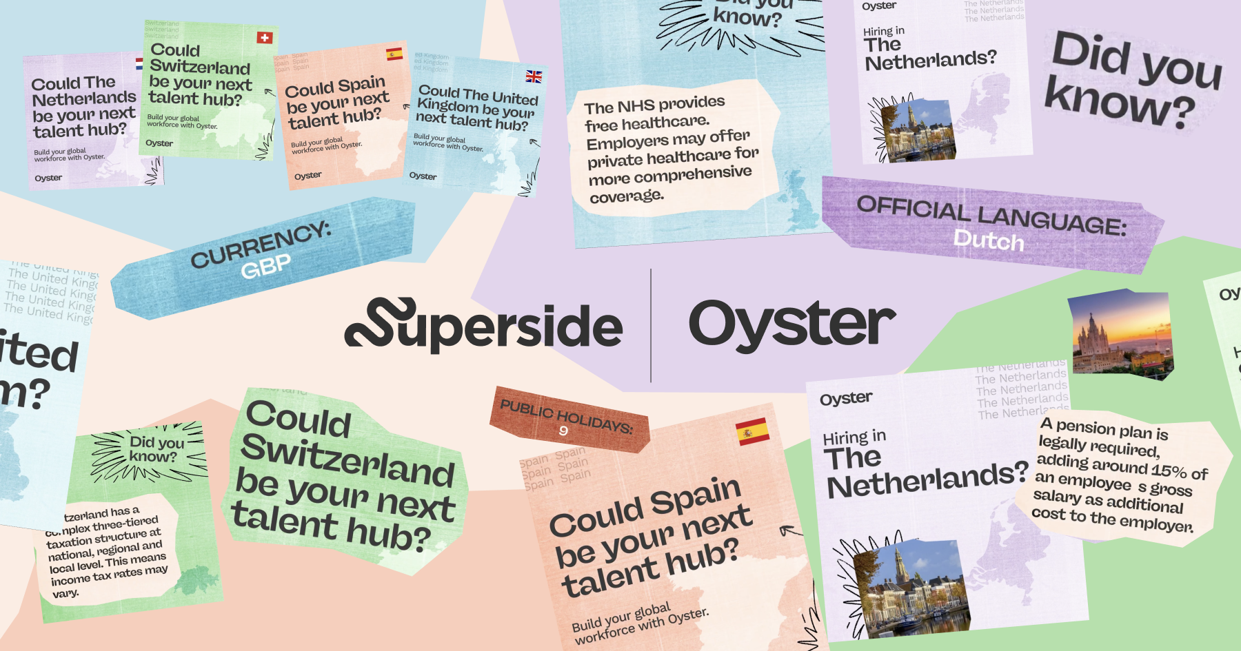
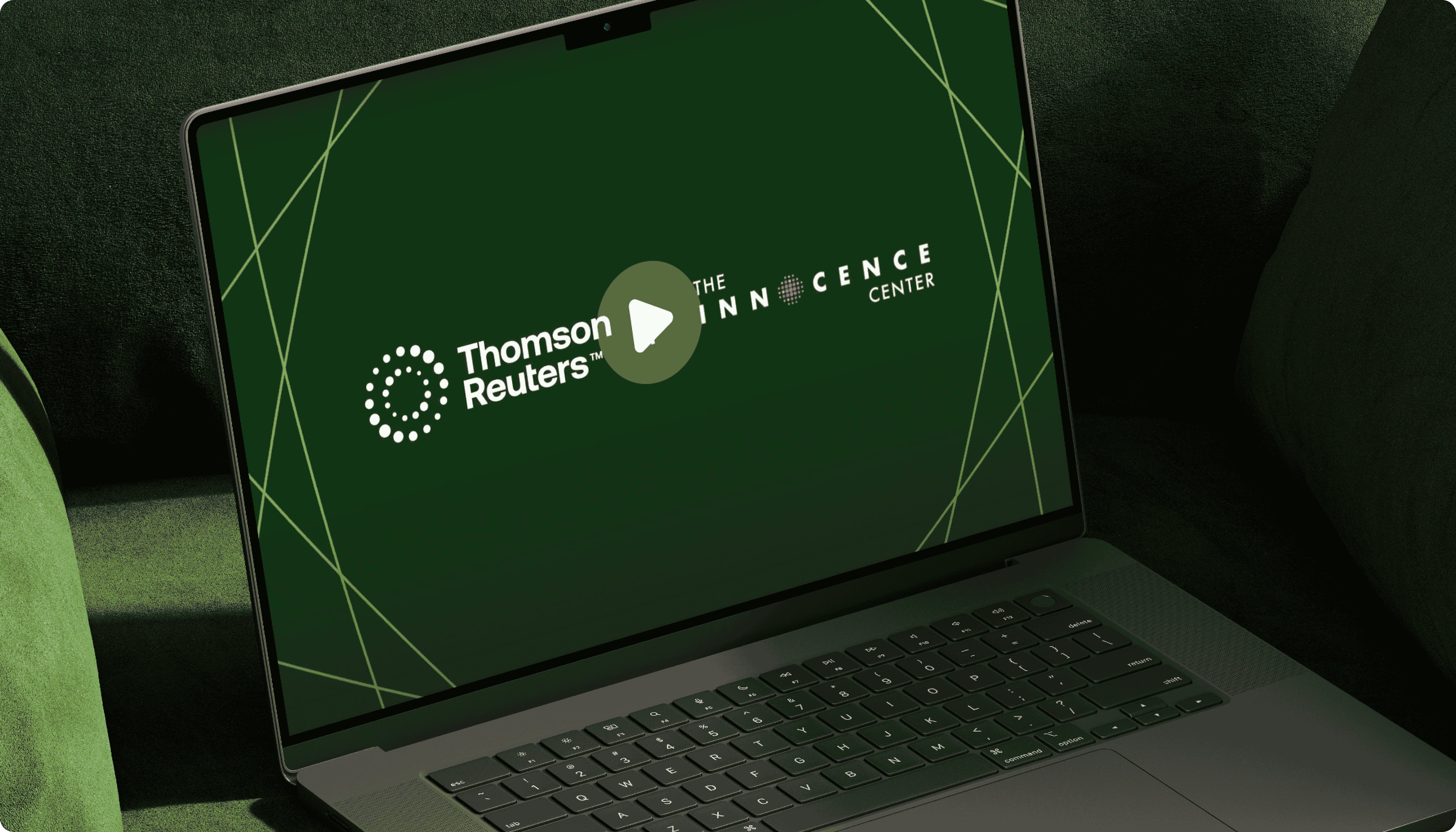
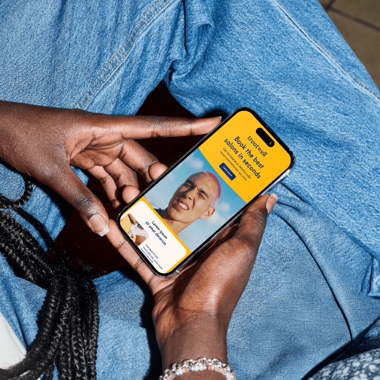
Trusted by 500+ of the world’s biggest enterprise brands
Get graphic design, print, motion, video and more
Whether you need an out-of-this-world illustration, beautiful print designs, or engaging digital marketing assets, Superside’s world-class graphic designers from around the world will make it happen.
Unlike traditional graphic design agencies, Superside is a tech enabled, Creative-as-a-Service design solution built to keep up with the evolving needs and fast pace of enterprise teams. Access a full suite of design services through a transparent design subscription model.
Book a demo with our experts
Creative services
Ad creative
Get original designs for your social media channels. Static, animated or video, from Instagram to YouTube or Facebook.
Branding
Get the brand expertise you need, however you need it, from brand development and design to custom branding solutions.
Web design
Get landing pages designed from scratch or based on existing materials with thoughtful UI/UX wireframes and designs.
Social media creative
Get static and motion ad creative, concepts, and variations for testing your way to better results across social media.
Email design
Invigorate your communications your emails with original email designs, templates, and creative to capture your audience’s attention.
eBooks & report design
Get eBooks and reports with designs that demands attention. Supercharge your reports, eBooks and digital learning content.
Illustration design
Get custom, on-brand illustrations for your business or marketing efforts that act as an extension of your company.
Packaging & merchandise design
Get 360 campaigns, designs and concept ideas for ads that capture and entice your audience be it online or offline.
Presentation design
Get original presentations designed for your persuasive pitch decks, sales decks, or PowerPoint presentations.
Concept creation
Get 360 campaigns, designs and concept ideas for ads that capture and entice your audience be it online or offline.
Print design
Get eBooks and reports with designs that demands attention. Supercharge your reports, eBooks and digital learning content.
Specialized production services
Video production
Get strategy-aligned videos and video as from pre-production to final edit to be successful online.
Motion design
Get on-brand motion graphics designed to enhance your website, digital campaigns, presentations and ads.
3D & AR design
Push your creative boundaries into a new dimension with social AR and 3D design o capture your audience's attention.
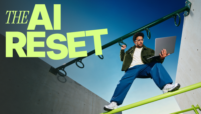
AI services
AI enhanced creative
Leverage AI experts for your design tasks to achieve 30%-60% production efficiency and reduce costs while maintaining quality and consistent branding.
AI consulting
Our AI consulting services make integrating AI into your workflows seamless and practical. We design solutions tailored to your team, processes, and goals—unlocking new opportunities for creativity, efficiency, and growth.
Marketing services
Marketing strategy
Empower your business with data-driven digital marketing initiatives, plans, and exceptional insights from our team of expert consultants.
Save up to 70% on production costs
Through AI, customers like Amazon, Reddit, and Salesforce managed to spend less than half of what they normally would on similar projects.
Superside is the perfect fit for fast moving brands
Boost your in-house creative
We handle the heavy lifting so you can focus on strategic, high impact work without adding overhead to the team.
Say yes to more projects
Whether you need more bandwidth or different skills, Superside has whatever resources you need to get the job done.
Don't sacrifice quality for speed
Our global team of creatives delivers agency-level work in a fraction of the time.


"Thanks to Superside, we’ve elevated ourselves. We’ve changed marketing in the industry by acting as more of a marketing agency for our brands, and streamlining that into robust marketing campaigns that move the needle."
"For us it has been important to find a creative partner like Superside –a team we can trust to deliver quality work on time, even with short notices."
"I am beyond happy with the work. Your designers routinely save the day!"
"I did not have the bandwidth. And I wouldn’t have even known where to begin to try to produce this, from finding a local crew, creating the detailed concept direction … So I said to Superside, ‘here's my problem’ and they said, oh yeah, we can solve that."
"We have access and responsiveness to meet our business-critical needs. The combination of quality, speed and 24/7 support allows us to be agile and efficient."
"The biggest benefit is time savings. The sheer volume Superside is able to produce is just amazing. If you think about 1-2 independent contractors vs. a team, it’s not a fair comparison."
"Superside took the time to learn about our company, applied their insights from various design projects and sought to meet our needs, even if it meant going through some additional edits."
See how top brands use Superside


Better rates than hiring designers in-house
Between the cost of hiring, retaining, supporting and growing the careers of designers and creatives, it ends up being a lot of money.
Superside is 20x faster than hiring internally and about half the cost of traditional design agencies.Our people are continuously trained on all the latest tools and processes, so you don't have to be.
Book a demo with our experts
Faster than hiring creatives in-house
20x
Reduction in average cost per asset
50%
Lower turnaround time for digital assets
70%
Average rating from customers
4.9/5
What makes our design services different?
We deliver speedy, high-quality graphic design services through a transparent subscription model.
We are a tech-enabled company, developing its own proprietary software to brief, manage, and coordinate a high-volume of design projects, making it possible to keep pace with teams at Amazon, Puma, Facebook, and more.
Learn how we can revolutionize the way your organization gets design work done. Book a call today.
Book a demo with our experts

Frequently asked questions
Creative-as-a-Service (CaaS) is a subscription service model that gives organizations access to quality creative assets at scale. CaaS solutions like Superside combine top talent and technology with a DesignOps process and team structure that removes the limits on speed, capacity, and capabilities for creative execution.
Superside subscriptions include a dedicated creative team onboarded to your brand and tailored for your specific needs, with specialized roles like Motion Designers, Design Directors, and Copywriters, along with in-plan hours to spend each month. Other “unlimited” design subscription services have hidden limits on output and speed. You can submit as many projects as you want, but they enter a queue to be worked on by 1 or 2, often freelance designers. Your next project only begins after your current project is fully completed, including any revisions.
You pick a monthly plan based on the capabilities you need and the volume you expect. For a predictable price, you get access to a dedicated project manager through a creative collaboration platform that lets you submit briefs, provide feedback, and access your finished assets and project files in a single place.
Graphic design is the art or practice of planning and arranging visual elements of a project to enhance or convey a message. A good graphic designer should be able to streamline communications and invoke emotion from their audience. Most people experience graphic design in their daily life from magazines and packaging to websites and social media.
By definition, graphic designers plan and arrange visual elements to convey a message that is pleasing to the eye. Our graphic designers specialize in the various areas of graphic design and are ready to assist with the creation of digital ads, marketing, motion graphics, print, merchandise, packaging, powerpoints, illustrations, infographics, and landing pages.
The simple answer: anyone who wants their brand, product, or service to invoke a response from their audience needs a graphic designer. Graphic design services use data and visual elements to streamline communication and easily convey your message in a comprehensive format.
Yes! We develop a budget that aligns if you have larger and more complex needs. Otherwise, all plans are identical, giving you full access to everything you need from Superside, regardless of the size of your monthly budget.
We offer credit card billing or invoicing.