


The In-Depth Guide to Professional Services Design


In 2022, the banking, finance and insurance industries generated a collective $4.96 trillion in the US alone. With stratospheric numbers like those, it’s fair (and rather obvious) to say that businesses offering professional services make lucrative clients.
In this post, we will cover how to craft unique fintech and insurance company designs, (as well as those for all professional services) that stand out in a sea of similarity. From branding to strategy, our designers give their insights, analyses and critical thinking rationales behind designing for professional services.
We'll be discussing:
What Makes Designing for Professional Services Tricky
The Importance of Excellent Design for Professional Services
3 (and a Half) Non-Negotiables to Professional Services Design
The 4-Step Strategy to Designing for Professional Services
How Professional Services Designs Come to Life
The Secret to Success: Set Your Service Apart
What Makes Designing for Professional Services Tricky
Imagine that you’re standing in line at a bank. Look around you. What color are the walls? Is the lighting cool or warm? If there is any accent color anywhere (such as the seats or signs), what color is that?
There’s a good chance that your answers are white, cool and dark blue. That’s because this classic, clean template is an excellent way for banks and other financial services providers to convey class and professionalism.
It’s a carefully curated collection of harmonious elements, and it’s that precisely refined design criteria that can make professional services design work difficult.
Be distinguished
Finding a way to distinguish an individual service while still maintaining the overall design status quo isn’t easy. Brands that take even a minor creative risk can end up standing out for the wrong reasons as much as they could for the right ones.
And, the more that brands feel pigeonholed into adopting the do-what-the-competitors-are-doing method of design, the more everything looks the same.
The Importance of Excellent Design for Professional Services
This doesn’t mean that the clean and classy approach to brand identity is wrong. It is, in fact, absolutely spot on for the financial services industry. Picture an insurance company with comic sans as their font of choice.
Even if their rates, brokers and technology were unmatched, they’d likely struggle to generate first-time clients.
Excellent professional services design doesn’t just follow the tried and true, it goes beyond it. Everything is considered, from the color palette right down to the receptionist’s ringtone, to ensure that all customer touchpoints reinforce the brand message, promise and sense of authority.
Finding and using every opportunity within the tight framework parameters is paramount to building client trust and confidence.
We helped Stackwise standout while remaining dignified.
How Design Affects UX
New York-based designer Frank Chimero summed it up in six words: People ignore design that ignores people.
Great design is aesthetically pleasing, but this is a by-product of its purpose. At its core, design exists to enhance the user experience (UX) wherever possible. Apple products are an excellent example of this: every creative aspect has been considered from the point of view of how the user may experience it.
As a result, the feel of an Apple watch strap, the soft touch of a Macbook keyboard, or the curved edges of an iPhone have been meticulously designed to ensure the UX on offer is as close to perfect as possible.
This is true of professional services, too. Good design works hand in hand with UX, making it easy for clients to feel empowered in their interactions, assisted in their queries and assured in their choice of services provider.
Three (and a Half) Non-Negotiables to Professional Services Design
Whether designing for banking, advisory, insurance or fintech companies, there are a few principles of professional services design that remain the same.
1. The riskier the design, The riskier the chance of success
Don’t (mis)interpret this as playing it safe. Rather, be aware of what designs people will immediately identify as those aligned to the financial sector. Perhaps one day professional services designs will be bright, fun and full of exclamation points, but we won’t go from current market trends to that without some transitional steps in between.
The further that designs fall outside of the expected norm, the more likely they are to suffer from failure to launch—unless they come equipped with copious amounts of context. But designs are like jokes in that regard: if you have to explain them, they don’t work.
2. Stay up to date
Outdated designs can do brand damage in any industry, but especially so in professional services. Ensure any design work is relevant, and wherever it makes sense, utilize any tech or fintech features that add value to the service. And don’t forget to keep UX at the forefront of your design decision-making!
3. Consistency is key
This is fairly standard practice, but it bears mentioning because of the importance of consistency. Make sure everything looks and feels on brand, as well as plays to the medium for which it is designed (for example, a service that uses lifestyle images would need to think about how this would work harmoniously for everything from video content to pitch templates).
Consistency builds trustworthiness, and trustworthiness builds client loyalty.
3 and a Half: Look to build trust wherever possible
While the right designs will convey trustworthiness, the incorporation of trust pillars such as testimonials or reviews takes this a step further. Although not strictly necessary, by showcasing how others experience their interactions, you can highlight authentic value from the perspective of the client.


Bridging Gaps Between Marketing & Design Teams
The 4-Step Strategy to Designing for Professional Services
Beyond following UX best practices, good design is guided by great strategy. This underlying strategy takes data, insights and business experience into account and keeps track of how designs are performing versus expectations. A strong strategy relies on four steps:
Step 1: Research
When it comes to services, the only opinion that really matters is that of the client. Whether they felt the experience was good or bad, it’s worth finding out why in both instances.
Knowing with certainty what appeals to an audience is invaluable as it lets you know exactly what is working and where to focus your efforts. Similarly, insight into any shortcomings creates an opportunity to fix them.
Conducting client surveys and analyzing the results will provide an excellent temperature reading of the actual user experience, enabling decisions to be made from a single source of truth.
Step 2: Distinction
Without a personal differentiator, remaining memorable in the mind of the client becomes close to impossible. Using the insights extrapolated from customer surveys, map out which brand characteristics are valued and sought after.
These characteristics usually form the basis for brand positioning and messaging. Although brand characteristics do not need to be completely unique, those that are can provide a strong design hook.
Step 3: Positioning
Positioning is all about how a service’s key characteristics are communicated in relation to competitors. By determining a position in the industry, services can identify and talk to a target audience from a point of authenticity and authority.
Accurately positioning a professional service in the market is essential, as it gives design work the best chance to resonate.
Step 4: Informing
This is the most important step, and the culmination of the research, brand distinction and positioning. What are the takeaways you want the audience to remember, and what is the most optimal way to display these takeaways?
While the slogan conveys the main message (“Providing trusted financial solutions since 1949”, for example), it is on the shoulders of design to add further enhancements.
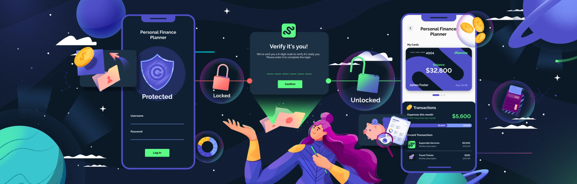
In the example above, trust and longevity are made clear in the slogan, so design may choose to focus on showcasing a deliberately modern look indicating that, despite their long-ago inception, this financial solutions provider is confident, competent and tech-savvy.
Contemporary design elevates legacy services like loans and investments, as seen here with our client, Salt.
How Professional Services Designs Come to Life
Depending on the service and their requirements, designs can range from simple campaign material to an entire brand identity. To accommodate the latter, the below outlines the most common visual elements and their treatments.
Logo
A logo is a brand’s visual fingerprint. Usually (but not always) devoid of typography, a good logo makes use of the brand’s color palette and expresses the brand persona, acting as the core around which all other elements are designed.
Because of the nature of the industry, financial services logos are often sleek and sophisticated.
Website
In an industry where reliability and trust are vital, a professional services website needs to meet a high standard. With an almost endless array of design possibilities and interactive multimedia components, as well as the added task of designing for desktop, tablet and mobile, web design is neither quick nor easy. In most cases, it doesn’t need to be award-winning design, but it does need to be up to scratch. Bad website design is always noticed and never necessary.
Marketing content
Because of the sheer amount of content required, marketing elements are perfectly suited to using the range of visuals, colors and typography available to the brand. Make use of any digital and print features where they make sense, and keep designs consistent without becoming repetitive.
Uniforms
In instances where uniform design is required, less is more. A stylish logo on a breast pocket is far more effective than anything bold. Uniform design is an element used to reinforce the client’s faith in the authority of the brand. Using it for anything else—promotional or general messaging, for example—will likely only have adverse effects.
Corporate gifts
Like uniforms, corporate gift branding design is understated. It should act to remind the individual of the brand, organically keeping them top of mind. Excessive gift branding both oversells the message and undermines the gift.
Templates
Numerous digital touchpoints have small design requirements, such as email signatures, business cards, letterheads, pitch decks and presentations. Keep these designs clean, on brand and suited to the element, creating a good impression on a client from their first interaction.
The Secret to Success: Set Your Service Apart
Admittedly this is not much of a secret, but knowing how to use design to differentiate a service from its competitors is easier said than done. It requires a sound understanding of which elements can be pushed, and to which degree.
This is where design work and theory meet industry knowledge. Research the service sector to gauge the visual trends. Nail down exactly where there are design niches and opportunities based on competitor content. Be confident in your design considerations, conscious of your color choices and clear in your rationales.
In this way, you don’t divert from the service sector, but you don’t follow the same copy-paste design approach as anyone else in the industry.
3 Final Tips and Best Practices
Before you go out and take the professional services industries by storm with your designs, here are three final tips:
1. Use white space generously
There is no such thing as a busy design and a classy design. Use white space liberally. It guides the eye to the focal point and exudes richness and sophistication.
2. Use simple visuals to explain complex concepts
Financial and professional services inevitably operate with complicated information. Instead of trying to minimize or simplify this, use clear, easy-to-understand visuals. In the same way that road signs can be very simple but extremely informative, basic visuals, when used correctly, can communicate substantial info.
3. Don’t be afraid to A/B test
With a wealth of information available, A/B testing designs is an excellent way to see which of two potentially strong approaches is better. Determined purely on client data, A/B tests are powerful tools to deduce exactly what is working.
To see how good professional services design can really be, learn about how Superside’s branding services can benefit you.


Beautiful Design Starts With Superside


Don’t miss anything!
Join our community of 50,000+ who receive the best in design and marketing content, weekly.


Improve your marketing performance
Get high-quality creative, ship campaigns faster and stand out from the competition.

Be more agile & responsive
Never say no to another project request. Get a hassle-free creative partner that can keep up.

Elevate your team
Allow your in-house creatives to focus on more strategic projects. Get new ideas & continuous design inspiration.

Save time & be more cost-efficient
Increase your design capacity without additional hiring and with fewer vendors to manage.
See Superside in action
Get a demo and discover how 450+ ambitious companies and 2,500 energized fans use Superside to free themselves from the shackles of limited budgets, broken processes and stretched in-house teams.