


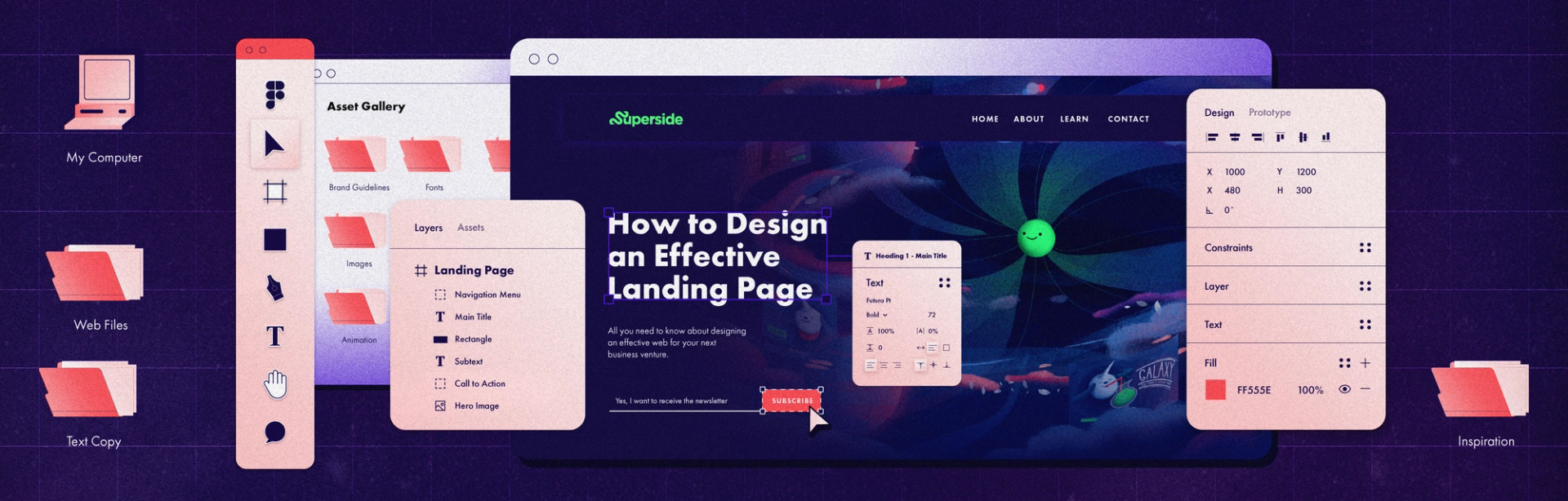
How to Design an Effective Landing Page in 2024


When it comes to digital advertising, simple is often better, and that couldn’t be more true when it comes to landing page design.
Have you ever heard of the paradox of choice? It’s a phenomenon where having too many options makes it harder for people to make decisions. If you’ve ever spent way too long trying to find something to watch on Netflix, then we’re sure you know what we’re talking about.
This concept is also why landing pages are so effective lead generation and increasing conversions. With most marketing campaigns, there is likely one key conversion action you want your visitors to take, such as:
- Make a purchase
- Book a call
- Signup for something (newsletter, guide, etc),
- Register for a product trial
So what is a landing page? Rather than driving your visitors to your homepage, where they could end up clicking on a variety of different pages and buttons, a landing page is a dedicated page focused on one key action or outcome. With less choice presented on this page, your visitors are much more likely to take that key action that you want them to.
Of course, there’s a difference between simple and easy. Your landing page design should be simple – but it also needs to incorporate many different elements, which can be challenging. In this post, we’ll be providing some expert guidance and answering the below questions about landing page design:
What Makes a Good Landing Page?
A great landing page's defining metrics is a high conversion rate and a low cost per sale, but how exactly do you achieve this? Before you design anything, there are five critical factors in creating high converting landing pages you need to understand.
- Your brand. Your brand is a lot more than your visual identity (i.e., your brand colors, fonts, logo, etc.). Your brand should also have a distinct voice, image, promise, and point-of-view. Your landing page design should feel like a natural extension of your customer experience, incorporating all of these pieces.
- Target Audience. Who are you aiming to reach with this campaign? Like any design project, you need to keep your audience top-of-mind when creating a landing page. Everything from your messaging to the page layout needs to speak to and align with your audience’s specific pain points and desires.
- Messaging. Speaking of messaging, you should have a clear understanding of what you’re promoting and why. You should concisely express the main idea you want people to understand and remember about your offering, use language that resonates with your target audience.
- Placement. How your audience will access the landing page (e.g., mobile or desktop) and where they’re coming from (e.g., email, PPC ad, Facebook ad, etc.) should inform your landing page design. If you’re mainly driving views to the page from paid advertising on Instagram, then you need to design for mobile first.
- Value proposition. Last but certainly not least, there’s your value proposition. What do you plan to deliver to customers once they convert? And why should they sign up for your offer specifically? Your landing page should clearly articulate these ideas. Try not to over embellish, either. Whether it’s downloading a guide, or signing up for a trial of your product, clearly state what people can expect from your offering—no one wants to be duped!
Everything needs to work together when it comes to the perfect landing page. It’s not just about design, it’s not just about copy, it’s not just about a great offer. It really is about everything coming together into one cohesively structured page that shows the user the full picture.
— Simon McCade, Product Designer
What Questions Should a Landing Page Answer?
A strong landing page should answer the following questions:
- What is the offer?
- Who is this offer for?
- How can your audience access the offer?
- Why should your audience care? (i.e., how are you different, what value do you offer, what problems do you solve, etc.)
Another question to ask yourself when designing a landing page is: what does your audience have to lose by not converting? Fear of missing out is a powerful sales tactic, so think about ways to build urgency or scarcity into your messaging, such as with limited-time offers or early-bird bonuses.
How Long Should a Landing Page Be?
We posed this question to our creative team, and there was a pretty clear consensus. While there are no hard rules, our staff agreed that shorter is better when it comes to landing page design. There’s even research to back this up. A 2020 analysis of over 1,000 landing pages found that shorter three field forms convert 12% better than pages with longer forms. Shorter headlines (up to 10 words) convert better than longer ones.
[Landing page design length] depends entirely on the brand. Some businesses should have a short landing page, and some need a bit more space. But on average, you should try to keep it as short as possible for those viewers who only browse.
[A landing page should be long] enough for a person to gather what your brand is about. A simple one-pager should provide a clear understanding.
It depends on the function of the page, but less is usually more.
Here’s a really simple landing page example from Semrush that drives this message home.
7 Tips For Creating an Effective Landing Page
Most effective landing pages follow a consistent structure, but to help paint a picture (and toot our own horn a little bit), we’ll use our very own Ad Designpalooza page as a landing page design example.
Here are the key components you need to have in your landing page templates.
- Use a main headline and a supporting headline
- Have a Unique Selling Proposition (USP)
- Showcase the benefits of your offering
- Use images or video to show context of use
- Use consistent and bold visuals
- Incorporate social proof into page
- Include a Call To Action (CTA)
1. Use a main headline and a supporting headline
Our Ad Designpalooza headline and supporting headline states the offer and explain what visitors would get once they sign up.
While keeping text to a minimum, there’s still a lot you can do with your main header section! Here are some quick tips and ideas you can follow:
- Intertwine features and benefits
- Try using a question instead of statement
- Outline a problem, agitate it, then provide a solution
- Leverage data and/or social proof
2. Know your unique selling proposition (USP)
Your unique selling proposition is what makes your offer different from everyone else in your market. It’s a short statement that should quickly answer the question of how you’re better than your competition. For this page, the on-demand element of the event helps it stand out from other online conferences.
3. Showcase the benefits of your offering
The benefits are the outcomes or results that users will experience by using your product or service. For this offer, the ‘featured talks’ and ‘meet our speakers’ work to articulate the offer’s benefits by giving visitors an idea of what types of talks they’ll hear and who they’ll be hearing from.
4. Use images or video showing the context of use
Simply put: people want to see what they’re opting into, so adding images or videos to your landing page that show your product or service in use can help people better understand your offer and drive them to convert. The website header video featuring highlights from different speakers helps set expectations for the page visitor and entices them to sign up for the whole event.
5. Use consistent and bold visuals
You don’t get a second chance at a first impression, so your landing page visuals should be both eye-catching and consistent with your other brand touch points to build trust with your target audience. When you compare this landing page to the Superside home page, you can see how the colors, fonts, space imagery, and tone of voice are very aligned.
Your prospects want to know that you don’t just talk the talk, but also walk the walk, and this is where social proof comes into play. Incorporating positive feedback, reviews, numbers, or statistics can help reinforce your messaging and build trust. For example, highlighting the fact that over 5,000 people have already signed up for this event reinforces its value.
7. Include a Call To Action (CTA)
A CTA is the most important element on a landing page! A landing page without a CTA is like a marketing team with no strategy—people need to know what action/s they should take.
This page features call-to-action buttons at the top of the page, as well as the bottom to capture users who are ready to opt-in right away and those who might want to read the entire page first. The CTA button copy (“watch on-demand”) also clearly defines the action Superside wants users to take and what they will be able to do once they opt-in, compared to more vague copy like ‘learn more’ or ‘sign up.’
Landing Page Design is an Art and a Science
If you look at a bunch of landing page design examples, you’ll see that most (if not all) follow the structure we outlined above. And there’s an obvious reason for that: it works.
It doesn’t matter your conversion goal, target audience, or price point – if you follow the guidelines above, you’ll be much more likely to have a high-converting and cost-efficient marketing campaign.
But just because you need to stick to a formula doesn’t mean you can’t find unique and clever ways to put your own spin on it. For example, you can test out different CTA button copy or colors or try out different header designs—a b testing your designs is the key to improving landing page conversions. Also, as you can see on our Ad Designpalooza page, we incorporated a lot of custom illustrations that help make the page feel unique and aligned with our design ethos.
While simple may be better with your landing page design, we urge you to find different ways to make it your own. Should you feel designing your own landing pages is too much work, get in touch with Superside, our landing page design services have you covered.

Don’t miss anything!
Join our community of 40,000+ who receive the best in design and marketing content, weekly.
Why choose Creative-as-a-Service with Superside?

Improve your marketing performance
Get high-quality creative, ship campaigns faster and stand out from the competition.
Be more agile & responsive
Never say no to another project request. Get a hassle-free creative partner that can keep up.

Elevate your team
Allow your in-house creatives to focus on more strategic projects. Get new ideas & continuous design inspiration.
Save time & be more cost-efficient
Increase your design capacity without additional hiring and with fewer vendors to manage.
See Superside in action
Get a demo and discover how 450+ ambitious companies and 2,500 energized fans use Superside to free themselves from the shackles of limited budgets, broken processes and stretched in-house teams.